-
Notifications
You must be signed in to change notification settings - Fork 787
Columns to Rows (Version 1.0)
Antwort version 1.0 is a complete code rewrite using a different strategy to support the latest Android Email clients.
Instead of forcing <td> into display: block !important; on mobile, we force a 100% width on aligned <table>s and include an Outlook only wrapper table.
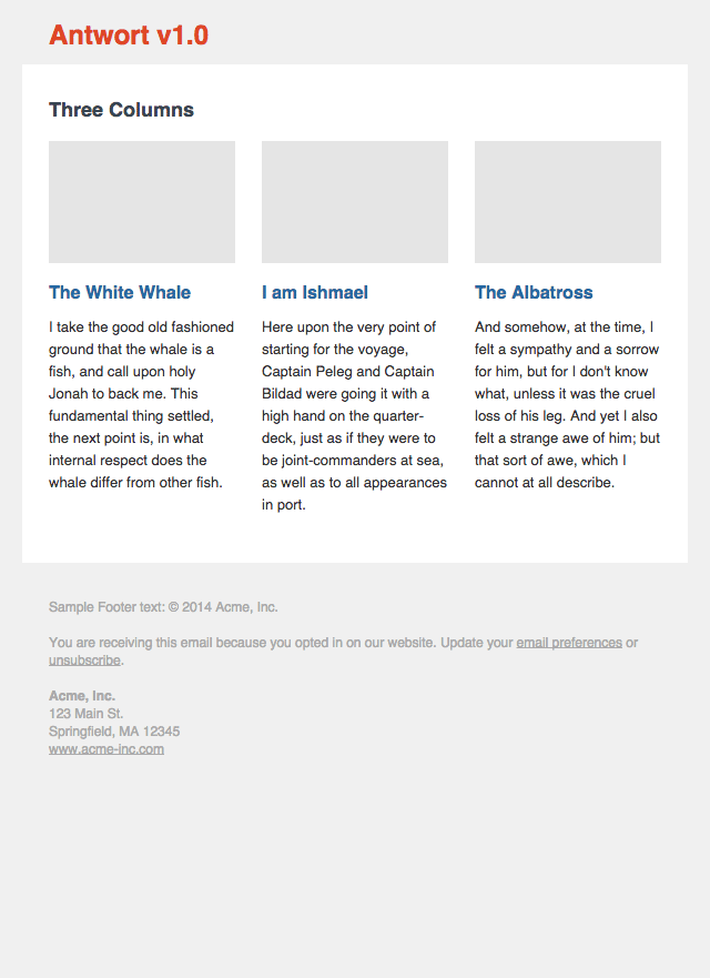
Antwort v1.0 Desktop Version

A <table align="left"> behaves like a floated element and all email clients support tables. So let's use used multiple aligned tables to be our columns. To make sure Outlook aligns our columns correctly, we need a wrapper table, which we'll serve only to Outlook using the [if mso] conditional:
<!--[if mso]>
<table border="0" cellpadding="0" cellspacing="0" width="100%">
<tr><td width="50%" valign="top"><![endif]-->
<table width="264" border="0" cellpadding="0" cellspacing="0" align="left" class="force-row">
<tr>
<td class="col" valign="top">
<strong>Herman Melville</strong>
<br><br>
It's worse than being in the whirled woods, the last day of the year! Who'd go climbing after chestnuts now? But there they go, all cursing, and here I don't.
<br><br>
</td>
</tr>
</table>
<!--[if mso]></td><td width="50%" valign="top"><![endif]-->
<table width="264" border="0" cellpadding="0" cellspacing="0" align="right" class="force-row">
<tr>
<td class="col" valign="top">
<strong>I am Ishmael</strong>
<br><br>
White squalls? white whale, shirr! shirr! Here have I heard all their chat just now, and the white whale—shirr! shirr!—but spoken of once! and…
<br><br>
</td>
</tr>
</table>
<!--[if mso]></td></tr></table><![endif]-->You need to set a fixed pixel width for the tables. Here we have 264px, which in this case is (600-3*24)/2 or our container minus gutters divided by number of columns.
In the example above, our tables have fixed width of 264px a .force-row class. To force them into rows on mobile we use the following styles:
@media screen and (max-width: 599px) {
  .force-row {
    width: 100% !important;
    max-width: 100% !important;
  }
}

|

|
|
Android Email app properly transforms columns to rows |
Android Gmail app makes it own rows by fudging our widths |
Depending on your design, this may not be desired behavior, esp. on Android Gmail app. Check your audience's email client share statistics before deciding if this strategy works for you.