User Interface
This page documents the design for Malasakit's user interface, which was driven by the following considerations:
- Users who may not be technically proficient. As much as possible, actions should rely on some form of simple touching, clicking, or dragging. Asking for inputs through a virtual keyboard should be avoided.
- Limited network connectivity. Stylesheets, scripts, and pages should be as small as possible. Furthermore, the simple inputs required by (1) meant there were fewer benefits to using a full-blown frontend framework.
Malasakit uses LESS, a CSS preprocessor with useful abstractions.
A main.less file imports directives from other .less files, and is compiled into main.min.css, which should be minified in production.
Every template is derived from base.html using template inheritance.
This base template does the following:
- Link to static files: jQuery,
client.js,sw-bootstrap.js(imports a service worker scriptsw.js),uuidv4.js, the JavaScript translation catalog (provides a JavaScript equivalent ofxgettext), andmain.min.css. - Add a navigation bar to the top of the page with a list of languages to select from (uses hyperlinks to navigate between languages).
- Add a heading.
- Add a footnote with brief acknowledgements.
The contents of the top-level components (nav, header, main, footer) is wrapped in a div.container element, which centers the content and constrains it to a maximum width of 960 pixels.

This page is minimal, so that the user can acquaint themselves with the system and change languages, if need be. Ideally, the landing page should fit all on one page to avoid users having to scroll down to find the "Begin" navigation button.
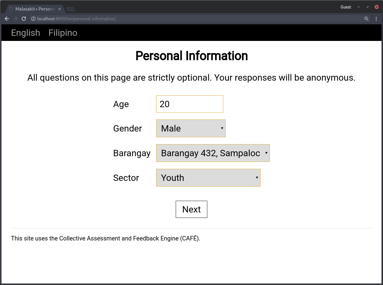 Users are asked for their age, gender, barangay, and sector (the "sector" contains various affiliations such as "youth" and "religious organization").
The list of barangays is set by the administrators to target ongoing field tests, so the dropdown menu should not contain too many options. Nevertheless, there is an "other" option that allows non-field-test participants to specify their barangay in an open text field. Data cleaning would need to be done on the backend to reconcile "dirty" inputs.
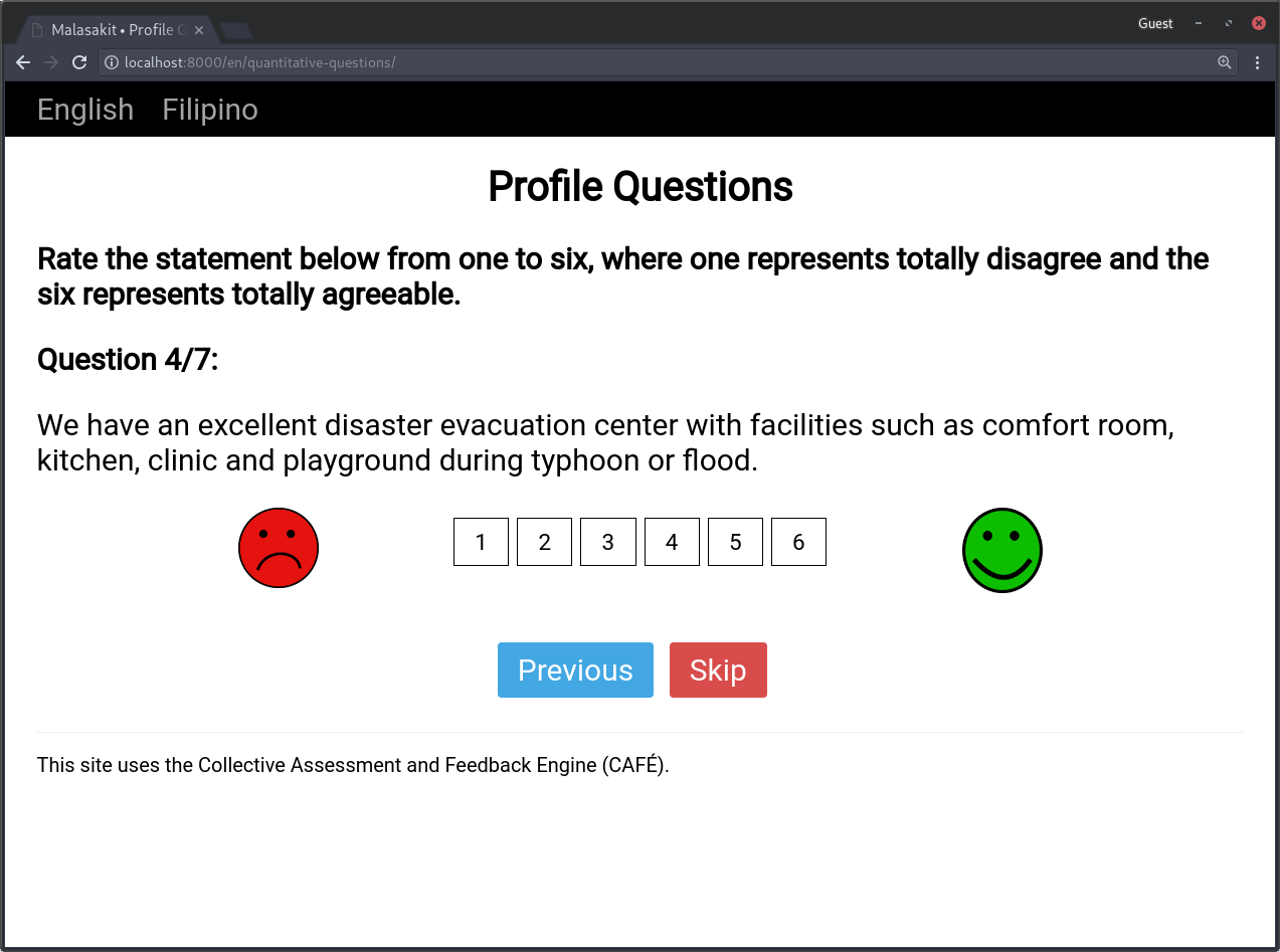
Quantitative questions are displayed one at a time to avoid overwhelming users and allow them to focus on the question at hand. This observation has been validated by observations in the field.
By default, quantitative questions are represented as a row of buttons, with emoticons on either side to add context on the meaning of the ratings. The "Previous" and "Skip" buttons are colored red and blue, respectively, to distinguish them to a user at a glance.
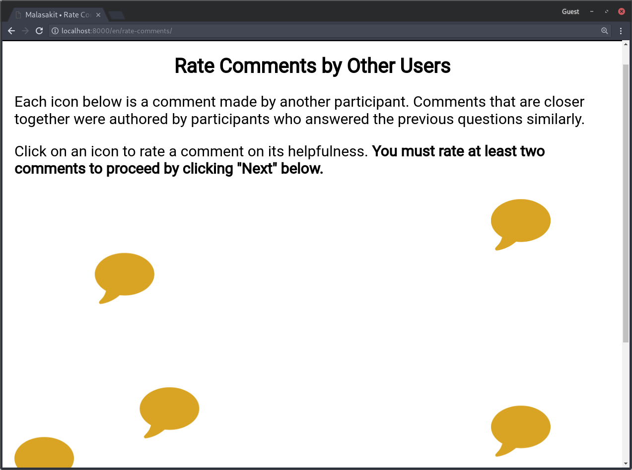
Other users' suggestions are displayed in clusters by the similarity of the comment authors' quantitative question responses. This is achieved using principle component analysis, then projecting the authors' responses onto the first two principal components.
Users must rate at least two comments before continuing. The purpose of this design is to encourage data collection and expose users to other suggestions. (Skipped comments count towards this two comment requirement, as users cannot be forced to provide a definite rating.) The "Next" button is disabled and colored gray while fewer than two comments have been rated. Users are free to rate up to all eight comments displayed.
The bloom icons and tags are rendered with d3's force simulation (with repulsive forces) so that overlapping icons seperate.
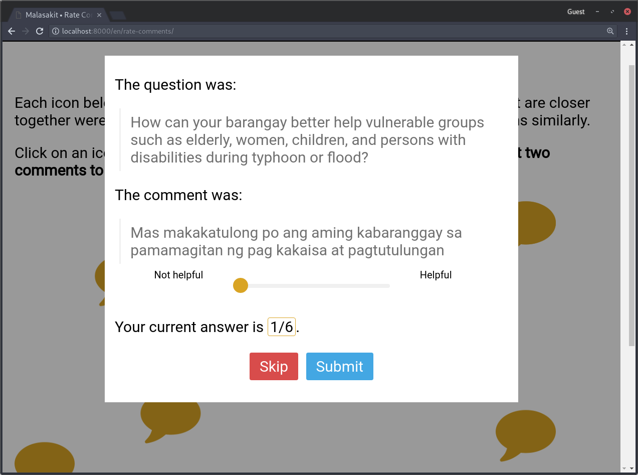 A modal opens when a user selects a comment.
 The qualitative questions are all displayed on the same page since, to reduce survey fatigue, there should be few of them.
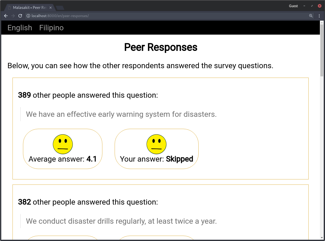
The peer responses page communicates how others rated the questions visually through the same emoticons used in the quantitative question section. This page is shown after the user has submitted their responses to minimize the effects of social influence bias.

This page simply thanks the user for participating. The social media hooks and links to disaster preparedness resources were removed to reduce confusion regarding navigation.