-
Notifications
You must be signed in to change notification settings - Fork 53
Adds HX711 Issue #101 #116
New issue
Have a question about this project? Sign up for a free GitHub account to open an issue and contact its maintainers and the community.
By clicking “Sign up for GitHub”, you agree to our terms of service and privacy statement. We’ll occasionally send you account related emails.
Already on GitHub? Sign in to your account
Conversation
There was a problem hiding this comment.
Choose a reason for hiding this comment
The reason will be displayed to describe this comment to others. Learn more.
Thanks Chris!
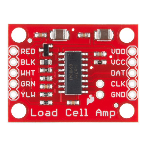
What part is this design based on? It looks different than the part in #101, and there's another row of pins not present in the original one. I see you mentioned you made this one generic, how does that work?
Some notes regarding the visual style:
- We use plain colors for the board itself (it looks like you used a gradient)
- The holes should be transparent (they should actually be holes in the shape), so that it looks good on either light or dark background
- We usually avoid drawing the on-board traces (to keep the SVG small). But if we do draw them, the contrast is lower (e.g. here)
Example of an existing part which uses a green board: https://elements.wokwi.com/?path=/story/franzininho--default
Other than that, I left some comments on directly on the code
|
I believe I have all the changes requested in the PR now. |
src/hx711-element.ts
Outdated
| <tspan x="0.05859375" y="69" fill="#FBFBFB">A-</tspan> | ||
| <tspan x="0.4921875" y="18" fill="#FBFBFB">E+</tspan> | ||
| <tspan x="297.444824" y="42" fill="#FBFBFB">GND</tspan> | ||
| <tspan x="297.168945" y="66" fill="#FBFBFB">DT</tspan> |
There was a problem hiding this comment.
Choose a reason for hiding this comment
The reason will be displayed to describe this comment to others. Learn more.
Shouldn't it be DOUT?
There was a problem hiding this comment.
Choose a reason for hiding this comment
The reason will be displayed to describe this comment to others. Learn more.
There was a problem hiding this comment.
Choose a reason for hiding this comment
The reason will be displayed to describe this comment to others. Learn more.
Looking at google images, it's either DT or DAT. So we can keep DT - but let's make sure the name in pinInfo matches
|
Its empty look is why I originally put some traces :) I will add to the Silkscreen as suggested. I will add the 50kg Load Cells to the drawing |
|
Added the sensors as requested and fixed text and updated silk screen. |
|
Two more requests:
|
|
Added requested changes for resizing view and using newer storyboard format. |
There was a problem hiding this comment.
Choose a reason for hiding this comment
The reason will be displayed to describe this comment to others. Learn more.
Thanks for all the changes. We're getting there!
src/hx711-element.stories.ts
Outdated
| argTypes: { | ||
| angle: { control: { type: '50kg', width: 580, height: 430 } }, | ||
| }, |
There was a problem hiding this comment.
Choose a reason for hiding this comment
The reason will be displayed to describe this comment to others. Learn more.
can be removed - there's no "angle" for the user to control
There was a problem hiding this comment.
Choose a reason for hiding this comment
The reason will be displayed to describe this comment to others. Learn more.
Did you forget about this one?
src/hx711-element.stories.ts
Outdated
| // export const Default = Template.bind({}); | ||
| // Default.args = { type: '50kg', width: 580, height: 430 }; |
There was a problem hiding this comment.
Choose a reason for hiding this comment
The reason will be displayed to describe this comment to others. Learn more.
Please remove
src/hx711-element.ts
Outdated
| @property() width = '58mm'; | ||
| @property() height = '43mm'; |
There was a problem hiding this comment.
Choose a reason for hiding this comment
The reason will be displayed to describe this comment to others. Learn more.
width/height shouldn't be provided by the user. Instead, they should be derived from the type.
One way to do this would be to introduce a getter, e.g.:
get dimensions() {
  switch (this.type) {
    case '5kg': return {width: '58mm', height:'43mm'};
    ...
  }
}
Then, in render, you could do
const { width, height } = this.dimensions|
Made the requested changes. |
|
Oops, I meant to always fall back to 50kg |
src/hx711-element.ts
Outdated
| case 'gauge': | ||
| return { width: '509', height: '200' }; | ||
| default: | ||
| return { width: '580', height: '430' }; |
There was a problem hiding this comment.
Choose a reason for hiding this comment
The reason will be displayed to describe this comment to others. Learn more.
why not return width/height as numbers instead of strings? then you can remove the conversion to integer in render()
|
As far as I can see, the last change only sets the default for storybook, but an invalid value for "type" passed to the element would still result in an empty space. One way to resolve this in a nice way would be to add a renderSensor() method that will return the relevant svg code based on the value of type, with a "default" fallback case. Something along the lines of: renderSensor() {
switch (this.type) {
case '5kg': return svg`<tags here>`;
case 'guage': return svg`<tags here>`;
case '50kg':
default: return svg`<tags here>`;
}
}Then, in render, you can just replace the whole section with I hope this explanation makes sense |
|
Hooray! |


This adds the HX711 for Issue #101
The issue mentions it is for gauge pressure sensor but this is also used for load cells and strain gauges so I made it generic.