A python class of drawing a Bar/Box plot based on the plotly package, with freely definable statistical annotations
I hope this program can help you, and I will be very happy if you can give me a
- Use
pip
pip install plotly-signifYou can import like this:
from plotly_signif import plotly_signif
# or
from plotly_signif import *- Download the
plotly_signif.pyto the path of your program
from plotly_signif import *- Enjoy it
You can refer to the following example :
from plotly_signif import *
import pandas as pd
iris = pd.read_csv('https://raw.githubusercontent.com/mwaskom/seaborn-data/master/iris.csv')
df1 = iris.groupby("species").mean()
df2 = iris.groupby("species").sem()
test = plotly_signif(data=df1,error=df2,text={"x":"X","y":"Y"})
test.plot()
# 添加统计注释
annotation_list = [[0,1,1],[2,0,3,-1],[2,1,2,2],[0,1,3,6],[0,2,3,9]]
test.add_annotations(annotation_list = annotation_list,text="***",inne_color="#B799FF")
test.add_annotations(annotation_list = [[1,2,3,3]],text="🏅",sign_d_index=2)
test.add_annotations(annotation_list = [[1,1,2,4]],text="😭",sign_d_index=2)
test.add_annotations(annotation_list = [[1,0,2,2]],text="⭐⭐⭐",sign_d_index=2,size=12)
test.add_annotations(annotation_list = [[1,2,0]],text="ns",size=14,sign_d_index=2.5)
# 绘制/保存
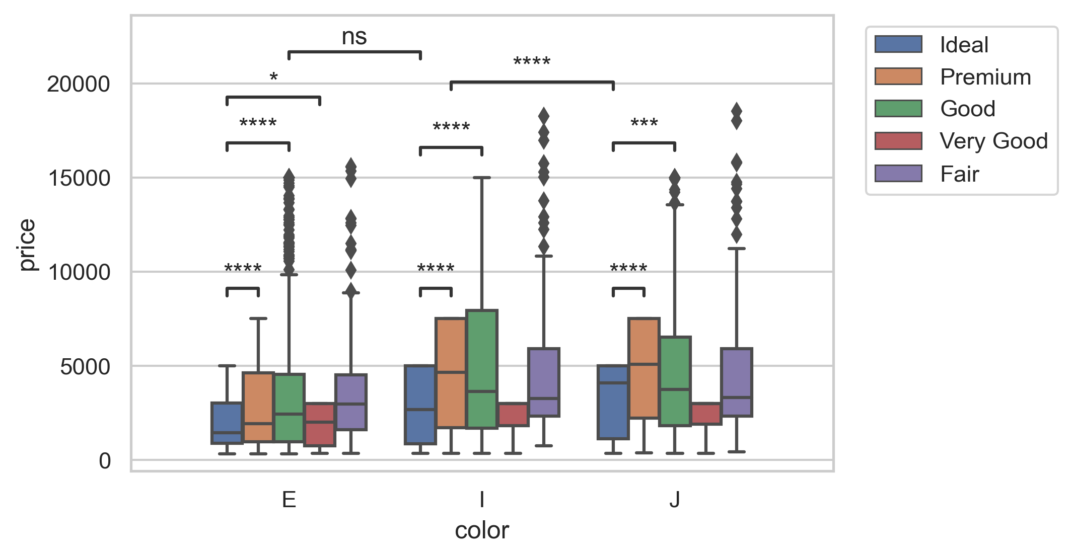
test.show("./image/example.png") # 保存使用属性 save_path = "./image/example.png" It is better than statannotations in representing such complex intra-group and inter-group annotations, but its current functionality and compatibility are not as good as statannotations. If this project cannot meet your needs, it is recommended to try statannotations.
The picture below is the first example given by statannotations. Pay attention to the annotations between groups.
test2 = plotly_signif(data=df1,error=df2,text={"x":"X","y":"Y"})
test2.set_color(["#453C67","#6D67E4",'#B799FF','#ACBCFF']) # change the colors
test2.plot(pic_px=[580,650])
# An example of changing labels based on plotly syntax
test2.fig.update_layout(
    title = dict(  # set the title
        text = "Test 2",
        font = {'size': 20},
        x = 0.5,
        y = 0.9,
        ),
)
test2.fig.update_layout(   # set the side labels
                legend=dict(
                    orientation="h",
                    x=0.12,
                    y=-0.15,
                    traceorder="normal",
                    font=dict(size=16),
                ),
            )
test2.add_annotations(annotation_list = [[0,1,3,6]],text="🧠",sign_d_index=2)
test2.add_annotations(annotation_list = [[0,0,3,3]],text="❓",sign_d_index=2)
test2.add_annotations(annotation_list = [[1,0,0,2.3]],text="👽",sign_d_index=2,inne_color="#FFFFFF")
test2.add_annotations(annotation_list = [[1,2,2,5]],text="🤖",sign_d_index=2,inne_color="#FFFFFF")
test2.add_annotations(annotation_list = [[1,1,1,7.6]],text="🐵",sign_d_index=2,inne_color="#FFFFFF")
test2.add_annotations(annotation_list = [[1,3,3,10]],text="🐁",sign_d_index=2,inne_color="#FFFFFF")
test2.show()data = pd.read_csv('https://raw.githubusercontent.com/mwaskom/seaborn-data/master/fmri.csv')
subject timepoint event region signal
0 s13 18 stim parietal -0.017552
1 s5 14 stim parietal -0.080883
2 s12 18 stim parietal -0.081033
3 s11 18 stim parietal -0.046134
4 s10 18 stim parietal -0.037970
... ... ... ... ... ...
1059 s0 8 cue frontal 0.018165
1060 s13 7 cue frontal -0.029130
1061 s12 7 cue frontal -0.004939
1062 s11 7 cue frontal -0.025367
1063 s0 0 cue parietal -0.006899Box_test = plotly_signif(data=data,text={"x":"Region","y":"Signal"},mode="Box")
Box_test.plot(pic_px=[840,620],Box_list=["subject","region","signal"])
annotation_list = [[0,1,0],[0,0,2,1],[0,2,5,4],[1,3,4,5]]
Box_test.add_annotations(annotation_list=annotation_list)
Box_test.fig.update_layout(title_text="Seaborn-data-fmri groupby subject")
Box_test.show()🌀 You can use plotly's syntax to set the object.fig , new settings will overwrite the default settings.
__init__:- data : Data frame used for drawing bar chart
- error : Data frame corresponding to error bars, only used with
mode = "Bar" - text : Image text label
- mode : default = "Bar" , and supports "Box" to plot
plot()- pic_px : image size list , [width,height] , The unit is px
- Box_list : If a box plot is drawn, the meaning of this list is
["which Group","which x","which y"]
add_annotations()-
annotation_list : A two-dimensional list representing the position of the annotation, with each sublist representing an annotation. The length of 3 is the inter-group annotation, the length of 4 is the intra-group annotation, and the last value controls the y-axis position.
[0,1,1]means that the annotation is between the 1/2th group, and the y-axis position drops 1 level relative to y_max;[2,0,3,-1]means that the annotation is within the 3rd group, and within the group In the 1/4th column, the y-axis position rises one level relative to y_max.表示注释在什么位置的二维列表,每一个子列表表示一个注释。长度为3的是组间注释,长度4为组内注释,最后一个值控制y轴位置。
[0,1,1]表示注释在第1/2个组之间,y轴位置相对于 y_max 下降1层;[2,0,3,-1]表示注释在第3个组内,组内的第1/4个柱间,y轴位置相对于 y_max 上升一层。 -
text : annotation symbol, default = "***" , which can also be 🪙🆙🏅⭐🔥🍋💔😃😭 ... symbols, visible https://www.emojiall.com/zh-hans/copy
-
size : symbol font size, default = 16
-
line_width : line width, default = 1.5
-
color : intergroup annotation color, default = 'rgba(0,0,0,1)'
-
inne_color : annotation color within group, default = "rgba(100,100,100,1)"
-
y_max_index : The y-height of the annotation when layer is set to 0, default = 1.15 , multiply the height of the tallest bar in the chart by y_max_index to get y_max
-
layer_down_index : control the spacing between upper and lower layers, default = 0.08 , layer_down = layer_down_index $ \times $ y_max
-
sign_d_index : distance between line and symbol, default = 4 , layer_down / sign_d_index
-
line_d_index : the length of the hanging line, default = 3.2 , layer_down / line_d_index
-
show()- save_path : path to save.
set_color(): set the color of the column, given a listset_color()need before useplot()
- Supports boxplots
- Supports horizontal drawing
- numpy
- pandas
- plotly
- kaleido (There may be problems with the installation of this package)


