Sample correlation plot visualizes the relationships between multiple variables within a dataset by displaying the correlation coefficients between each pair of variables. Each cell in the plot represents the correlation between two variables, with colors indicating the strength and direction of the correlation. Positive correlations are shown in one color range, while negative correlations are displayed in another, allowing for quick identification of strongly correlated and inversely correlated pairs. The plot provides an intuitive overview of how variables interact with each other, facilitating the detection of patterns, redundancies, and potential multicollinearity within the data. This type of visualization is particularly useful for exploratory data analysis, feature selection, and understanding complex interrelationships in high-dimensional datasets.
This script useful while trying to integrate multiple datasets.
R version 4.0
- Installation:
-
install.packages ("ggplot2") # click here for more detailed understanding
-
Example Input file: File1 & File2
- File preparation: In input file please provide .txt file extension with "\t" (tab) seperation
-
File1.txt
example: Col1 Col2 Gene1 1234 Gene2 1112 -
File2.txt
  example: Col1    Col3

          Gene1    1222

          Gene2     900
SCRIPT USAGE GUIDE
library(ggplot2)
    File1 <- read.table("File1.txt", header = TRUE)

    File2 <- read.table("File2.txt", header = TRUE)
    merged_data <- merge(rna_data, chip_data, by = "Col1")

    correlation <- cor(merged_data$Col2, merged_data$Col3)

    plot <- ggplot(merged_data, aes(x = Col2, y = Col3)) +

       geom_point() +

       geom_smooth(method = "lm", se = FALSE, color = "blue") +

       labs(title = paste("Correlation: ", round(correlation, 2)),

            x = "Col2_targets",

            y = "Col3_targets") +

       theme_minimal()
ggsave(filename = "Pairwise_correlation_plot.pdf", plot = plot, width = 8, height = 6)
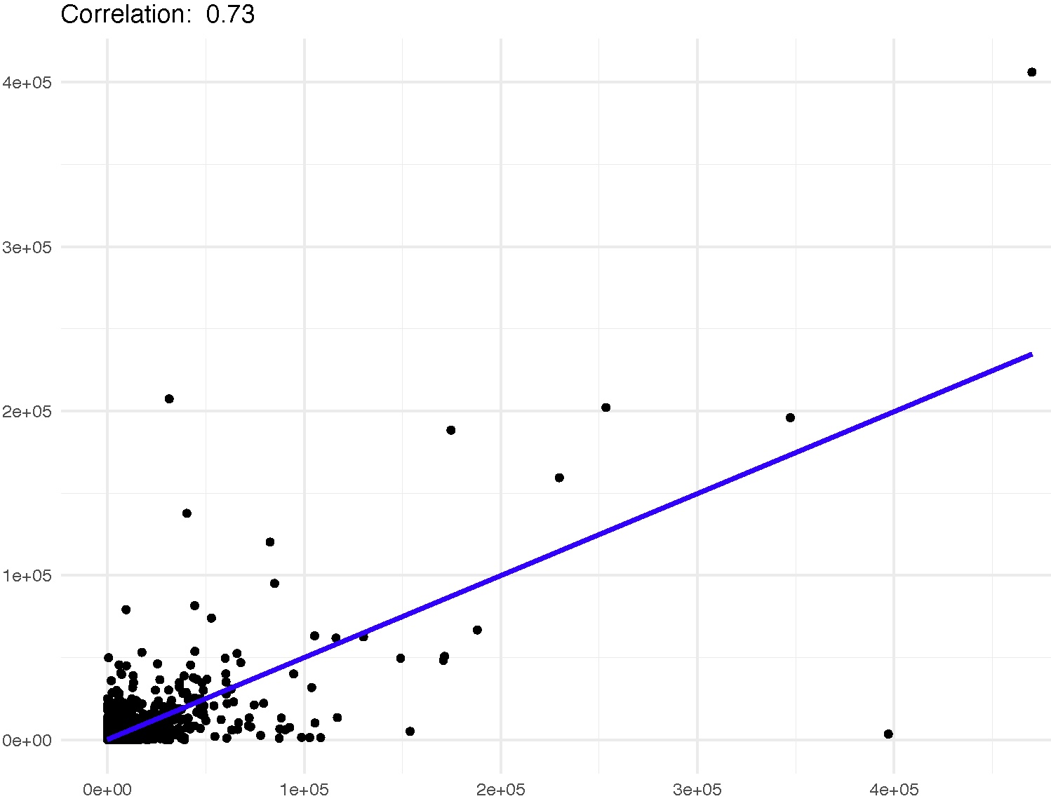
A correlation suggests that there might be some degree of relationship between the gene expression levels and the binding intensity of the protein.
    Correlation scale:

    Low::Moderate::High - Correlation