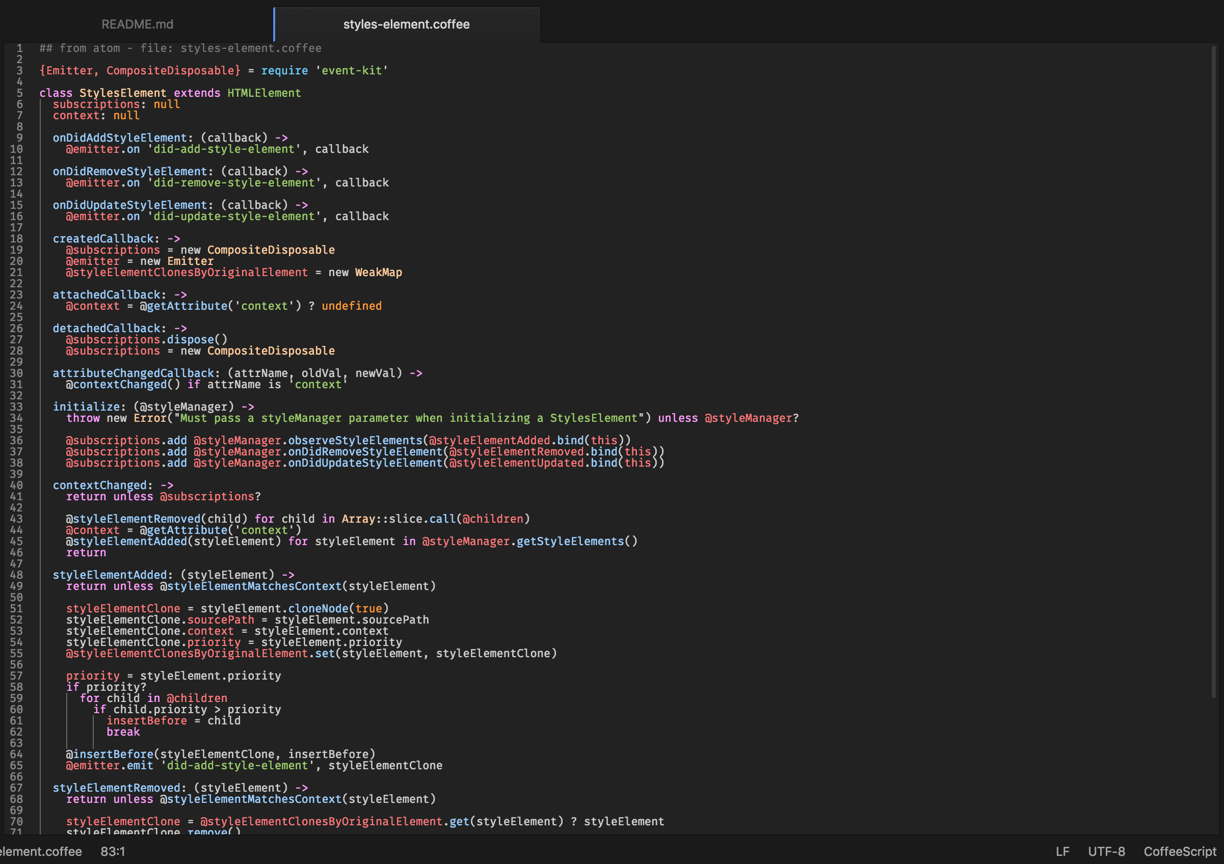
Crisp, vibrant colors, balanced by dark a background and gutter - take it on a spin! I dig it (use it every day), hopefully you will too.
The goal: for it to be easy on the eyes, while showcasing what's important. For those of us that spend countless hours in Atom, let's ensure we're not causing extra eye strain. The vibrancy of the color scheme has been chosen to make those id's, classes, variables, etc. stand out effectively, while ensuring you don't have to strain to parse code.
Would love any feedback you may have!
Compatible with/built in Atom 1.14.4
 example of .coffee file with this theme applied
Font used in screenshots: Fira Mono
###Yes, the name is a Bon Iver reference ;-)
Other ways to reduce eye strain and sleep sounder: f.lux (© Flux Software LLC).