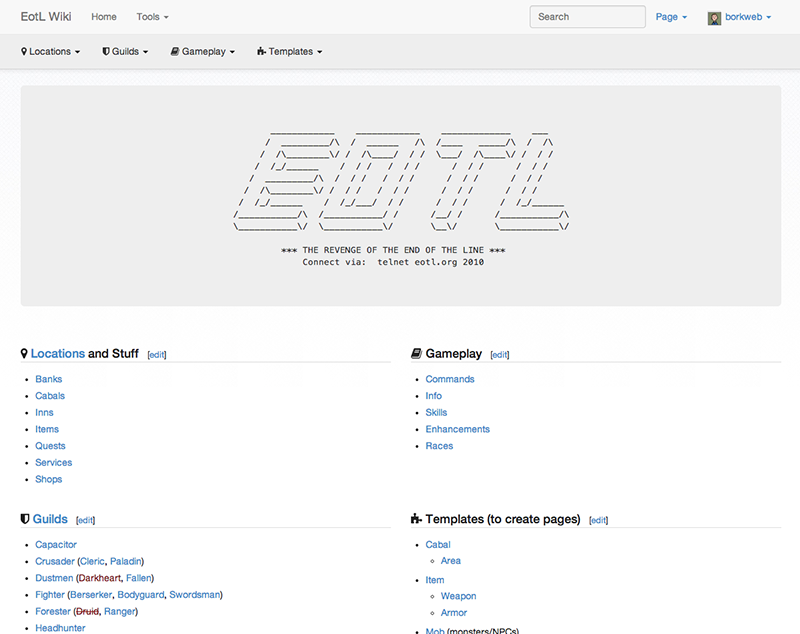
This is a MediaWiki skin that uses Bootstrap 3 from Twitter! The framework gives a boatload of features that play really nicely with a MediaWiki installation. To get up and rolling, there's a few things that should be done.
If you'd like to see one of these in the wild, check out the EotL Wiki.
First, clone the repository into your skins/ directory.
git clone https://github.com/borkweb/bootstrap-mediawiki.git
Next, in LocalSettings.php set:
$wgDefaultSkin = 'bootstrapmediawiki';Then add at the bottom:
require_once( "$IP/skins/bootstrap-mediawiki/bootstrap-mediawiki.php" );Once you've enabled the skin, you'll want to create a few pages.
There are some customizations you can do to the theme by placing some variables in your LocalSettings.php file
| Variable | Description |
|---|---|
$wgNavBarClasses |
Add additional classes to the navbar (example: navbar-inverse to get the black navbar). Example: $wgNavBarClasses = 'navbar-inverse'; |
$wgSitenameShort |
Use this if you wish for your nav title to use a shorter name than your wiki's name. Example: $wgSitenameShort = 'Short name'; |
$wgTOCLocation |
Moves the Table of Contents (when one exists) into a sidebar. Usage: $wgTOCLocation = 'sidebar'; |
$wgSiteCSS |
Adds a custom CSS file so you can run your own CSS without customizing the base theme styles. Example: $wgSiteCSS = 'custom.css'; |
$wgSiteJS |
Adds a custom JS file so you can run your own JS. Example: $wgSiteJS = 'custom.js'; |
This MediaWiki page will contain what appears in your footer. I've set mine to the following:
<div class="row">
	<div class="col-md-6">
		=== Stuff ===
		* [[Link to some place]]
		* [[Another link]]
	</div>
	<div class="col-md-6">
		=== More Stuff ===
		* [http://external.resource.org Go here]
	</div>
</div>This MediaWiki page will control the links that appear in the Bootstrap navbar after the logo/site title. The format that this page is expecting is as follows:
* Menu Item Title
** [[Page 1]]
** [[Page 2]]
** [[Page 3]]
* Another Menu
** [[Whee]]
** [[OMG hai]]
* [[A Link Menu]]
This template is used to leverage Bootstrap's alert box:
<div class="alert {{{2}}}"><strong>Heads Up!</strong> {{{1}}}</div>Usage:
{{alert|Message you want to say|alert-danger}}
This template is used to do Bootstrap tooltips!
<span title="{{{2}}}" class="tip" rel="tooltip">{{{1}}}</span>Usage:
{{tip|Something|This is the tooltip!}}
or
{{tip|[[Bacon]]|Delicious snack}}
This template is used to do Bootstrap popovers!
<span title="{{{2}}}" data-content="{{{3}}}" data-toggle="popover">{{{1}}}</span>Usage:
{{pop|Whatever triggers the popover|Popover Title|Popover Content}}
