[RadioGroup] Create new RadioGroup component
#487
Conversation
 atomiks
added
the
component: radio group
atomiks
added
the
component: radio group
Netlify deploy preview |
 github-actions
bot
added
the
PR: out-of-date
github-actions
bot
added
the
PR: out-of-date
packages/mui-base/src/RadioGroup/Indicator/RadioGroupIndicator.tsx
Outdated
Show resolved
Hide resolved
| /** | ||
| * The unique identifying value of the radio button in the group. | ||
| */ | ||
| value: string; |
There was a problem hiding this comment.
We don't have to enforce strings here. Let's make it any or unknown as in Tabs.
There was a problem hiding this comment.
A hidden <input> is rendered for the whole RadioGroup root which requires the native DOM type:
{props.name && (
  <input type="hidden" name={props.name} value={checkedItem ?? ''} required={required} />
)}
So we can allow string or number. I don't think anything else needs to be allowed anyway?
There was a problem hiding this comment.
Similarly to the Select, we can allow arbitrary values here and expose a prop to control how it's serialized.
There was a problem hiding this comment.
What valid use cases are there for something other than a string or number?
atomiks
force-pushed
the
feat/RadioGroup
branch
from
a319d4a
to
87e9b02
Compare
github-actions
bot
removed
the
PR: out-of-date
atomiks
force-pushed
the
feat/RadioGroup
branch
from
00dee60
to
f27e6eb
Compare
 atomiks
force-pushed
the
feat/RadioGroup
branch
from
atomiks
force-pushed
the
feat/RadioGroup
branch
from
9b9e040
to
e866d9d
Compare
|
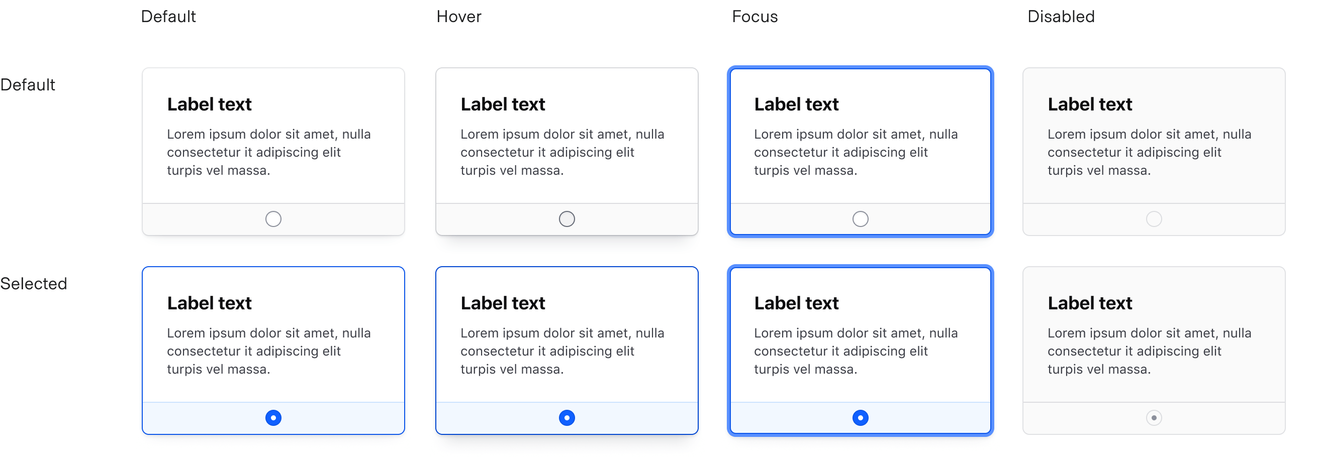
@atomiks The docs demo is missing the "indicator", I think that's one (or perhaps the main?) point of confusion. There should be (whatever "should" means) a little dot inside the circle when it's selected. Like this https://helios.hashicorp.design/assets/components/form/radio-card/radio-card-states-2acdd2c7a5775a7479f7c497d3947804.png |
|
@colmtuite that's just one particular design though. The indicator can be anything, such as a plain filled-in white circle which is an outline when unchecked. |
|
@atomiks I don't see the |
| import { useEnhancedEffect } from '../../utils/useEnhancedEffect'; | ||
| import { useCompositeListContext } from './CompositeListContext'; | ||
|
|
||
| export interface UseCompositeListItemParameters { |
There was a problem hiding this comment.
@atomiks is Composite/CompositeItem intended to be a successor to the current useCompoundParent/Item?
At least for Slider I think this could be a completely replacement for it if we could pass arbitrary metadata into these parameters (for slider it's the id of the associated input element)
BTW the only other component also using useCompound is Tabs, which uses useCompound in a similar way that Accordion needs, I'll try using CompositeList/Item for Accordion first ~
There was a problem hiding this comment.
Yes, it's a replacement for both them & FloatingList. It can be modified wherever necessary for different components
Closes #26