-
-
Notifications
You must be signed in to change notification settings - Fork 823
Conversation
|
We're fairly dead-set on pixel-perfect resizing instead of per-tile sizing, however this raises some usability concerns. Allowing the user to resize how they want, they can end up cutting off a room. Normally when this happens they can scroll to fix the problem, however letterboxes in a larger list is so horrible to use the proof of concept for it never saw light of day (it's also jittery, and would take mostly time to fix). In order to keep the scroll jumping in check, it'd be good to have a predictable set of behaviour for when to cut off and when not to cut off: namely it's possible for us to make a stable implementation that allows for pixel-perfect resizing, however the usability in some scenarios is fairly questionable. Bearing in mind the colours are for visibility purposes only, here are some options which make the list feel more stable: Legend:
Ceiling approachBy using the ceiling function, we end up with an opportunity for the user to completely hide the last item of the list. A concern with this would be that they might not realize they have more rooms over time, and report bugs like "my rooms are missing" when in fact they just need to resize the list. Floor approachThe floor function can be used to ensure we never cut anything in half, though has the possibility of the user creating massive gaps in their room list. A concern from the development side would be that this gets easily reported as a bug, and rightly so: it feels completely strange to have a large empty space where there could be a room (in the screenshot the gap is ~5px shorter than what's needed for a room tile). Round approachMy personal favourite of the above options, the round function let's the user only hide 50% of the tile, or end up with a much smaller gap. This leaves the tile on screen and doesn't appear as much like a bug. Quantized (grid) approachThe easiest to implement of all the options, the user is only ever able to see/resize a whole number of rooms. No tiles are cut off, and no weird math functions need to be involved. However, the user can perceive this as jumping due to the large step size of 34px. Letterboxes with the whole list scrollableNo. The overlap which warrants a scrollbar would only be about 34px in the worst case, 17px if using the rounding approach. The level of confusion portrayed by that double scrollbar does not feel worth it. |
|
(taking this out of draft, though not into the queue yet - would like to remove the math hacks first) |
|
After some discussions with design, the resize handle will likely need some work. In particular, the show more button is likely going to jump out of the list and be near the resize handle in terms of components. For now, this is ready for review with the intent of landing to unblock some styling/related work, and with the understanding that it's very much a code dump and less so a unit of reviewable work. |
| @import "../../../../node_modules/react-resizable/css/styles.css"; | ||
|
|
||
| .mx_RoomList2 .mx_RoomSubList_labelContainer { | ||
| z-index: 12; |
There was a problem hiding this comment.
Choose a reason for hiding this comment
The reason will be displayed to describe this comment to others. Learn more.
this arbitrary decision is fixed in a later PR - please ignore this particular style choice.
There was a problem hiding this comment.
Choose a reason for hiding this comment
The reason will be displayed to describe this comment to others. Learn more.
looks sane otherwise


This is a functional PR and not a pretty one. It's meant to get the basic mechanics of resizing in place to unblock development/styling in the area, it's not meant as a final solution.
For context, the resize handle is being debated and might change. For instance, it is likely to pop out of the room list and into some combination of the resize handle or the area the handle takes up. For now the actual behaviour of show more/resizing is deferred.
Code reviewer: The comments on this are unlikely to be of use to you. This is also a code dump rather than some unit of reviewable work, sorry.
For element-hq/element-web#13635
Things explicitly not included:
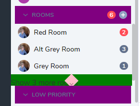
Here's what it looks like, though not pretty (see above regarding CSS):

Outstanding questions