-
-
Notifications
You must be signed in to change notification settings - Fork 270
New issue
Have a question about this project? Sign up for a free GitHub account to open an issue and contact its maintainers and the community.
By clicking “Sign up for GitHub”, you agree to our terms of service and privacy statement. We’ll occasionally send you account related emails.
Already on GitHub? Sign in to your account
center images in URL preview cards #1556
Conversation
center is more likely to have relevant content than top left
|
Preview: https://1556--pr-cinny.netlify.app |
I am not sure about it, like github links preview image looks bad in center align, and these preview images can be anything of any type so i think sticking with browser default left top is a good idea overall. |
|
I've only seen few sites so far that actually looked good with left alignment, and almost all sites looked either unchanged or better with center alignment. This is only kinda subjective, since I haven't done any conclusive tests. I think a designer would assume a center layout when images are used to cover a box / get cut off, since it will cut off smaller chunks. The github image embed kinda expects to be rendered full-size and not in the small square box, we can probably tweak the OG meta tags detection to better recognize that intent by the web devs. |
|
World uses LTR languages more than RTL and thumbnail with informative text is high likely to have them left align in left side of thumbnail. Other graphical image can be of any type.
I didn't get it. wdym? |
Thumbnails should not contain much text, they are way too small to contain much information. The GitHub preview shows that well, the project title is the only readable text on there, the other texts are probably not considered readable unless you have very good eyes or glasses on. The preview image will also contain just a lot of photos, at least for many social media posts. Especially for normal non-developer users this will be relevant, since the subject of a photo is in the middle or near the middle most of the time, not leaning to only the left side of the photo. Website and company logos, even if they are just text, are usually also well recognizable when for example half a letter on the left and right side of the logo would be missing. It's worse when a whole letter on the right side is missing I think.
I meant we could implement a large preview in the future, for sites, like GitHub, that would want a larger image in the chat preview. Sample for how github looks on slack: (and even on this full resolution the text is still kinda on the small side, although it'll probably be considered mostly readable) However currently it doesn't seem that the synapse URL embed exposes anything useful to determine which pictures to preview like this. Discord for example relies on some twitter meta tags, which aren't read or exposed by synapse. |

Description
center is more likely to have relevant content than top left
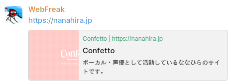
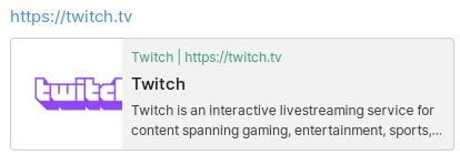
samples before:


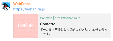
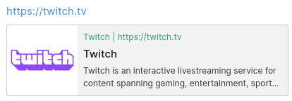
samples after:


Type of change
Checklist: