Final Report
CSE 512 - Brian Burg - [email protected]
(Demo online at: https://brrian.org/webkit-dashboard/)
A healthy test suite is the lifeblood of any large distributed software project. Projects with millions of lines of code, hundreds of developers, dozens of configurations, and frequent code changes can only thrive with robust, accurate test suites that identify problems reliably and immediately. When a developer proposes a code change, she can run tests locally on a few configurations to detect failures caused by her changes. However, even if the change is committed after running tests locally, the change could cause test regressions for other configurations (such as debug/release, windows/mac, 32/64-bit).
Detecting and diagnosing test regressions is critical to maintaining stable, high-quality code. Speed is critical: if new changes are committed while tests are failing, then it is much harder to diagnose which test failures were caused by which changes. When a test regresses, the cause may be difficult to pin down: did it fail because of a code change, or because the test itself has problems? A test can be unreliable due to nondeterminism, logic errors, or other unforeseen conditions that are not reproducible on a developer's machine. To tell whether the test or code change is at fault, a developer needs to examine the test's history. By looking at a test's history, it is much easier to assess the health and reliability of a test and diagnose a failure.
This CSE 512 project investigates how visualizations can aid in diagnosing test regressions in the context of WebKit. WebKit is an open-source browser engine with many contributors, large test suite, and existing dashboards. Investigating test regressions is currently difficult: WebKit's existing dashboard for test history presents a series of a large tables with poor visual encodings, hard to use filters, and other deficiencies. These problems make it difficult to discover when a test started misbehaving, to determine problems are isolated to a specific platform or time range, or to answer other straightforward questions that a developer would ask to diagnose a test regression.
This document first covers a few related tools for monitoring test results over time, and explains the different use cases that they attempt to address. Then, I present the design principles and prototype instantiation of a redesigned test history dashboard for the WebKit project. I present several challenges encountered along the way, and describe possible short-term improvements and long-term future work.
Any large distributed software project has tools and interfaces for detecting test regressions and understanding how changes move through build, checkin and deployment processes. In this section, I discuss a few of these related tools, with a particular interest in what objects, metrics and tasks they prioritize.
A very common operational tool is an interface that shows the status of a project's builds across multiple configurations (i.e., Windows vs Mac OS X, or Debug vs Release). A build usually represents a complete compilation of the whole project at a specific source code revision, and optionally runs tests. A build is either "green" (everything passes) or "red" (compilation or testing failed); this is the high-level bit conveyed in this type of build tool. For example, a developer may want to see whether their changes have been included in the most recent build, or see if the build for a configuration has problems. These interfaces de-emphasize the effects of a single code change or history of one test because a build often encompasses multiple changes. The de-facto tool in this space for many projects is the default build-tracking interface provided by Buildbot. You can see examples for the WebKit project and LLVM project, which track approximately 20-50 configurations. Mozilla uses its own product called Treeherder which tracks over 100 build configurations. WebKit's bot watcher dashboard provides an even higher-level view of build failures with links to specific build results.
In complex software, tests often fail intermittently due to nondeterminism. So-called "flaky tests" usually indicate a problem with the test or test harness rather than the code under test. Some projects use special interfaces to detect and mitigate flaky tests. At Mozilla, a specialized dashboard exists to show the frequency and probability of so called "orange" tests that intermittently fail for unknown reasons. The history interface is bug/issue-oriented, meaning that it tracks number of opened bugs whose symptoms were detected in a run. A bug could cover multiple test failures, or a test could fail due to multiple bugs. WebKit and Blink essentially share the same flakiness dashboard, which is really a test history interface with special filters to highlight flaky tests.
Existing interfaces that track the history of a specific test tend to focus on performance tests and benchmarks. Benchmarks are designed to be deterministic, so these tools do not typically account for test failures, crashes, or other intermittent failures. Countless commercial and open-source dashboards exist for viewing benchmark results. For example, arewefastyet.com is a cross-browser benchmark tool that graphs performance over time. The WebKit project has its own performance/benchmarking dashboard and supports similar tasks.
From looking at other tools, a key realization is that interfaces must support a staged, interactive workflow for investigating test history and other similar post-commit tasks. In other words, the large volume of data and overlapping information needs of different developers precludes a single unified interface; no interface can fulfill all possible information needs. Instead, a dashboard should present different visualizations and interfaces as the level of granularity and task context changes. A high-level overview should surface relevant results for further inspection and simultaneously deemphasize uninteresting results. Detail views---such as for the history of a single test---should allow interactive inspection of low-level details.
This project explores these ideas using two interface levels that summarize test results for recent builds and show results for a single test. Let's deconstruct the visualizations:
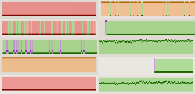
The history sparkline (seen above) is the main visualization element developed for this project. It summarizes the results for a specific test obtained from a single builder's most recent runs. Each sparkline flows from left to right, showing most recent results on the rightmost edge. The x-axis uses a linear scale is based on a run's ordinal, not its timestamp or revision number. This compresses extra space that would wasted by a timestamp-based scale due to less busy periods, such as weekends and nights. The y-axis uses a linear scale that encodes how long a test took to run (i.e., its duration); longer-running tests are higher. The test duration is shown per run using a flat line; repeated outcomes and duration share the same line. Finally, the outcome of each run is encoded using a color scheme based on existing tools. Red indicates test failure; green indicates test success; yellow indicates a timeout (the test exceeded the maximum duration and was cancelled); purple indicates that the test crashed; and gray/transparent indicates that no test result was found for a given run.
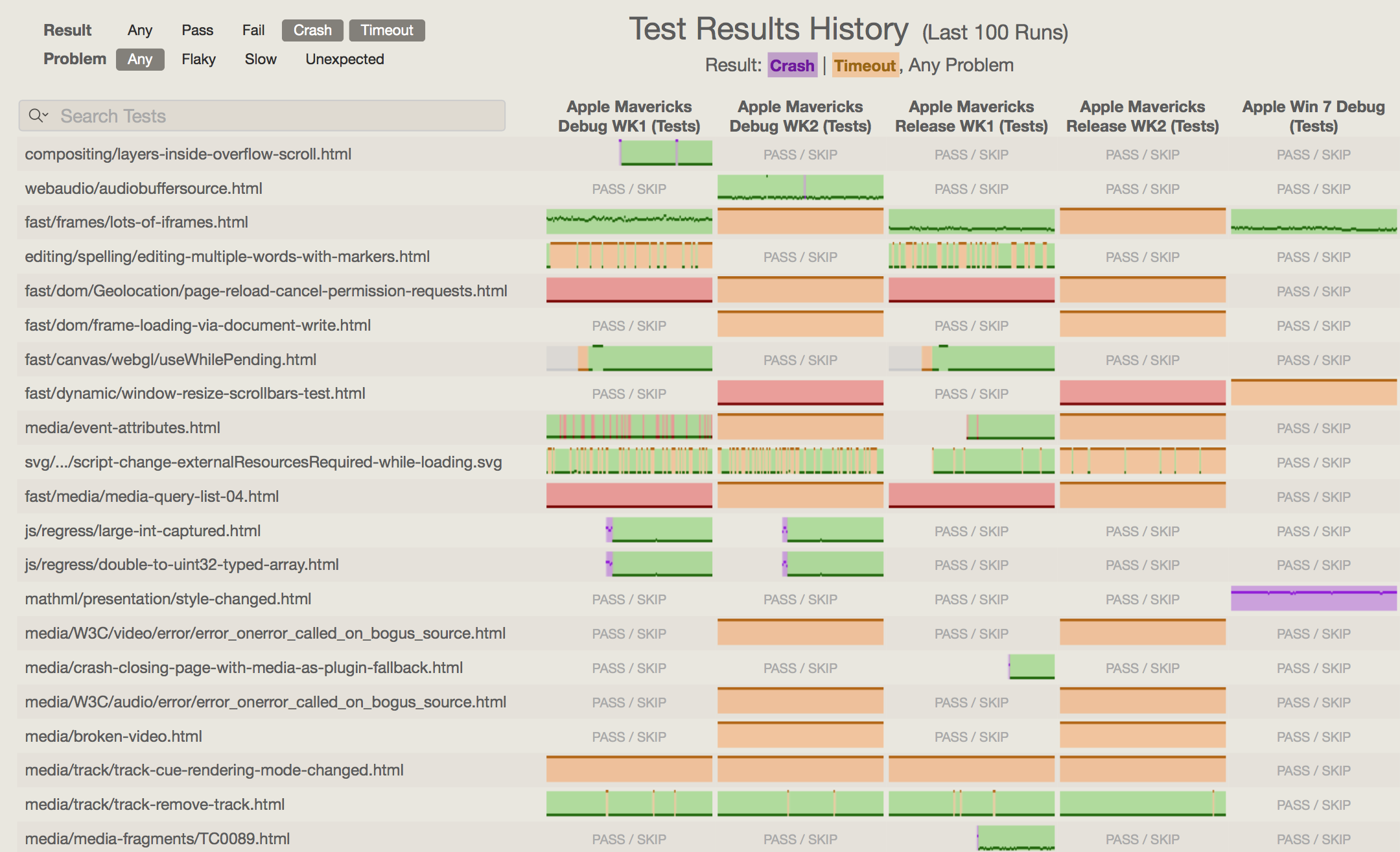
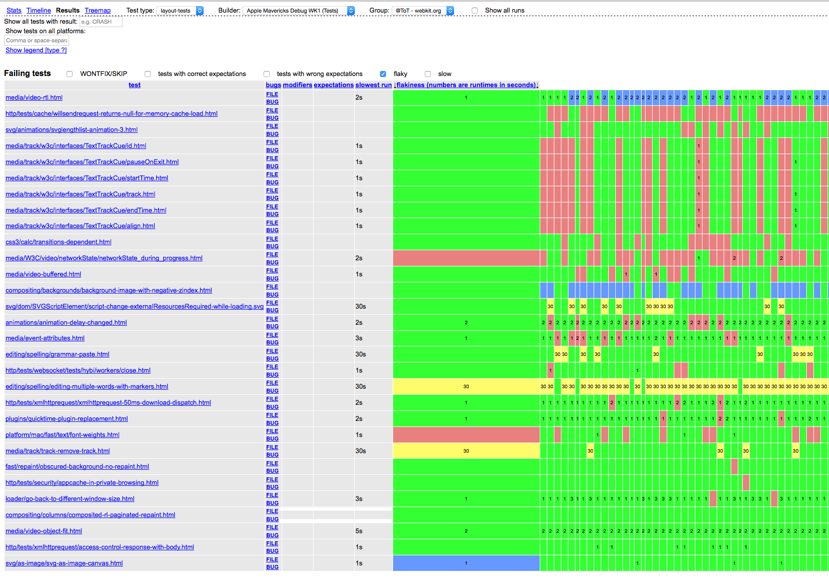
The overview grid (seen above) uses sparklines to show many histories at a glance. Each row represents a single test, and each column represents a build configuration. Thus, each cell is the history of a test for a specific configuration. Cells labeled PASS / SKIP represent test/configuration pairs for which no data is available because the test has either always passed or has never run. Clicking on a cell or test name shows a different view with more details about a specific test (see next section).
Many tests are displayed by default, but most users have a specific subset in which they are interested. The overview has several subtractive filtering mechanisms to limit the tests shown based on a search string (seen above the tests column) or by which outcomes occur in their history. As filters are changed by the user, the interface re-renders the grid to show tests that match. The grid interface uses an efficient rendering strategy which can quickly reflect changes to filters while preserving interactivity with the page.
The goal of the overview is to support quickly finding anomalous test histories and clicking on them for more details. The sparklines are intentionally small to discourage a user from trying to inspect their details, and in order to fit more configurations on a single screen. The compact representation allows a user to tell by sight whether a test is flaky, broken, or recently regressed. Compared to the previous test history dashboard, this approach supports quickly judging relevance without requiring higher-level thought and comparisons across a large screen space.
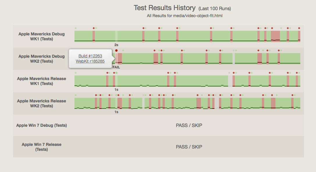
The test history detail view shows history for a single test on multiple configurations. To make it easier to visually compare histories from multiple configurations, the table axes are flipped compared to the overview (which mainly supports comparing histories of multiple tests for one configuration). Each row contains an interactive graph that's similar to the sparkline from the overview. The visual encodings remain the same, but this graph is interactive and large enough to discriminate small differences in test durations. Hovering over one run (a vertical slice of the graph) highlights the same run ordinal in the graphs for other configurations. Clicking on a run shows a popover with outbound links to that run's revision, build output, and other details. Circles in the top gutter act as visual guides for "critical" runs---those which regressed a test. When hovered over a run, a text selector appears in the the bottom gutter. The text shows a readout of the result: thet est's duration if it passed, and the result otherwise.
The time spent implementing these interfaces was split evently between building visualizations and managing data obtained from a live server. The dashboard interfaces were built by reusing existing utility and UI classes, the d3 visualization library, and an existing color scheme and design language (from the WebKit bot watcher's dashboard). To drive visualizations, the dashboard uses the same JSON data feeds as the existing flakiness dashboard interface. The data model is completely new, and performs extensive re-aggregation of test results to simplify rendering with d3. To support interactivity and rapid development, the dashboard application uses a model-view-controller architecture and tooling reused from the Web Inspector interface. (Some other recently created dashboards also reuse this UI framework.) The interface architecture only shows one view at a time; these views could be incorporated into composite views easily.
The desire to add interactivity to the detail views revealed a number of problems with the data used to generate the timelines. For example, it would be nice to select one run and see the corresponding runs on other configurations. However, the notion of a "corresponding run" is fuzzy, and leads me to believe that this should not be the only unit of measure. Runs are problematic for correlation on a per-commit basis, because they can include multiple commits (different per each configuration), or occur at different times. Thus, two runs with the same ordinal do not necessarily incorporate the same code changes. Runs also do not correlate well to the number of code changes; there's no way to know from the current visualization whether a run comprised 1 or 10 commits. This is important to know when trying to find the actual code change (as opposed to the run) that caused the test regression.
Another problem encountered is the context-sensitivity of the test results. WebKit has a notion of "test expectations": a machine-readable description of what results we should expect for a given test and configuration. This file makes it possible for feature-specific tests to run for some configurations and not for others. Many tests fail or timeout reliably, and are marked as such in the test expectations file. However, the current interface prototype does not cross-reference the test expectations files, thus making some of the data ambiguous. For example, the PASS / SKIP label can only be disambiguated by cross-referencing the expectations for that test. Unfortunately, the test expectations parser is a complex piece of legacy code and there was not sufficient time to incorporate it into the prototype.
Early feedback from WebKit developers has been positive, especially with respect to the friendly color scheme and compact encoding of test histories into the overivew. Finding patterns is much easier, and searching for specific tests or results is much faster due to improved rendering. While the prototype is not quite at feature parity with the existing flakiness dashboard, I hope to continue work on it until it can be mainlined into WebKit and replace the old dashboard. Since the prototype uses modern development practices such as MVC, it should be easy to reach parity and add new features with much less effort compared to refactoring the old (2007-era) dashboard.
I am also a WebKit reviewer and have been working on the project for 3 years, so I had my own reactions during the course of the project. The biggest surprise for me was the sheer number of tests that have inconsistent coverage across different configurations. Nearly 3000 tests are completely skipped for the Mac port, and most tests outside of the core rendering engine seem to have some sort of non-standard test expectation. This raises questions about the health of the test suite: do tests ever really recover once they have been marked as failing, crashing, or skipped in the expectations list? Are skipped tests the victim of test infrastructure, test construction, or the code being tested? What parts of the codebase are well-tested or under-tested? The prior dashboard did not elicit these questions, because the data was invisible: it filtered out expected failures from results by default. (That said, the current prototype overemphasizes the number of SKIP results because of the context-dependence problem described above.)
The choice of visual encodings in the sparkline has worked out well, but should be revisited for the test history graphs. In particular, the use of "runs" as the unit of measure along the x-axis leads to many understandability problems, such as the cross-referencing issues detailed earlier in this document, and an imprecise measure for when tests were added, skipped, or recieved expectation changes. An alternative would be to use single revisions on the x-axis, and then plot each run with a width corresponding to the number of revisions it incorporates since the previous run. This also makes it possible to convey the inherent uncertainty with respect to which revision actually caused a regression if a run incorporates multiple changes. For example, the last change of a run could have a stronger color to indicate that a run was performed exactly at that revision. A smaller encoding issue was the use of circles for "critical runs" in the gutter. In my limited experience so far, only the previous 100 runs are displayed, so these circles do not really make it any easier to scan for or click on regressing runs. If many more runs were displayed (exceeding the pixel width of the graph), then this extra hit target may be more useful.
In the short term, there are many improvements that would help this prototype reach use case parity with existing tools. The biggest deficiency is the lack of cross-referencing to expectations files, which would help to disambiguate some results and make harmless, documented failures appear less alarming. The prototype lacks task-oriented filters from previous versions, such as "most recent regressions", "only slow tests", "only flaky tests", or "only wrong expectations". There are many obvious engineering improvements, such as: a way to choose which configurations are shown; improved render performance; supporting deep links and browsing history; and floating test columns and configuration headers to orient the user within larger grids.
A bigger improvement could come from tighter integration with other dashboards and supporting a developer during normal development tasks. The prototype developed here is mainly useful for a developer who fixes tests en masse, or who is on-call to diagnose any build or test failures. Wider improvements are possible: simply tracking the status of a proposed code change or commit is difficult with current tools. A developer must know how to use many different dashboards as their change is pre-tested, reviewed, committed, and validated for correctness and performance. An integrated tool for tracking all of these aspects at the level of a commit or patch would be useful for all developers and reduce the amount of time spent later to triage regressions and resubmit buggy patches.