WRadioButton
WRadioButton is a component used to make a radio button form control. A radio button is a binary selection control which is able to be selected by the user but may only be deselected by selecting another radio button in the same group. WRadioButton is merely a UI artifact of RadioButtonGroup.
A UI must never contain a single interactive, enabled, visible WRadioButton. A group of WRadioButtons must always contain exactly zero or at least two interactive, enabled, visible radio buttons.
- Why use WRadioButton
- Creating a WRadioButton
- Accessibility
- Appearance
- Change action
- HTML output
- Disabling
- Hiding
- Read only
- Default submit button
- Testing
- Related components
- Further information
WRadioButton provides one optional response to a single selection in which once any selection is made there is no option to make no selections. It provides an adequate selection mechanism when the number of options is small (see below). For many 1 of n selections a WDropdown or WSingleSelect may be more appropriate than a group of WRadioButtons. The main exception to this is when the selectable options are presented in a row or column of a WTable.
Most logical groups of radio buttons should be implemented using a WRadioButtonSelect which is a significantly lighter component for this purpose. The following circumstances are when a WRadioButtonSelect is not appropriate:
- the radio buttons are not visually grouped within a single section of the UI which can contain a fieldset element, for example if the radio buttons occupy a row or column of a WTable or are dispersed in the UI; or
- the labels of the radio buttons contain content other than plain text as WRadioButtonSelect allows for only plain text labels.
Firstly there is no such thing as a single WRadioButton: see the accessibility notes and the notes on RadioButtonGroup.
WRadioButton may only be created by being added to a RadioButtonGroup. The input component is the RadioButtonGroup; the individual WRadioButtons in the RadioButtonGroup are merely selectable options which form aspects of that input component.
RadioButtonGroup group = new RadioButtonGroup();
WRadioButton rb1 = group.addRadioButton(VALUE_1);
WRadioButton rb2 = group.addRadioButton(VALUE_2);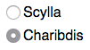
There is an alternate overload of addRadioButton which does implicit bean binding. See the addRadioButton JavaDoc for more information.
WRadioButton rb3 = group.addRadioButton();A WRadioButton must be placed into a RadioButtonGroup. In most cases a logical group of radio buttons is best implemented through WRadioButtonSelect. Aspects of groups of WRadioButton which have an accessibility aspect are discussed in semantic grouping.
A RadioButtonGroup is a single selection tool. It only support zero selections if:
- no radio buttons in the group are selected on page load; and
- no radio buttons in the group are selected by the user; and
- the user does not use an access key to focus a radio button in the group; and
- the user does not focus a deselected radio button then use the arrow keys to move to a previous or subsequent radio button.
In Java each WRadioButton is added to a RadioButtonGroup. The RadioButtonGroup must be added to the component tree and each WRadioButton must separately and individually be added to the tree. A simple example is shown below:
RadioButtonGroup quest = new RadioButtonGroup();
add(quest);

final WRadioButton rb1 = quest.addRadioButton("grail");
final WRadioButton rb2 = quest.addRadioButton("pail");
final WRadioButton rb3 = quest.addRadioButton("ale");

// Add the WRadioButtons to an appropriate grouping control
WFieldSet fset = new WFieldSet("What is your quest?");
add(fset);

WFieldLayout layout = new WFieldLayout(WFieldLayout.LAYOUT_STACKED);
fset.add(layout);
layout.addField("To seek the holy grail", rb1);
layout.addField("To mend the holey pail", rb2);
layout.addField("To imbibe the whole ale", rb3);
As a rule of thumb a group of WRadioButtons should number less than about seven unless the WRadioButtons can be laid out in a set of rows and columns or in a single row or column of a WTable. If the WRadioButtons are laid out in rows and columns then a rough maximum is around no more than three to five rows of no more than three to five columns and a total number of radio button/label pairs of no more than about 12-15.
A WRadioButton in a screen is deemed to be in an interactive state if and only if:
- it is not in a read-only state; and
- it is not in a disabled state; and
- it is not hidden; and
- it is not nested in any component which would cause it to be hidden by virtue of that component being hidden or closed (if a WTab or WCollapsible); and
- it is not nested in any component which causes it to be disabled by virtue of that component being disabled and that disabled state flowing onto its content (this latter state will usually be caused by using a WSubordinateControl disable action).
If an application includes any WSubordinateControl or WAjaxControl which target one or more WRadioButtons one must ensure, and explicitly specify the following end conditions for each and every such action:
- a group of WRadioButtons must have exactly zero or at least two WRadioButtons which are in an interactive state;
- if an action disables, hides, makes read-only or removes a WRadioButton in a group then after that action has taken place there must be exactly zero or no fewer than two WRadioButtons in an interactive state still in the group in the current screen;
- if point number two cannot be complied with because the penultimate active WRadioButton in a group is being removed, hidden, disabled or made read only then either the action must not be made available or both remaining WRadioButtons in the group must undergo the same action resulting in exactly zero WRadioButtons in that group being in an interactive state.
The initial or default selection of a WRadioButton may be set from a data source or manually.
// manually select a WRadioButton `rbutton`
rbutton.setSelected(true);

// A RadioButtonGroup can set the correct WRadioButton to select
// based on value
group.setSelectedValue(SOME_STRING);
Note that a WRadioButton in a disabled state may not be selected.
Only one WRadioButton in a RadioButtonGroup may be marked as selected on page load. When a WRadioButton is selected it forms the tab stop for all radio buttons in its group. Dispersing the WRadioButtons around the UI may cause accessibility and / or usability issues for keyboard users.
Unlike WCheckBox a WRadioButton cannot be set as selected as part of a constructor. If a WRadioButton is to be selected on load then an explicit call must be made to setSelected(boolean). If a RadioButtonGroup is bound to a data source then the group will determine which WRadioButton to select based on the source binding.
The interaction model for a group of radio buttons makes it extremely problematic to specify a RadioButtonGroup with no WRadioButton selected by default. Please consult the documentation on implicit null selection for the conditions which a group of WRadioButtons must comply with before it may be specified to have no single WRadioButton selected by default.
A RadioButtonGroup may be marked as being a mandatory field in the UI. Its accessors are setMandatory(boolean) and getMandatory(). The input components of each WRadioButton in the RadioButtonGroup' has the required attribute set. The WLabel for the WRadioButton is not decorated with a visual indicator that the component is mandatory since the WRadioButton is the answer: the question should be marked as mandatory. See required field markers for more information.
// given RadioButtonGroup `group`
// make the field mandatory
group.setMandatory(true);
If a RadioButtonGroup is marked as required then its only valid state which will allow completion of a submission is that one WRadioButton in that RadioButtonGroup is checked.

A WRadioButton must be placed into a semantic group. This is not the same as a RadioButtonGroup which is a programatic group. There are exactly three appropriate grouping paradigms for a set of WRadioButtons:
- they all appear in a single WFieldSet (preferred); or
- they all appear in a single column of a WTable and the column header provides a suitable "question" for which the WRadioButtons provide optional "answers"; or
- they all appear in a single row of a WTable and that WTable has row headers turned on and the row header provides a suitable "question" for which the WRadioButtons provide optional "answers".
A UI must never contain a single interactive, enabled, visible WRadioButton. A group of WRadioButtons must always contain exactly zero or at least two interactive, enabled, visible radio buttons.
Aspects of groups of WRadioButton which do not have an accessibility aspect are discussed in RadioButtonGroup.
All WRadioButtons in a UI must be associated with a label. This may be done using:
- WLabel (preferred) this is required if the label must be visible in the UI; or
- using the toolTip property if the label does not have to be visible in the UI; or
- using the accessibleText property of WRadioButton.
When designing a UI containing a WRadioButton the WLabel must be placed immediately after the radio button.
A WRadioButton which is not appropriately labelled may display an unlabelled control warning.
A single WRadioButton does not constitute a form control but only a facet, or option, within the form control defined by the group. When using a WRadioButtonSelect the component is rendered inside a HTML fieldset element with requisite required indicator at the group level. The only way to adequately provide a required indicator for a group of individual WRadioButtons is to place the group into a WFieldSet. The WFieldSet is then set to be mandatory which indicates that at least one control within that WFieldSet must be complete.
Since WRadioButton has accessible required properties intrinsic to the control it may, under very limited circumstances, to provide a graphic marker within the component which provides the 'question' for the WRadioButtons. In most cases this should be a WFieldSet in which case setting the WFieldSet's mandatory property as described above is all that needs be done. The only other grouping mechanism which provides adequate accessibility is to place the WRadioButtons into cells in a single row or column of a WTable and to ensure that the row or column header (as appropriate) contains the 'question' and, if preferred, a WStyledText of Type.MANDATORY_INDICATOR to indicate that exactly one of the radio buttons in the row/column must be selected.
See toolTip. A WRadioButton may use the toolTip property if it is not possible to include a label in the UI. This should be a last resort.
// given WRadioButton `field`
// to set the toolTip
field.setToolTip("this is a toolTip");WRadioButton may have accessible text applied as information additional to the visible label text. This should be used with care and restraint as it may result in less accessible applications.
// with WRadioButton field
field.setAccessibleText("Some further context to this selection.");A WLabel for a WRadioButton may be given an access key to provide rapid keyboard access.
A WRadioButton in an enabled, interactive state may be set as the default focus point for a page. If this is specified it must comply with accessibility principles regarding focus and not put users into a position where they may skip content required for full understanding of the current view. See Setting focus for more information.
WRadioButton (when not in a read-only state) outputs a HTML input element in the radio state. The appearance of this is dependent on the user agent. The illustrations in this document were all created using Google Chrome v53.x on OS X.
WRadioButton may have one or more values to be added to the component's wrapper element. This can be used for fine-grain styling of specific components but should be used with care.
For more information see WComponents HTML class property.
A WRadioButton may be used to trigger an Action which runs if the RadioButtonGroup's selected WRadioButton changes. This will trigger any time the selection changes and the server application is informed, not only if the WRadioButton triggers the call back to the server by being a trigger for a WAjaxControl.
// with RadioButtonGroup `group`
group.setActionOnChange(new Action() {
  @Override
  public void execute(final ActionEvent event) {
    // do something
  }
});A WRadioButton will output a HTML input element in the radio state. When in a read-only state the component will output a span element.
The RadioButtonGroup component has no UI artefact at all.
A WRadioButton may be disabled on page load. When disabled the WRadioButton will not respond to user input or interaction. This property may be used in conjunction with WSubordinateControl controls to enable or disable content without making another server call. The disabled state is ignored if the WRadioButton is also in a read-only state.
A RadioButtonGroup may be set disabled. In this case all WRadioButtons in the RadioButtonGroup will be disabled.

NOTE A disabled form control does not return its value to the application when the form is submitted. If a WRadioButton is disabled via a subordinate control after its state has been updated by the user its state will not be updated. Some user agents may not render the selected state of a disabled radio button.
A WRadioButton may be hidden on page load. When hidden the WRadioButton is not available to any compliant user agent. It is present in the source and is not obscured in any way. This property is determined by a WSubordinateControl. When a WRadioButton is hidden a WLabel associated with it is also hidden.
A RadioButtonGroup may be hidden but it is not able to be controlled by a WSubordinateControl as it is not present in the UI.
The read only state changes the output rendering of the WRadioButton so that it appears as a graphical representation of the control in the state set when last updated. The control is not able to be interacted with by the user and does not return any value back to the application.
A WRadioButton in a read only state may be the target of a WSubordinateControl or WAjaxControl. If it is the target of an AJAX action its read only state may be changed.
A RadioButtonGroup may be set as read-only. In this case all WRadioButtons in the RadioButtonGroup will be read-only.

A WRadioButton may be associated with a WButton in a way that if the user hits the ENTER key whilst the WRadioButton has focus then the nominated WButton will be deemed to be the control which submits the form to the server. This is discussed in more detail in Implicit form submission.
This setting is not used if the WRadioButton is in a read-only state or is a trigger for a WAjaxControl.
Prior to WComponents v1.4 WRadioButton could be tested as a regular HTML element using a simple org.openqa.selenium.WebElement or a SeleniumWComponentWebElement. From v1.4 it is recommended that WRadioButton be tested using the com.github.bordertech.wcomponents.test.selenium.element.SeleniumWRadioButtonWebElement extension of WebElement.
The best way to get a WRadioButton from a test view is by using SeleniumWComponentsWebDriver which has a method findWRadioButton(By). This can be used in conjunction with com.github.bordertech.wcomponents.test.selenium.ByLabel, for example, to find a WRadioButton using its label's text.
@Test
public void testFindByLabel() {
  SeleniumWComponentsWebDriver driver = getDriver();
  String labelText = "Pick me!";
  SeleniumWRadioButtonWebElement rb = driver.findWRadioButton(new ByLabel(labelText, false));
  Assert.assertNotNull("Unable to find radio button by label text", rb);
}The SeleniumWRadioButtonWebElement extension provides:
- methods provided by SeleniumWComponentInputWebElement; and
- methods provided by SeleniumWComponentWebElement.
Note that when the WRadioButton is not in a read-only state some common Selenium actions and tests are passed to the input element within the WRadioButton's root element. An example is, for example, click will click the radio button input not the component (which is the wrapper).
@Test
public void testDoClick() {
  SeleniumWComponentsWebDriver driver = getDriver();
  // get a radio button which is not selected.
  // In this example it is completely contrived:
  SeleniumWRadioButtonWebElement rb =
    driver.findWRadioButton(new ByLabel("I am deselected", false));
  Assert.isFalse(rb.isSelected());
  // click the component
  rb.click();
  // the result will be as if the radio input was clicked
  // (again, contrived example - assume not disabled or read-only)
  Assert.isTrue(rb.isSelected());
}boolean SeleniumWRadioButtonWebElement.isSelected() works on WRadioButton in an interactive or read-only state.