This exercise allows you to practice and apply the concepts and techniques taught in class.
Upon completion of this exercise, you will be able to:
- Create a webpage based on provided design and assets.
- Create and link an external CSS stylesheet with an HTML document.
- Display images in a webpage using HTML image tags and CSS
backgroundproperty. - Use the CSS
positionproperty to position elements on a webpage. - Use Flexbox to layout and position elements on a webpage.
- Center content on a webpage, including images and text.
- Submit completed work using Git and GitHub by creating a Pull Request.
Everybody likes music, right? So the odds are that you have heard of Spotify.
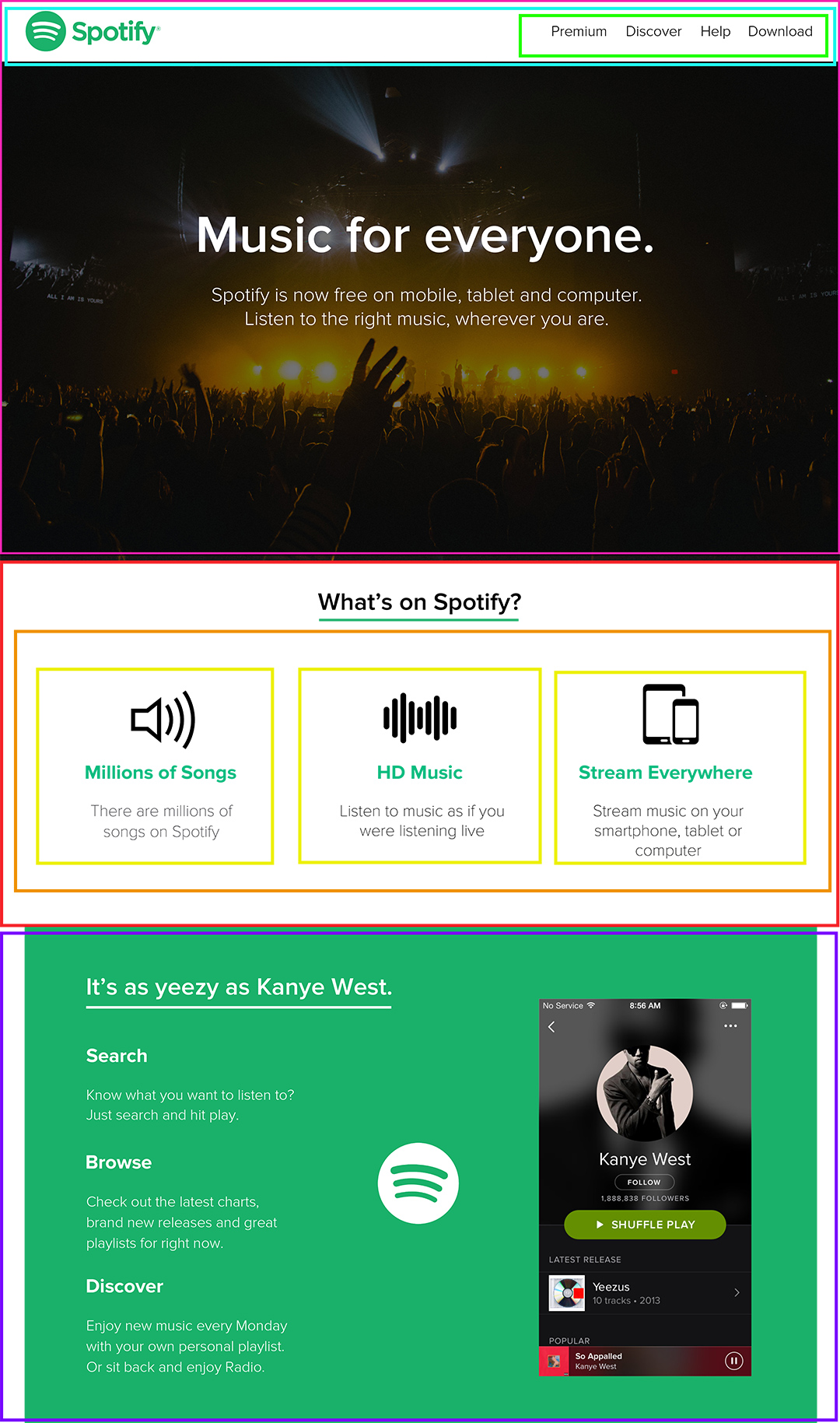
In this lab, we will be building a simplified version of the Spotify landing page:
All of the necessary assets and images are already provided. You might also find it useful to resort to the full-length PDF version of the website as a reference.
- Fork this repo
- Clone this repo
Upon completion, run the following commands:
git add .
git commit -m "done"
git push origin master
Create Pull Request so your TAs can check up your work.
You are provided with some assets - in the images folder, you will find the necessary images, and the text is ready for you in the index.html file. Write your HTML and CSS code in the index.html and styles/style.css files, respectively. Again, remember to follow the best practices.
The page is split into 4 sections, and we have generously cut it down into pieces!
In general, website designs don't just come out of the wild, so you will likely have mockups/sketches that you will have to integrate. Therefore, it is a good practice to help you cut the website into pieces before coding to help you structuring your HTML.
The last section isn't as detailed as the others ones, good luck 😄
Let's do this!
- The navbar should be
position: fixed. - Align the logo to the left and the
ulwith the links to the right, either usingfloatorflex.
- Check out this guide on centering things.
- It looks like the
divs take up about a third of the container each. How can you represent this in code?
- It looks like we have 2 main sections, a containing element with the text flowing from top to bottom and the image of the Spotify player on the right.
- Position the Spotify logo absolutely according to the green
div.
Happy coding! ❤️

