- https://lestaret.wordpress.com/tag/king-james-bible/
- http://www.drew.edu/news/2015/12/17/heres-a-closer-look-at-drews-1611-king-james-bible
- https://www.kingjamesbibleonline.org/
I used a microscope and a reproduction King James Bible skillfully crafted by GreatSite.com. After that it was just a matter of tracing in Adobe Illustrator and importing to FontForge. You can see the raw image output of my microscope and all my Illustrator traces in the "KJV glyphs" directory.
Many programs support the OpenType features this font provides.
- XeTeX supports all of them, you can see a good example of how to use XeLaTeX with this font in
info/info.tex - Adobe software supports most of the features
- You can enable features in LibreOffice by name by setting the font to e.g.
KJV1611:histwherehistis the feature you want to enable, in this case Historical Forms. - Inkscape supports the kerning and contextual alternates.
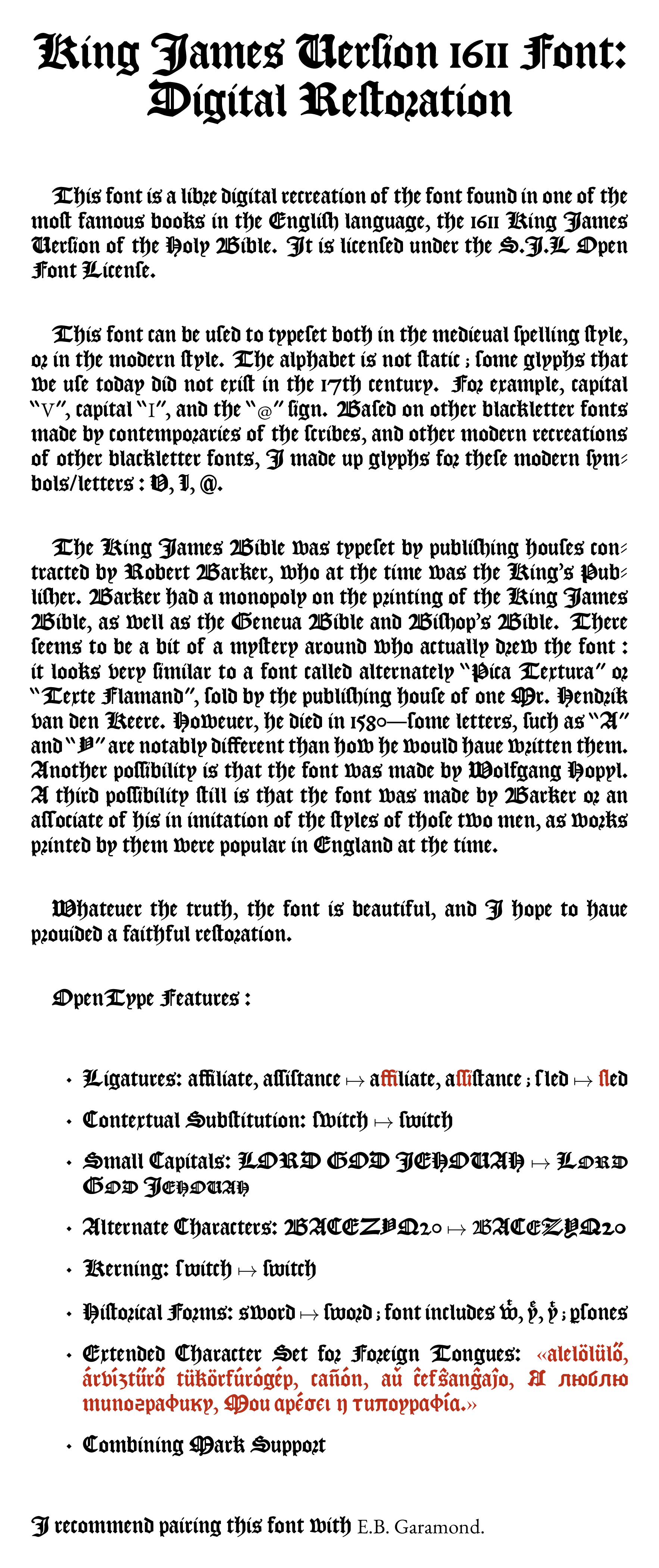
This font is a libre digital recreation of the font found in one of the moſt famous books in the Engliſh language, the 1611 King James Verſion of the Holy Bible. It is licenſed under the S.J.L Open Font Licenſe.
This font can be used to typeset both in the medieual spelling style, or in the modern style. The alphabet is not static ; some glyphs that we use today did not exist in the 17th century. For example, capital “V”, capital “I”, and the “@” sign. Based on other blackletter fonts made by contemporaries of the scribes, and other modern recreations of other blackletter fonts, I made up glyphs for these modern symbols/letters.
The King James Bible was typeset by publishing houses contracted by Robert Barker, who at the time was the King’s Publisher. Barker had a monopoly on the printing of the King James Bible, as well as the Geneva Bible and Bishop’s Bible. There seems to be a bit of a mystery around who actually drew the font : it looks very similar to a font called alternately “Pica Textura” or “Texte Flamand”, sold by the publishing house of one Mr. Hendrik van der Keere. However, he died in 1580 : some letters, such as “A” and “Y” are notably different than how he would haue written them. Another possibility is that the font was made by Wolfgang Hopyl. A third possibility still is that the font was made by Barker or an associate of his in imitation of the styles of those two men, as works printed by them were popular in England at the time.
Whatever the truth, the font is beautiful, and I hope to have prouided a faithful restoration.
OpenType Features :
- Ligatures
- Discretionary Substitution
- Alternate Characters
- Special Kerning: f and long s (ſ)
- Extended Character Set
I recommend pairing this font with E.B. Garamond.

