Table of contents:
- Development setup
- Linting
- Production setup
- Pull requests guidelines
- Branching strategy
- React guidelines
To run and develop the module NodeJS 16 is required. In this section 2 ways of configuring a development environment are described.
The following dependencies are required in order to be able to run the project:
If you wish to keep your host clean, it is also possible to develop the module in a Docker container. You can do that by using the Visual Studio Code's Remote Containers extension and read how to initialize your dev container.
git clone https://github.com/podkrepi-bg/frontend
cd frontend

# Symlink dev environment on unix
ln -hfs .env.local.example .env.local

# Symlink dev environment on Windows
mklink .env.local .env.local.example

# Install dependencies
yarn# View existing remotes
git remote -v
# Change the 'origin' remote's URL
git remote set-url origin https://github.com/podkrepi-bg/frontend
# Check updated remotes
git remote -v
yarn devVisit http://localhost:3040/
Install the binary via https://docs.docker.com/compose/install/
docker-compose updocker-compose up -d
docker-compose logs -fStop the docker container with docker-compose down
yarn lint
yarn lint:styles
yarn format
yarn type-checkyarn builddocker build . \
--file ./Dockerfile \
--target production \
--build-arg NODE_ENV=productionAll PRs must:
- pass all checks before they will be considered for review
- have proper title and description
- have at least one screenshot if the changeset leads to visual difference
Inherits the process from https://nvie.com/posts/a-successful-git-branching-model/
Good branch names: 🌞
nice-kebab-cased-titlesfixes-footer-links4411290-setup-state-management-integrationfeature/new-designhotfix/db-connectionrelease-1.2.3
Bad branch names: ⛅
patch-1- not enough contextcamelCasedBranchNames- camel casePascalCasedBranchNames- pascal caselong-titles-above-80-chars-{.....}- too long#58/something- shell understands it as comment
| Branching model | Merges |
|---|---|
 |
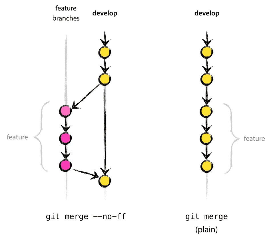 |
A common way to sort the imports in the file is by their source: external, absolute, relative separated by an empty line. Each of those groups can be sorted by line length, but that's not super important.
import React, { useState } from 'react'
import { useTranslation } from 'next-i18next'

import Nav from 'components/layout/Nav'
import Layout from 'components/layout/Layout'

import SimpleForm from './SimpleForm'
import styles from './advanced.module.scss'Inherits AirBnb naming convention https://github.com/airbnb/javascript/tree/master/react#naming
Use PascalCase for React components and camelCase for their instances
Pascal cased file names src/components/GenericForm.tsx
export default function GenericForm() {}Filename and default component of the file should have the same name.
Camel cased file names src/utils/hooks/useUser.ts
Lowercase kebab cased folders src/components/common/password-reset/ResetForm.tsx
Lowercase kebab cased files located in src/pages/sample-page.tsx which correspond to /sample-page url.
The common convention is that the main type of the component's props is called after the component itself with suffic -Props.
Prop types of AdvancedForm becomes AdvancedFormProps.
type AdvancedFormProps = React.PropsWithChildren({
  title?: string
  age?: number
})

export default function AdvancedForm({ title = 'Nice', children, age }: AdvancedFormProps) {
  return (
    <div title={title} data-age={age}>
      {children}
    </div>
  )
}- Nice IDE support and readability
export default function RegisterPage() {
  return <div>page</div>
}-
Named function
⛅ Allows attaching static props to the function
function RegisterPage() {
  return <div>page</div>
}

Register.getInitialProps = async (ctx) => {
  return { stars: 128 }
}

export default RegisterPage
-
Const arrow function
🌞 Nice for locally defined components
const RegisterForm = () => <form>page</form>

export default function RegisterPage() {
  return <RegisterForm />
}
⛅ Okay for default exports, but not preferred
const RegisterPage = () => <form>page</form>

export default RegisterPage
-
Unnamed arrow function ⛈️
Discouraged
https://github.com/yannickcr/eslint-plugin-react/blob/master/docs/rules/display-name.md
export default () => <div>page</div>
-
Class components ⛈️
Discouraged as hooks cannot be used inside the class components
class Page extends React.Component {
  render() {
    return <div>page</div>
  }
}
There are three common ways to style a component:
Styles using the <Box /> component
Single component that inherits all sizing props from MUI https://material-ui.com/system/basics/#all-inclusive
🌞 Nice for quick layouts that should follow the theme
<Box component="nav" px={5} mt={2}>
  <a>{t('nav.forgottenPassword')}</p>
</Box>:partlysunny: Not the best for custom scenarios with more than _six props passed to it. Use hooks instead
:partlysunny: Not nice when the children have clear nesting structure of more than _three levels. Use hooks or scss instead
<Box component="nav" px={5} pb={12} mt={2} mb={4} lineHeight={2} letterSpacing={none} fontSize={20}>
  <Box component="span" px={5} pb={12} mt={2} mb={4} lineHeight={2} letterSpacing={none} fontSize={17}>
    <a>{t('nav.forgottenPassword')}</p>
  </Box>
  <Box component="span" px={5} pb={12} mt={2} mb={4} lineHeight={2} letterSpacing={none} fontSize={13}>
    <a>{t('nav.forgottenPassword')}</p>
  </Box>
</Box>🌞 Nice for very specific styling that leverages theme methods and props
export default function SomeBox() {
  return (
    <Box
      sx={(theme) => ({
        display: 'flex',
        flexDirection: 'column',
        alignItems: 'center',
        p: 4,
        margin: theme.spacing(5, 3, 4),
        color: theme.palette.secondary.main,
        backgroundColor: theme.palette.primary.main,
        '&:hover': {
          color: theme.palette.secondary.dark,
        },
      })}>
      <p>{t('nav.forgottenPassword')}</p>
    </Box>
  )
}
⛅ Too verbose for simple use cases, if it contains less than 2 css rules. Use Box instead
⛅ Not the best when dealing with styling of deep nested structures within the same component. Use scss instead
Next.js supports SCSS out of the box. Read more at https://nextjs.org/docs/basic-features/built-in-css-support#sass-support
File convention is based on a suffix .module.scss (ex. about.module.scss)
🌞 Nice when dealing with complex nested structures that are scoped in a single component. When dealing with sub-components we're not sure if some of the rules will be left unused.
@import 'styles/variables';

.page {
  color: $text-color;

  .nav {
    background-color: $nav-color;

    a {
      text-decoration: none;
      text-transform: uppercase;
    }
  }
}
import styles from './about.module.scss'
;<Box className={styles.page}>
<p>{t('nav.forgottenPassword')}</p>
</Box>⛅ Too verbose for simple use cases, if it contains less than 2 css rules in a dedicated file. Use Box instead
@import 'styles/variables';

a {
  text-decoration: none;
}
⛈️ Cannot use theme support or theme variables Use hook instead
Default namespace is called common and contains translations used on all pages (Layout, Nav, etc) and is stored at frontend/public/locales/{locale}/common.json
Namespaces (scopes, domains) are stored in separate json files at frontend/public/locales/{locale}/{namespace}.json
One namespace can combine the translations keys from several pages with common reusable strings ex. auth scope collects keys for login and register pages.
It is preferred to use kebab-case for translation keys and extract another level of nesting when the common prefix of the keys is above 3 or makes sense to be separated as new keys might be added in the future.
- Namespace is separated with
: - Translation nesting levels are separated with
. - Words in a translation key are separated with
-
domain:pages.nested-level.another-nested-level.translation-key
{
  "cta": {
    "login": "Log In",
    "register": "Register",
    "send": "Send",
    "reset": "Reset"
  },
  "fields": {
    "email": "Email",
    "password": "Password",
    "confirm-password": "Confirm Password",
    "first-name": "First name",
    "last-name": "Last name"
  },
  "pages": {
    "forgotten-password": {
      "instructions": "To reset your password, please type your email address below.",
      "greeting": "Hello {{name}}!"
    }
  }
}
Usage of translation hook useTranslation is preferred over usage of <Trans /> component, whenever possible.
import { useTranslation } from 'next-i18next'

export default function CustomComponent() {
  const { t } = useTranslation()

  return (
    <div>
      <h1>{t('nav.custom-page')}</h1>
      <h2>{t('auth:pages.forgotten-password.greeting', { name: 'Interpolation' })}</h2>
      <p>{t('auth:pages.forgotten-password.instructions')}</p>
    </div>
  )
}import { GetStaticProps } from 'next'
import { serverSideTranslations } from 'next-i18next/serverSideTranslations'
import Page from 'components/forgottenPassword/ForgottenPasswordPage'
export const getStaticProps: GetStaticProps = async ({ locale }) => ({
props: {
...(await serverSideTranslations(locale ?? 'bg', ['common', 'auth'])), // List used namespaces
},
})
export default PageWe're integrated with https://allcontributors.org/ bot
Comment on this issue, asking @all-contributors bot to add a contributor:
@all-contributors please add @<username> for <contributions>
<contribution>: See the Emoji Key (Contribution Types Reference) for a list of valid contribution types.