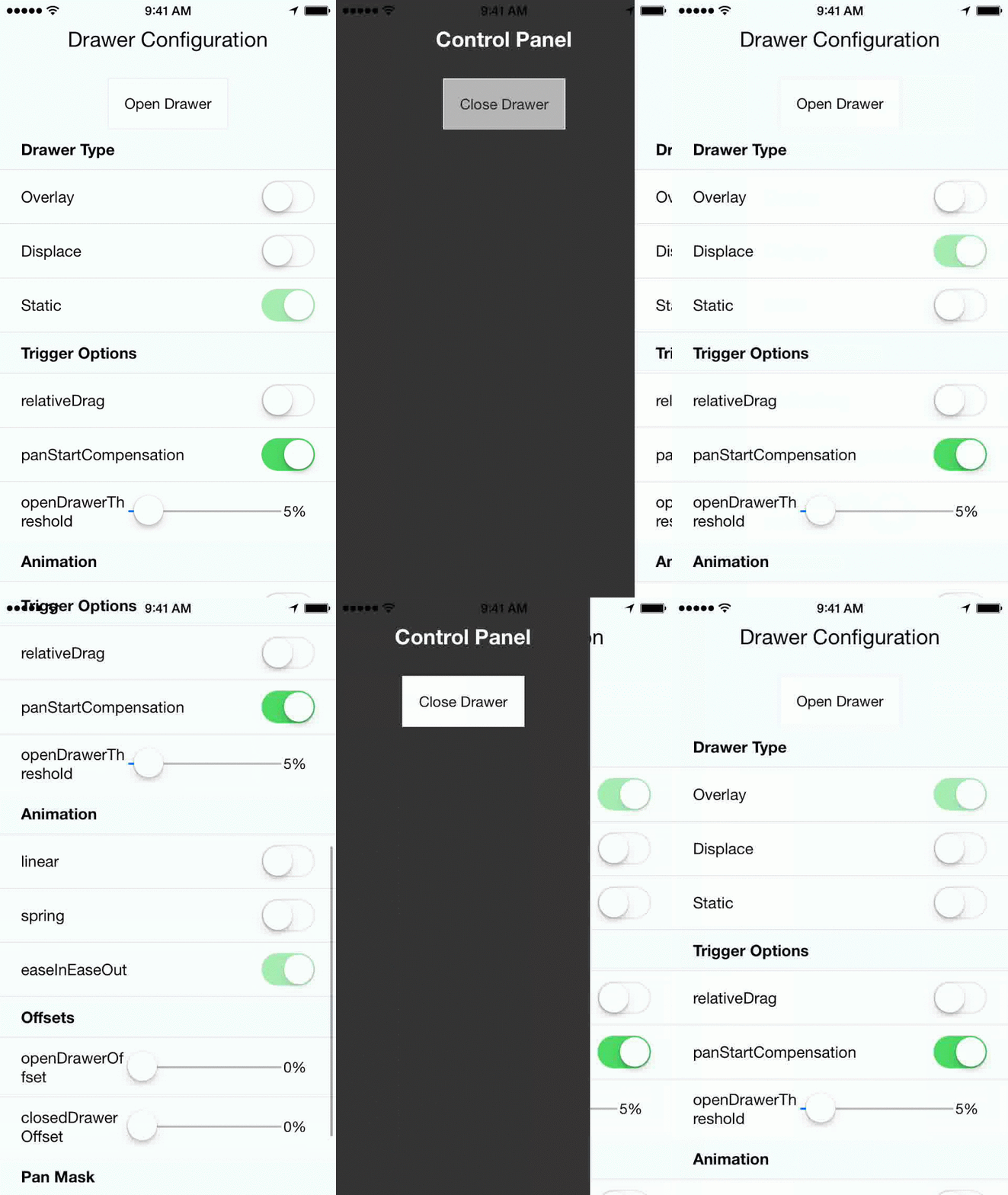
React native drawer, configurable to achieve material design style, slack style, parallax, and more. Works in both iOS and Android.
npm install --save react-native-drawer
import Drawer from 'react-native-drawer'

class Application extends Component {
  closeControlPanel = () => {
    this._drawer.close()
  };
  openControlPanel = () => {
    this._drawer.open()
  };
  render () {
    return (
      <Drawer
        ref={(ref) => this._drawer = ref}
        content={<ControlPanel />}
        >
        <MainView />
      </Drawer>
    )
  }
})//Parallax Effect (slack style)
<Drawer
type="static"
content={<ControlPanel />}
openDrawerOffset={100}
styles={drawerStyles}
tweenHandler={Drawer.tweenPresets.parallax}
>
<Main />
</Drawer>
//Material Design Style Drawer
<Drawer
type="overlay"
content={<ControlPanel />}
tapToClose={true}
openDrawerOffset={0.2} // 20% gap on the right side of drawer
panCloseMask={0.2}
closedDrawerOffset={-3}
styles={drawerStyles}
tweenHandler={(ratio) => ({
main: { opacity:(2-ratio)/2 }
})}
>
<Main />
</Drawer>
const drawerStyles = {
drawer: { shadowColor: '#000000', shadowOpacity: 0.8, shadowRadius: 3},
main: {paddingLeft: 3},
}This module supports a wide range of drawer styles, and hence has a lot of props.
content(React.Component)null- Menu componenttype(String: displace:overlay:static)displace- Type of drawer.open(Boolean)null- If true will trigger drawer open, if false will trigger close.openDrawerOffset(Number|Function)0- Can either be a integer (pixel value) or decimal (ratio of screen width). Defines the right hand margin when the drawer is open. Or, can be function which returns offset:(viewport) => viewport.width - 200closedDrawerOffset(Number|Function)0- Same as openDrawerOffset, except defines left hand margin when drawer is closed.disabled(Boolean)false- If true the drawer can not be opened and will not respond to pans.styles(Object)null- Styles for the drawer, main, drawerOverlay and mainOverlay container Views.
Note: In the future animations with use Animated, and the api will change.
tweenHandler(Function)null- Takes in the pan ratio (decimal 0 to 1) that represents the tween percent. Returns and object of native props to be set on the constituent views { drawer: {/native props/}, main: {/native props/}, mainOverlay: {/native props/} }tweenDuration(Integer)250- The duration of the open/close animation.tweenEasing(String)linear- A easing type supported by tween-functions
onOpen(Function) - Will be called immediately after the drawer has entered the open state.onOpenStart(Function) callback fired at the start of an open animation.onClose(Function) - Will be called immediately after the drawer has entered the closed state.onCloseStart(Function) callback fired at the start of a close animation.
captureGestures(oneOf(true, false, 'open', 'closed'))open- If true, will capture all gestures inside of the pan mask. If 'open' will only capture when drawer is open.acceptDoubleTap(Boolean)false- Toggle drawer when double tap occurs within pan mask?acceptTap(Boolean)false- Toggle drawer when any tap occurs within pan mask?acceptPan(Boolean)true- Allow for drawer pan (on touch drag). Set to false to effectively disable the drawer while still allowing programmatic control.tapToClose(Boolean)false- Same as acceptTap, except only for close.negotiatePan(Boolean)false- If true, attempts to handle only horizontal swipes, making it play well with a childScrollView.
panThreshold(Number).25- Ratio of screen width that must be travelled to trigger a drawer open/close.panOpenMask(Number)null- Ratio of screen width that is valid for the start of a pan open action. If null -> defaults tomax(.05, closedDrawerOffset).panCloseMask(Number)null- Ratio of screen width that is valid for the start of a pan close action. If null -> defaults tomax(.05, openDrawerOffset).initializeOpen(Boolean)false- Initialize with drawer open?side(String left|right)left- which side the drawer should be on.useInteractionManager(Boolean)false- if true will run InteractionManager for open/close animations.elevation(Number)0- (Android-only) Sets the elevation of the drawer using Android's underlying elevation API
You can achieve pretty much any animation you want using the tween handler with the transformMatrix property. E.G.
tweenHandler={(ratio) => {
  var r0 = -ratio/6
  var r1 = 1-ratio/6
  var t = [
             r1,  r0,  0,  0,
             -r0, r1,  0,  0,
             0,   0,   1,  0,
             0,   0,   0,  1,
          ]
  return {
    main: {
      style: {
        transformMatrix: t,
        opacity: 1 - ratio/2,
      },
    }
  }
}}
Will result in a skewed fade out animation.
Three options:
-
Use the open prop (controlled mode):
<Drawer
  open={true}
-
Using the Drawer Ref:
// assuming ref is set up on the drawer as (ref) => this._drawer = ref
onPress={() => {this._drawer.open()}}
-
Using Context
contextTypes = {drawer: React.PropTypes.object}
// later...
this.context.drawer.open()
git clone https://github.com/rt2zz/react-native-drawer.gitcd react-native-drawer/examples/RNDrawerDemo && npm install- iOS
- Open ``./examples/RNDrawerDemo/RNDrawerDemo.xcodeproject` in xcode
command+r(in xcode)
- Android
- Run android simulator / plug in your android device
- Run
react-native run-androidin terminal
Component was adapted from and inspired by @khanghoang's RNSideMenu AND @kureevalexey's react-native-side-menu


