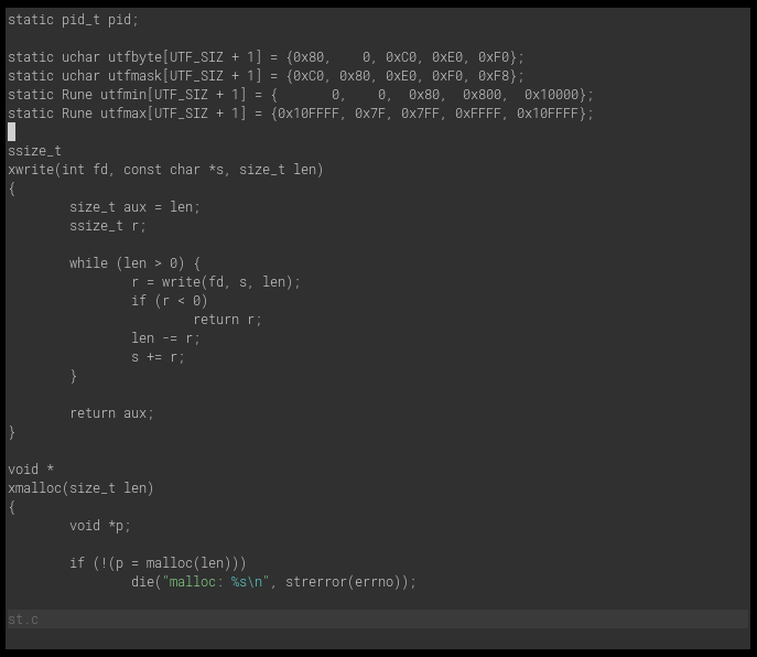
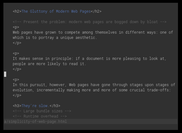
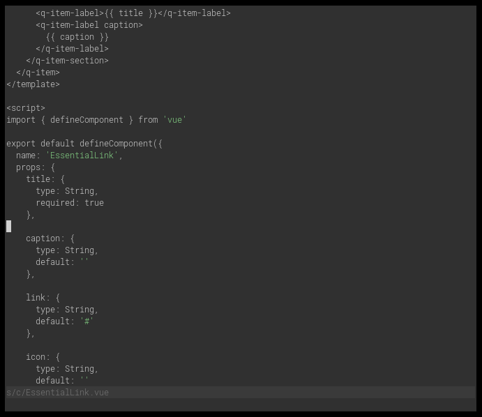
A simple, low-contrast Vim colorscheme with (drastically) reduced syntax highlighting.
Highlight only when exceptional. Such is the way of highlight.vim.
You can see it in the editor's own UI elements. Notice how the statusline remains unassuming, unless something of note appears.
You can see it in the syntax highlighting itself. Notice how everything is a colorless white by default. Comments are melded into a background gray. Strings are highlighted.
Copy the contents of colors into ~/.vim on UNIX-like systems, or install
with your favorite plugin manager.
If you're on GUI, termguicolors, or any terminal with 256-color support, highlight.vim should Just Work™.
If you're on a 16-color terminal, you'll have to configure your terminal's
palette. Here's a sample .Xresources. Use it directly, or import it into
terminal.sexy then export to any needed format.
/* ! HIGHLIGHT */
/* ! special */
*.foreground:   #d0d0d0
*.background:   #303030
*.cursorColor:  #d0d0d0

! black
*.color0:       #303030
*.color8:       #767676

! red
*.color1:       #ff8787
*.color9:       #ff8787

! green
*.color2:       #87d787
*.color10:      #87d787

! yellow
*.color3:       #ffd75f
*.color11:      #ffd75f

! blue
*.color4:       #5f87d7
*.color12:      #5f87d7

! magenta
*.color5:       #d787d7
*.color13:      #d787d7

! cyan
*.color6:       #5fd7d7
*.color14:      #5fd7d7

! white
*.color7:       #d0d0d0
*.color15:      #d0d0d0
I called it "Highlight" because that's what it does: it highlights.
Wouldn't it be confusing with Vim's own :highlight?
I see it as a fortunate coincidence. It's called "Highlight", and it uses
:highlight. Simple enough! Such is the way of highlight.vim.
Yes, this may be controversial. So far, though, the reasoning has been pretty simple for me:
- First it was very jarring.
- Then I got used to it.
- Then I noticed I could read and comprehend code more quickly.
- Then I realized it was hard for me to go back — "normal" syntax highlighting now takes my eyes all over the place and hampers my reading ability.
It's a positive for some people, a negative for others. It turned out to be a positive for me.
Here's a bit more discussion on it:
I've used Chris Kempson's Base 16 Eighties palette for the longest time. The final colors in highlight.vim's palette are the closest Xterm-palette equivalents I found. It was easy, thanks to ClosestX11Color.
The structure behind the colorscheme file is inspired by vim-rnb's way of doing things. Perhaps one day I'll upgrade to the new, up-and-coming vim/colorschemes.
If anyone else sees this and wants to use it, go ahead.
This project is open source, licensed under MIT.


