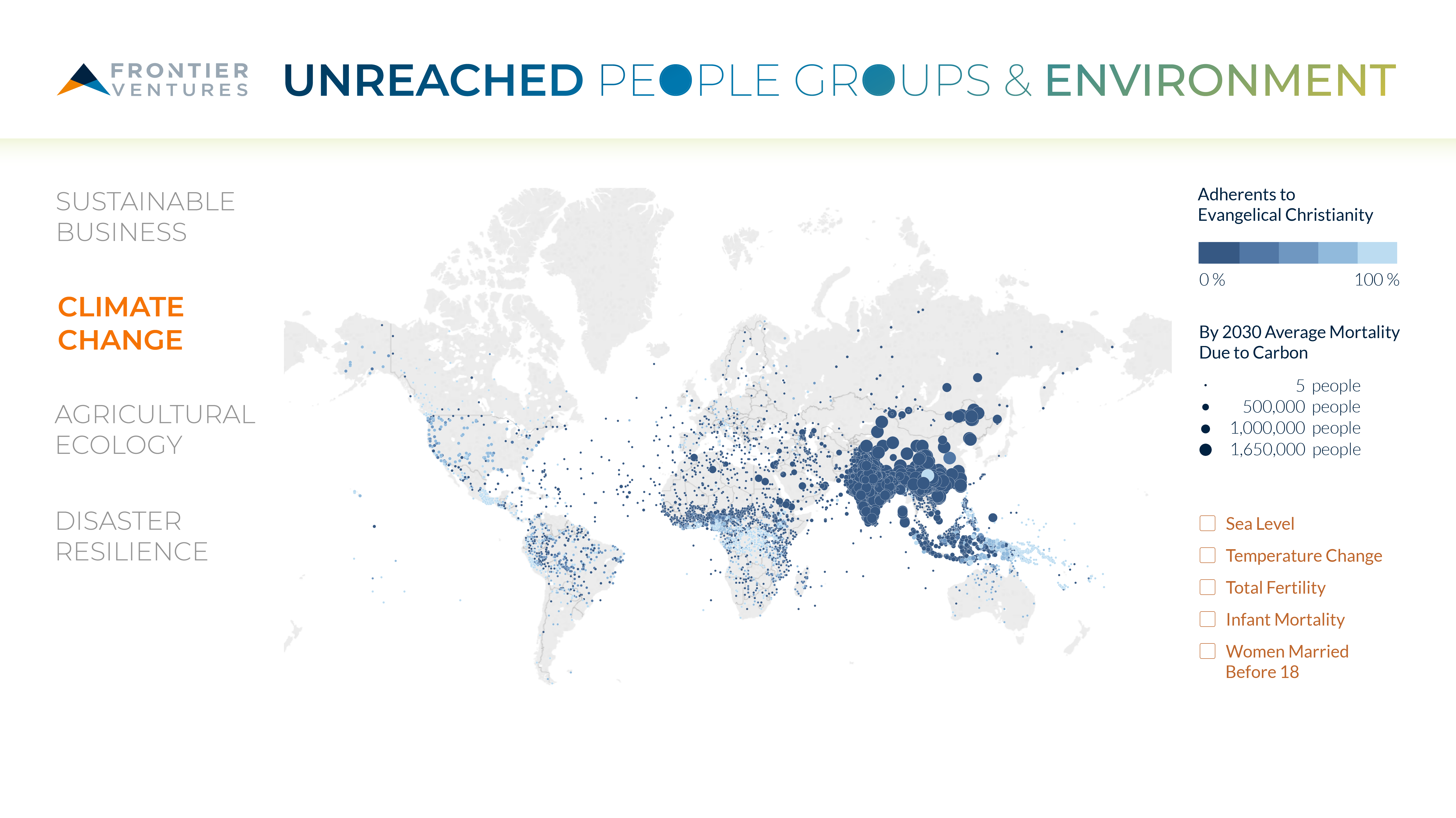
Data visualization is a general term that describes any effort to help people understand the significance of data by placing it in a visual context. Data visualizations help decision makers identify patterns, trends and correlations that might go undetected in text-based data which can be exposed and recognized easier through graphic representations. This project will combine dataset about unreached people groups with datasets connected to pollution and environmental issues in order to help identify places where human suffering is connected with pollution. Teams will analyze and visualize specific data sets to help viewers deepen their understanding of God's global mission and their place in it.
- Joshua Project People Groups: Thousands of people groups and various features including:
- population
- unreached (Y/N)
- % adherents, % evangelicals
- latitude, longitude
- DARA International Climate Vulnerability Monitor Data: Countries and their cost of mortality / economy from carbon and climate change effects. Included levels from 2010 and projected levels for 2030.
- Tableau: Interactive data visualization by overlaying variable layers on the world map. You can see how we compiled it in Tableau by downloading the file "Interactive Map - Data Visualization"
- Python: Pandas, numpy, matplotlib. The usual data analysis tools for in-depth statistical analysis. You can check out the plots for people groups with more than 10 data points in the "climate" or "carbon" folder.
- Adobe Creative Suite: Used for branding and prototype mock-ups. You can check them out in the "graphics" folder.
This is what we built in 3 days. Imagine a month or a year. Imagine the amount of impact and insight we could have about unreached people groups around the world. We believe that data visualization and analytics can reimagine the way we do missions.
- Imagine the new missionaries that will be inspired by seeing the vocational needs across the world.
- Imagine how missions organizations can strategize, plan and optimize their resources for the future.
You can find it here: https://drive.google.com/open?id=1fyMa3Kp21RQJh8TkVtQyBv38udXvlOv5-iL1TEuIBOU
