CSS 画三角形的方式数不胜数。
在实际开发中,通常只给 border 一个较小的值(1-2px),这种情况下会使得大家对 border 的样式造成一定误解。
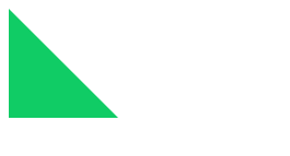
实际上,border是由三角形组合而成。
因此,可以借此方式来实现三角形:
<head>
 <style>
  .by-border {
   width: 0;
      height: 0;
      background-color: #fff;
      border-right: 100px solid transparent;
      border-bottom: 100px solid rgb(16, 204, 101);
  }
 </style>
</head>
<body>
 <div class="by-border"></div>
</body>
效果为:
TODO: