Ui suggestion #993
Replies: 9 comments 11 replies
-
|
Agree that the status bar could be removed or used for something. Moving buttons to the menu might be a bit unexpected for users. |
Beta Was this translation helpful? Give feedback.
-
|
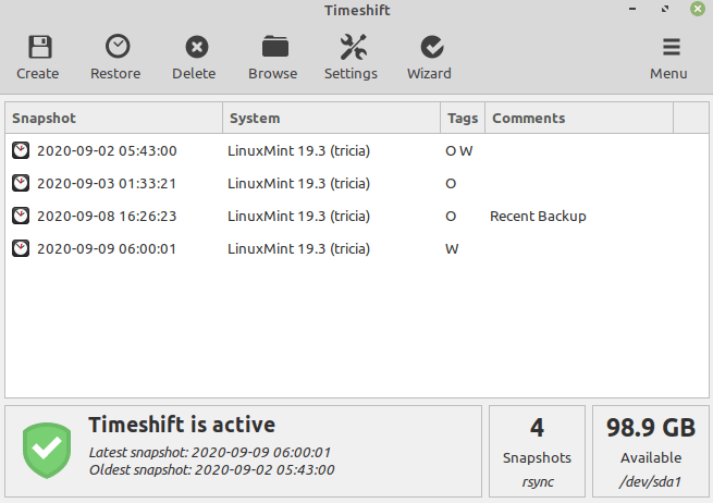
I was thinking for example of Timeshift, it's clearer with a big button. |
Beta Was this translation helpful? Give feedback.
-
|
You mean like this screenshot? Pull requests that improve Vorta are always welcome. Just discuss your ideas before implementing. And dont copy code directly from other projects. Taking ideas and inspirations is ok though. 👌 |
Beta Was this translation helpful? Give feedback.
-
Beta Was this translation helpful? Give feedback.
-
The window you posted is much larger than the current default size. So the horizontal tabs will use about 15% more space on one side? Regarding the Start/Cancel buttons, moving them will detach them from the logs that belong with it. So I'm not a fan of that. And the unusual placement of buttons where one usually finds the menu. Here some other UI concepts to explore. Similar complexity. The icon tabs on top are a common theme. |
Beta Was this translation helpful? Give feedback.
-
I just checked, its the same factor between width and height and width is the same in centimetre (I have taken a rule).
True true, you're right. I don't think it's such a good idea
I like the first two. Maybe I can do something configurable ? User can choose between two interfaces. |
Beta Was this translation helpful? Give feedback.
-
No problem. I have to do some tests to be sure. Screencast.202021-05-26.2021.17.355.mp4The text is at the bottom just like before. And profile on the left. But I dont think is a good idea. Just put the profile ComboBox at the top like before is ok. |
Beta Was this translation helpful? Give feedback.
-
|
Hello, @m3nu , can I make a pull request since #955 have been merging ? |
Beta Was this translation helpful? Give feedback.


-
Hello,

I checked the mainWindow ui file because I wanted to optimize the space at the bottom (on my screen, the window is to big the first time). There is a status bar and and it seems that noboy use it so I have removed it. I have also moved the cancel and backup buttons to a toolBar.
This is the result :
It's just a suggestion but I think a toolBar is a good idea. It is more compact and beautiful (with icons).
My "Backup" button on toolBar starts a backup and it works.
I have others suggestions like adding the misc tab in a setting action in toolBar (all ui is made for one profile, one backup but misc tab is about all profiles and backups, its global settings), keep misc tab for repository settings and add compression option in it, maybe move the profile menu elsewhere...
Beta Was this translation helpful? Give feedback.
All reactions