Building charts from queries is easier than ever.
Clients have a #draw method which accepts a query, a DOM node and a configuration object as arguments. You can call this directly on the client, which will execute a request and visualize its response, like so:
client.draw(query, node, config);Keen.ready(function(){
var query = new Keen.Query("count", {
eventCollection: "pageviews",
timeframe: "this_14_days",
groupBy: "visitor.geo.country"
interval: "daily"
});
var chart = client.draw(query, document.getElementById("chart-wrapper"), {
title: "Custom chart title",
chartType: "columnchart"
});
});Charts can also be instantiated with the Keen.Dataviz object. Learn more about this object here.
Keen.ready(function(){

  var chart = new Keen.Dataviz()
    .el(document.getElementById("chart-wrapper"))
    .chartType("columnchart")
    .prepare(); // start spinner

  var req = client.run(query, function(err, res){
    if (err) {
      // Display the API error
      chart.error(err.message);
    }
    else {
      // Handle the response
      chart
        .parseRequest(this)
        .title("Custom chart title")
        .render();
    }
  });

  // Re-run and refresh every 15 minutes...
  setInterval(function() {
    req.refresh();
  }, 1000 * 60 * 15);

});
A note about Keen.ready(fn): This wrapper function is called when the full library is loaded (when using the asynchronous loading snippet), the DOM is ready, and the Google Charts library is loaded.
The second argument for the #draw method is a reference to the DOM element where your chart will appear. This should be a block level element, like a <div> tag, referenced by its ID attribute:
document.getElementById("chart-wrapper")
{
  colors: [ "#ff0000", "#222", "lightblue" ],
  title: "My chart title!",
  height: 400,
  width: 600,
  colorMapping: {},
  labelMapping: {},
  labels: [],
  chartOptions: {
    // pass directly through to underlying vizz library
  }
}labelMapping: object that selectively replaces previous values with desired values:
labelMapping: {
  "https://yourdomain.com/": "Home",
  "https://yourdomain.com/gallery.html": "Gallery"
}labels: array that totally replaces all values (useful for funnels):
{
  labels: [
    "Step 1",
    "Step 2 (75%)",
    "Step 3 (50%)",
    "Step 4 (12%)"
  ]
}colorMapping: object that corresponds labels (key) with desired colors (value).
colorMapping: {
  "Home": "#ff0000",
  "Gallery": "purple"
}chartOptions: config object passed to the underlying visualization library (Google Charts).
chartOptions: {
  isStacked: true,
  legend: { position: "none" },
  bar: {
    groupWidth: "90%"
  }
}chartType: string identifying the type of chart to render:
Area, bar, column and line charts all operate on the same underlying query/response type: numeric values on an interval. So, the demos for these chart types will all utilize the following query, but will specify their own respective chartType property.
var total_pageviews = new Keen.Query("count", {
  eventCollection: "pageviews",
  groupBy: "channel",
  timeframe: "this_3_days",
  interval: "daily"
});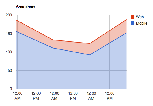
client.draw(total_pageviews, document.getElementById("total-daily-revenue-areachart"), {
  chartType: "areachart",
  title: "Daily revenue (7 days)",
  chartOptions: {
    isStacked: true
  }
});
<div id="total-daily-revenue-areachart"></div>
Find additional configuration options for area charts here.
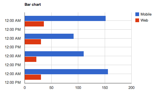
client.draw(total_pageviews, document.getElementById("total-daily-revenue-barchart"), {
  chartType: "barchart",
  title: "Daily revenue (7 days)",
  chartOptions: {
    isStacked: true
  }
});
<div id="total-daily-revenue-barchart"></div>
Find additional configuration options for bar charts here.
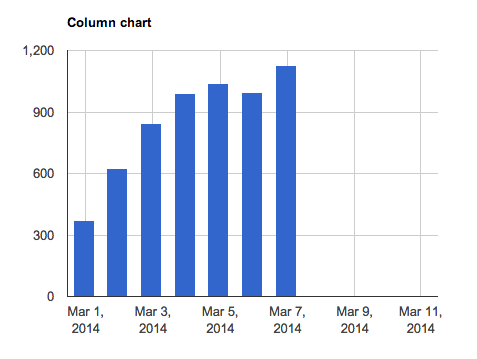
client.draw(total_pageviews, document.getElementById("total-daily-revenue-columnchart"), {
  chartType: "columnchart",
  title: "Daily revenue (7 days)",
  chartOptions: {
    isStacked: true
  }
});<div id="total-daily-revenue-columnchart"></div>Find additional configuration options for column charts here.
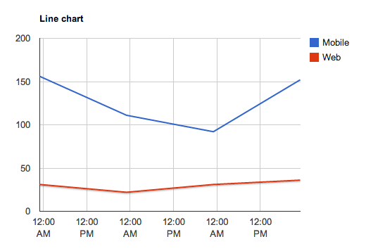
client.draw(total_pageviews, document.getElementById("total-daily-revenue-linechart"), {
  chartType: "linechart",
  title: "Daily revenue (7 days)"
});<div id="total-daily-revenue-linechart"></div>Find additional configuration options for line charts here.
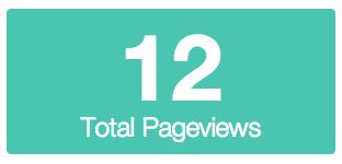
Visualize single numeric query responses, such as a count, sum, average, etc.
var count = new Keen.Query("count", {
  eventCollection: "pageviews"
});
client.draw(count, document.getElementById("count-pageviews-metric"), {
  chartType: "metric",
  title: "Total Pageviews",
  colors: ["#49c5b1"]
});<div id="count-pageviews-metric"></div>Additional options
chartOptions.prefix: string to prepend to the beginning of the result valuechartOptions.suffix: string to append to the end of the result valuechartOptions.prettyNumber: use short syntax to render numbers (eg: 300k), enabled by default
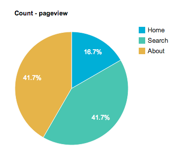
Pie charts can render groupBy queries that do not include an interval.
var visitor_origins = new Keen.Query("count", {
  eventCollection: "pageviews",
  groupBy: "referrer"
});
client.draw(visitor_origins, document.getElementById("count-pageviews-piechart"), {
  chartType: "piechart",
  title: "Visitor Referrers"
});
<div id="count-pageviews-piechart"></div>
Tables can render any query response, including extractions.
var all = new Keen.Query("extraction", {
  eventCollection: "pageviews",
  timeframe: "this_7_days"
});
client.draw(all, document.getElementById("extract-pageviews-table"), {
  chartType: "table",
  title: "All page view data"
});<div id="extract-pageviews-table"></div>Find additional configuration options for tables here.
Funnels are a fancy analysis type that allow you to see what percentage of users (or devices) complete various steps.

Keen.ready(function(){
  var watch_activation_funnel = new Keen.Query("funnel", {
    steps: [
      {
         event_collection: "purchases",
         actor_property: "user.id",
         filters: [
            {
              "property_name" : "product",
              "operator" : "eq",
              "property_value" : "telekinetic watch"
            }
         ]
      },
      {
        event_collection: "activations", // how many activated the device?
        actor_property: "user.id",
        optional: true
      },
      {
        event_collection: "sessions", // how many had a session?
        actor_property: "user.id",
        optional: true
      },
      {
        event_collection: "sessions",
        actor_property: "user.id",
        filters: [
            {
              "property_name" : "lifetime_session_count",
              "operator" : "gt",
              "property_value" : 1 // how many had more than 1 session
            }
         ],
         optional: true
      },
      {
        event_collection: "send_invitations",
        actor_property: "user.id"
      }
    ],
    timeframe: "last_7_days" // inherited by all steps
  });

  client.draw(watch_activation_funnel, document.getElementById("chart-05"), {
    library: "google",
    chartType: "barchart", // or "columnchart"
    height: 340,
    title: null,
    colors: ["#79CDCD"],
    labels: [ "Purchased Device", "Activated Device", "First Session", "Second Session", "Invited Friend" ],
    chartOptions: {
      chartArea: { height: "85%", left: "20%", top: "5%" },
      legend: { position: "none" }
    }
  });
});To display a modified query result or data from another source into a visualization, pass a result object and a div to Keen.Dataviz. The Keen IO API docs describe what the results look like for all the different query types (counts, series, funnels, etc).
Here's an example that takes a hard-coded value "1896" and draws it as a number.
var chart = new Keen.Dataviz()
  .el(document.getElementById('my-div'))
  .parseRawData({ result: 1896 })
  .chartType("metric")
  .colors(["#6ab975"])
  .title("Wow!")
  .width(400)
.render();Here's an example that runs two queries, divides them, and then outputs the results:
Keen.ready(function(){

  var sessions_count = new Keen.Query("count_unique", {
    eventCollection: "screen_view", // Use this collection because there is at least 1 screenview per session
    targetProperty: "session.id",
    timeframe: "last_7_days"
  });

  var paid_sessions_count = new Keen.Query("count_unique", { // Find number of sessions with payments
    eventCollection: "payment",
    targetProperty: "session.id",
    timeframe: "last_7_days"
  });

  var chart = new Keen.Dataviz()
    .el(document.getElementById("paid-session-conversion"))
    .colors(["#6ab975"])
    .title("Conversion %")
    .width(400)
    .prepare(); // start spinner

  // Send query to Keen IO
  var mashup = client.run([sessions_count, paid_sessions_count], function(err, res){
    if (err) {
      // Display the API error
      chart.error(err.message);
    }
    else {
      // divide paid sessions by sessions to get conversion rate
      chart
        .parseRawData({
          result: (res[1].result/res[0].result).toFixed(2) * 100
        })
        .render();
    }
  });

});Here's an example that takes the data from two different line charts and plots them both onto the same graph.
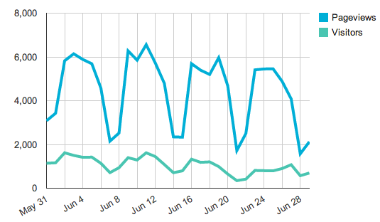
Keen.ready(function(){
  // use a variable to ensure timeframe & interval for both queries match
  var interval = "daily"
  var timeframe = "last_30_days"

  var pageviews = new Keen.Query("count", { // first query
  	eventCollection: "pageviews",
  	interval: interval,
  	timeframe: timeframe
  });

  var uniqueVisitors = new Keen.Query("count_unique", { // second query
  	eventCollection: "pageviews",
  	targetProperty: "uuid",
  	interval: interval,
  	timeframe: timeframe
  });

  var chart = new Keen.Dataviz()
    .el(document.getElementById("visitors-uniques"))
    .chartType("linechart")
    .chartOptions({
      hAxis: {
        format:'MMM d',
        gridlines:  {count: 12}
      }
    })
    .prepare();

  client.run([pageviews, uniqueVisitors], function(err, res){ // run the queries

  	var result1 = res[0].result  // data from first query
  	var result2 = res[1].result  // data from second query
  	var data = []  // place for combined results
  	var i=0

  	while (i < result1.length) {

  		data[i]={ // format the data so it can be charted
  			timeframe: result1[i]["timeframe"],
  			value: [
  				{ category: "Pageviews", result: result1[i]["value"] },
  				{ category: "Visitors", result: result2[i]["value"] }
  			]
  		}
  		if (i == result1.length-1) { // chart the data
        chart
          .parseRawData({ result: data })
          .render();
  		}
  		i++;
  	}
  });
});