It is not often that a single skill can be universally accepted as a necessity for everyone in a field as broad as bioinformatics. It would be practically impossible to have complete mastery over every aspect of bioinformatics, but skill in data visualization represents an integral part of the bioinformaticians toolbox. Regardless of the types of data you are dealing with, there will come a time where you either choose to visualize your data for personal exploratory reasons, or you must present your data and findings to others. Understanding the nature of your data and the data visualization tools at your disposal can be the difference between creating insightful and clear figures that strengthen your points or creating confusing, obfuscating figures that distance your audience from the point you were trying to make. In this chapter, we will discuss various types of data you may encounter and some good practices to follow as well as common pitfalls that you want to be wary of.
Chromosome conformation capture is a method to detect interacting segments of chromosomes in a genome. This is accomplished by cross-linking the genome using an agent, usually formaldehyde, to arrest the interacting sections of chromatin in place. These segments are then digested using targeted restriction enzymes and ligated back together for PCR amplification. Sequencing is performed following amplification to see which sections were grouped together. The interacting segments are then found when aligning the segments back to the reference genome, and from there, insight into the nature of their interactions can be further studied [1][2].

Figure 1: An overview of the various 3C technologies and the steps involved in each.
Hi-C sequencing is currently one of the most commonly used techniques when investigating chromatin interactions. These interactions are often associated with promoters and enhancer regions on the chromosomes, topologically associated domains (TAD), and other structural chromatin features that may play a part in epigenetic gene expression [3]. Hi-C sequencing allows direct investigations of “all vs. all” segments of the genome. This has been enabled by utilizing next generation sequencing, allowing much larger libraries to be created and assessed. Hi-C presents advantages over prior chromosome conformation capture technologies because of this ability to query all vs. all compared to the limited range of prior technologies. The scope of prior chromosome conformation capture techniques can be seen in the following table (truncated from [2]).
| Hi-C visualization | Hi-Browse | JuiceBox | my5C | 3D Genome Browser | Epigenome Browser |
|---|---|---|---|---|---|
| Intrachromosomal heat map | ✓ | ✓ | ✓ | ||
| Interchromosomal heat map | ✓ | ✓ | ✓ | ||
| Circular plot | ✓ | ✓ | |||
| Rotated local heat map | ✓ | ✓ | |||
| Local arc track | ✓ | ✓ | |||
| Locus-specific circular plot | ✓ | ||||
| Virtual 4C plot | ✓ | ✓ | ✓ | ||
| Multi-dataset visualizations | ✓ | ✓ | ✓ | ✓ | |
| Hi-C signal transformations | ✓ | ✓ | ✓ | ✓ |
A common problem within bioinformatics, or any field dealing with data at scale, is deciding how to properly treat your data. Hi-C data is looking at interacting segments of the entire genome, and as such, the amount of data produced for a single Hi-C experiment can be enormous and an incredible amount of variation can be seen between segments. These variations can either be due to noise or they can be biologically significant fluctuations that we want to capture. To distinguish between these possibilities, a few techniques have been developed to aid us in our analysis. They are matrix normalization, which assumes that the read matrix is “balanced” and has equal row and column sums, and an iterative correction technique (ICE) used to correct for bias between counts being placed in certain bins (particularly bins which occur near the diagonal of a correlation matrix) [4]. We will leave it to the reader to investigate these techniques as they are quite involved but suffice it to say that some kind of normalization needs to be performed prior to analysis.
Now that we understand 3C technologies, some of their strengths and weaknesses, and how to prepare our own Hi-C data we can begin to discuss visualization techniques.
Fortunately, a great deal of effort has gone into developing Hi-C visualization tools and as such, most Hi-C visualization can be done using prebuilt tools. An excellent article was published that goes into detail about five of the most common tools and this will form the basis of our own study into Hi-C visualization [5]. The table above represents an excerpt from that article, highlighting the five different 3C analysis methods commonly used and their various capabilities. Choosing which tool to use and what kind of visualization to generate can be the key to producing meaningful figures, and in the next section, we will discuss exactly that.
When interested in large-scale interactions, the most common tool to determine correlation between genomic loci should come as no surprise: it’s our old friend, the heatmap! Heatmaps are excellent for finding commonly interacting segments within our Hi-C data and especially so when we’re dealing with data at scale because it affords us a zoomed-out view of all interactions at once. Three of the five tools listed above (Hi-Browse, Juicebox, my5C) can generate these heatmaps for us [5][6]. Examples of these large scale visualization techniques can be seen in the following figure.

Figure 2: Four different large-scale chromatin interaction visualizations. a.) Hi-C interactions across all chromosomes in a kidney sample. The green arrow indicates a highly interacting set of samples b.) Visualization of the murine X chromosome c.) The murine X visualized using a heatmap with a particular locus highlighted using the green circles seen in the heatmap d.) A circle plot generated from the interactions found in the murine X chromosome with the green arrow indicating the locus plotted in the previous heatmap in c [5]
However, what if we need to look more closely at an individual locus? Trying to identify one particular set of interactions in a heatmap which covers the entire genome would be difficult and more importantly, inefficient. Two other tools presented in the above table (3D Genome Browser, Epigenome Browser) would serve us better when examining small local interactions [5]. Examples of output from the local analysis can be seen in the following figure.

Figure 3: Local chromatin interaction visualization techniques. a.) A cartoon of a single loop of chromatin joined by two proteins b.) The circle plot showing the interacting segments, with the specific area that was indicated using red arrows in a again being pointed out in this circle plot c.) Using the genome browser to identify promoter/enhancer regions identified by the Hi-C data [5]
The genome-wide visualizations from above and these local visualizations (along with many other visualizations) can be created using just the five tools we've discussed. It is generally a good idea to begin with large-scale visualizations to get some insight into the quality of your Hi-C data and then, when you're reasonably sure your data looks good, you can dive into more refined local analysis visualizations.
As we have seen, Hi-C sequencing can provide valuable insight into the nature of chromatin interaction and further elucidate the nature of particular segments of the genome. This insight is dependent on the choices we make when determining how to approach our data. While any of the techniques or tools we’ve discussed can help guide us in our analysis, there are certainly some tools that are better suited to particular inquiries, and we hope that as you continue through this chapter you keep that principle in mind!
-
Han, J., Zhang, Z. & Wang, K. 3C and 3C-based techniques: the powerful tools for spatial genome organization deciphering. Molecular Cytogenetics 11, (2018).
-
Li, G. et al. Chromatin Interaction Analysis with Paired-End Tag (ChIA-PET) sequencing technology and application. BMC Genomics 15, (2014).
-
Dixon, J. R. et al. Topological domains in mammalian genomes identified by analysis of chromatin interactions. Nature 485, 376–380 (2012).
-
Imakaev, M. et al. Iterative correction of Hi-C data reveals hallmarks of chromosome organization. Nature Methods 9, 999–1003 (2012).
-
Yardımcı, G. G. & Noble, W. S. Software tools for visualizing Hi-C data. Genome Biology (2016). doi:10.1101/086017
-
Lajoie, B. R., Berkum, N. L. V., Sanyal, A. & Dekker, J. My5C: web tools for chromosome conformation capture studies. Nature Methods 6, 690–691 (2009).
Genomic data holds the past, present and future of an individual - the human genome. Sequencing the human genome of 3 billion base pairs was not feasible until the development of cheaper and faster sequencing technologies. Now that we can efficiently, and cheaply harvest the data derived from the human genome, how do we visualize its interpretations?

Figure 4: Circos plot generated using the software, Circa, visualizing varients in the breast cancer cell line
To visualize genomic data, researchers use circos plots; a visualization tool used to identify similarities and differences across the genomic structure. Circos plots can be used to visualize multiple aspects that can be revealed through genomic data; such as chromosome similarity, and phylogeny. In a circular ideogram layout, circos displays the relationship between positions by the use of ribbons (lines connecting the two points in the circle) that encode position, size and orientation of related genomic sequences. The circlular composition is used to show connections between objects and between positions; connections between neighboring points in the circle indicate close interactions, while farther points indicate distant interactions.

Figure 5: Left, sketch of interactions possible within chromosome. Right, Circos plot depicting interactions in human chr21.
Circos plots can be made using the original circos software written in Perl, or various R packages, such as:
- cirlize
- RCircos
- CIRCUS
- OmicCircos
For chromosome visualization, Circa can be used to create the circos plots without any code.
Although, a seemingly digestable data visualization tool (and pretty too!), data can quicly become convoluted. Circos plots are most effective when there is not too much data crammed in - which can often happen in chromosome-based circos plots. Stay away from adding 20 datasets, with multiple colors and tiny datapoint captions. Ensure that you only highlight the patterns that are interesting rather than all the data you have.
- Circos plots are a useful and beautiful tool to visualize genomic data
- Points on circumference indicate positions on chromosome, where connections symbolize relationships
- Keep plots simple! Use circos plots to highlight interesting patterns, and not all your data.
- https://genome.cshlp.org/content/early/2009/06/15/gr.092759.109.abstract
- https://medium.com/@Marianattestad/a-treatise-on-making-circos-plots-from-genomic-data-7ff496849e0
- http://circos.ca/intro/circular_approach/
Gene expression is the synthesis of a functional RNA gene product from a gene. Essentially it is the qualification of a phenotype from a genotype. Due to high dimentionality (large number of genes, complexity of biological networks) of the data, it can be difficult to visualize this type of data. In this section, we will explore two data visualization models.
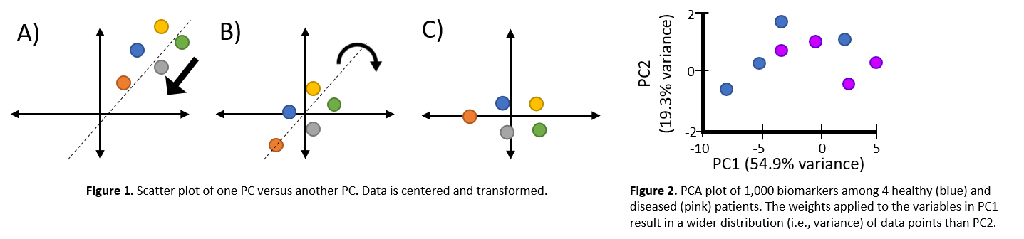
Figure 6: Left, Images depict the transformation/reduction of genomic data into principal components. Right, Example of PCA plot.
Simplifying genomic data like transcriptomes, whole genome sequencing, proteomes, PCA is a classical dimension reduction approach where it creates linear combinations of gene expressions, or principal components. Principal components are orthogonal to eachother and effectively represent the effects of original measurements by removing redundancies. The purpose of PCA is to reduce dimensionality of the data while preserving as much variance as possible. PCA can be used to discover relationships between biomarkers that can not be easily seen.
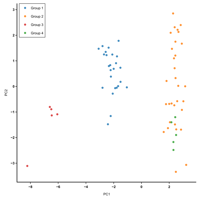
Figure 7: PCA is used to capture the essence of the data in few principal compentents. This image shows a PCA of cluster similarity.
PCA is used when:
- there are many variables (expression of thousands of proteins)
- you want to make sure transformed measurements are independant of eachother
PCA can be ran on excel using XLSTAT statistical software, Analyse-it, among other software.

Figure 8: Image depicts similarities between gene expression in DNA microarrays.
Heatmaps are a data visualization technique that can be used to identify genes that are commonly regulated, find biological signatures, represent changes in gene expression, etc. The colors within the tiles of the heatmap are scaled within a range proportionate to gene expression values (ex, in a range from white=no expression, and black=high expression, dark grey would indicate moderate level of expression and light grey would indicate low level of expression). Gene sequences corrrespond to the row of the martices (n = number genes), and the chips, or samples corrrespond to the columns (n = number samples). Dendrograms flanking the matix depicts clustering/relationships between the rows/columns.
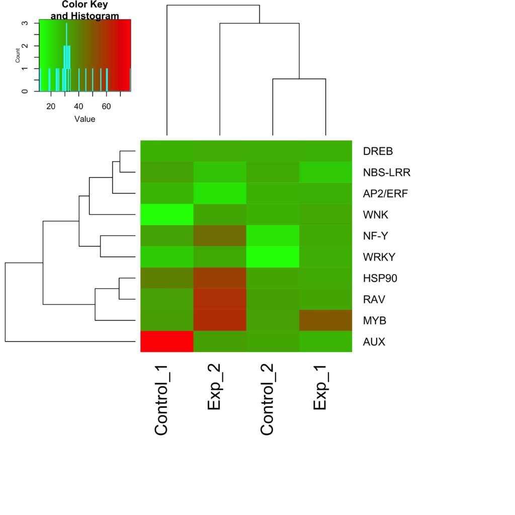
Figure 9: Understanding the color gradients within a heatmap is essential. In this example, red is highly expressed while green is low expression of the genes (right) at the experimental conditions (bottom)
- PCAs can be used to reduce the dimensionality of large gene expression datasets
- Heatmaps can be used to visualize gene expression patterns
- https://academic.oup.com/bib/article/12/6/714/221174
- https://academic.oup.com/bioinformatics/article/17/9/763/206456
- https://www.xlstat.com/en/solutions/features/principal-component-analysis-pca
- https://en.wikipedia.org/wiki/Heat_map
- https://bitesizebio.com/34121/show-disparity-gene-expression-heat-map/
Chromatin immunoprecipitation, or ChIP, is a method used to identify binding sites or transcription factors within the genomone. ChIP-sequencing allows for precise analysis of DNA-protein binding sites using next-gen sequencing (NGS).
The UCSC Genome Browser is a powerful web-based genome browser that consolidates published studies and Encyclopedia of DNA Elements (ENCODE) in one easy to use site. Here you can import your genome, and visualize transciption factor binding sites brought to you by ChIP-seq in an alignment.

Figure 10: Different customizable features of the UCSC Genome Browser
Figure 11. Different customizable features of the UCSC Genome Browser
The UCSC Genome Browser should be used when:
- you want to visualize DNA-protein binding sites by ChIP-seq available on the ENCODE database (large database)
The UCSC Genome Browser should NOT be used when:
- you have a large dataset, i.e. large sequences, as it can be slow due to web traffic
IGV, Integratice Genomics Viewer, is a tool that allows for real-time visualization of large and diverse genomic datasets. Unlike UCSC Genome browser, IGV is a downloadable software for your local machine, meaning that interactions such as aligned sequence reads, mutations, copy number, gene expression, etc, faster than before. Datasets used by IGV can be loaded locally or remotely through cloud services - no loading time!

Figure 11: IGV window displaying copy number and mutation data.
The UCSC Genome Browser should be used when:
- you want to visualize a large get of genomic data in a seamless, and fast visualization tool against your own datasets.
JASPAR is a large open-access, open-source, non-redundant database of Transcription Factor (TF) binding sites for eukaryotes. The TF binding site data is stored as position frequency matrices (PFMs) and TF flexible models (TFFMs).

Figure 12: JASPAR interactive searching interface.

Figure 13: JASPAR clustering. Circos plot of JASPAR PFM clusters. Clicking into leaf in circos plot will show cooresponding motif descriptions.
MEME, Multiple Em for Motif Elicitation, discovers new and unique reoccuring, fixed length patterns within DNA or protein sequences. Users will submit their sequences, and MEME will output a fixed number of motifs determined by the threshold set by the user. Using statistical modeling, MEME outputs the sequences of best width, number occurances and a description of each motif.

Figure 14: Sample Meme html output: Displays protein motifs found by MEME
- UCSC genome browser is a powerful genome browser that holds a lot of published DNA information, but it can be slow to use as it is web-based, making it an optimal choice for smaller datasets.
- IGV is a integrative visualization tool that allows you to load your own datasets along with external datasets, and harvest information against large datasets faster than that of the UCSC Genome Browser.
- JASPAR is an interactive tool for not only visualizing and finding TF motifs. JASPAR differs from its competitors as it is curated, non-redundant and open-source.
- MEME is used to find unique and new motifs within a sequence. Although not interactive, MEME outputs its results in html format for the bioinformatician to analyze.
- https://www.encodeproject.org/documents/92228d7b-f959-4dcd-94d3-39f5173fd92a/@@download/attachment/UsersMtg-UCSCbrowser.pdf
- http://homer.ucsd.edu/homer/basicTutorial/genomeBrowsers.html
- http://systemsbio.ucsd.edu/course/BENG207/tutorial/images/ucscdisplay.jpg
- https://ars.els-cdn.com/content/image/1-s2.0-S0888754308000451-gr1.jpg
- https://www.ncbi.nlm.nih.gov/pmc/articles/PMC3346182/
- http://jaspar.genereg.net/about/
- https://www.ncbi.nlm.nih.gov/pubmed/29140473
- https://en.wikipedia.org/wiki/MEME_suite
- https://www.ncbi.nlm.nih.gov/pmc/articles/PMC1538909/
Phinch is a data visualization tool that’s used to quickly analyze complex genomic datasets [1]. Phinch is used primarily for metagenomic datasets, and is used to determine the composition of species in these particular datasets. Phinch has several visualizations for datasets that are publication-ready. One visualization is the taxonomy bar chart, which allows users to see the abundance of certain taxa in each sample. Another chart that can be used is the bubble chart, where the circle size is positively correlated with the abundance of a given taxon. Additionally, Phinch is capable of displaying a sankey diagram, which organizes taxa abundance in samples hierarchically by taxonomy. Phinch is a neat tool that can be used to take a glance at your data without the need for heavy programming knowledge.

Figure 15 a taxonomy bar chart for the abundance of taxa in a coral pond
Figure 16 a bubble chart for the abundance of taxa in a coral pond

Figure 17 a sankey chart for the abundance of taxa in a coral pond
To communicate your research effectively, one must consider how you present your data to others. Graphs are a great way to visualize your data, but how do you know what kind of graph to use? Here is a comparison of the different types of graphs you can use and how they’re useful in different situations [3].

Figure 18 A comparison of different types of plots and their strengths and weaknesses
It’s also important to choose a graph that represents your data well. For example, a bar graph is more visually appealing in this plot describing cancer incidence than a line plot, because you can see the difference between types more clearly in the bar graph.
Additionally, it’s very important to order your data in a way that has a logical order, so that trends in the data are obviously seen at first glance. In plotting cancer incidence by tissue type, it’s difficult to see which tissue type has the highest/lowest cancer incidence in the left plot, whereas in the right plot, you can easily see the trend as the types are arranged from highest to lowest cancer incidence [4].

Figure 19 Plots where cancer incidence by type is plotted as a bar graph (top left), line plot (top right). The elements in the graph are unordered by tissue (bottom left), and ordered by lowest cancer incidence to highest cancer incidence (bottom right)
Although it seems like a minute detail in presenting your data, picking colors is something that cannot be overlooked. To represent your data well, you need to make sure to pick colors that correspond to trends in the data you are trying to emphasize to the reader. Don’t handpick your colors! Let the color palettes you pick explain your data. ColorBrewer is a useful tool you can use to pick color schemes for different purposes [2]. The three types of schemes are sequential, diverging, and qualitative. Below are examples of how you could use each color scheme.

Figure 20 an example of using the different color schemes in ColorBrewer. a) map of people per square mile by county with a sequential color scheme b) map of the percent change in total population from 1990 to 2000 by county with a diverging color scheme c) map of the minority group with highest percent of county population with a qualitative color scheme
Sequential color schemes imply order and are suited to representing data that ranges from low-to-high values either on an ordinal scale (e.g. cold, warm, hot) or on a numerical scale (e.g. age classes of 0–9, 10–19, 20–29, etc.). For example, to visualize interaction frequency in Hi-C data, one can use this kind of color scheme.

Figure 21 a Hi-C matrix that labels interaction frequency between regions of the genome using a sequential color scheme
Diverging color schemes should be used when a critical data class or break point needs to be emphasized, particularly if there are two vastly different trends that need to be visualized. For example, to visualize over and underexpression of particular genes for RNA-seq heatmaps, one can use this color scheme.

Figure 22 a heatmap that labels over and underexpression of genes using a diverging color scheme
Qualitative color schemes are used to differentiate data by kind. Since there is no conceptual ranking in this type of data one these colors aren’t too similar to one another, instead these colors are very distinct from one another. For example, if one wants to differentiate between each chromosome in a Manhattan plot, use this color scheme.

Figure 23 a Manhattan plot labeling the different chromosomes using a qualitative color scheme
-
Bik, Holly, “Phinch: An interactive, exploratory data visualization framework for –Omic datasets.” bioRxiv, doi: https://doi.org/10.1101/009944
-
Harrower, Mark, et al., “ColorBrewer.org: An Online Tool for Selecting Colour Schemes for Maps.” The Cartographic Journal, Vol. 40 No. 1 pp. 27–37, June 2003.
-
https://www.ck12.org/statistics/types-of-data-representation/lesson/Analyzing-Data-PST/
-
http://sphweb.bumc.bu.edu/otlt/MPH-Modules/BS/DataPresentation/DataPresentation7.html
Over the course of this chapter, we have explored a range of data visualization techniques. We started with specific tools and tips for distinct data sets which lead to more general guidelines for creating effective figures. The sections that dealt with more specialized tools were intended not only as a simple guide in dealing with that particular type of data, but also as an example of how deep you can go when considering what kind of figures you want to make for your own data. For most of the data that you will deal with, there will already be data visualization tools at your disposal. This means that the most difficult part of presenting your data usually will not be generating the figures, but deciding which kind of figures you want to make! These are the choices that we wanted to focus on. We hope that after reading this chapter, you feel more informed and empowered to make your own impactful figures no matter the kind of data you are working with!