-
Notifications
You must be signed in to change notification settings - Fork 9
/
Copy path20-visualisation2.Rmd
683 lines (523 loc) · 22.3 KB
/
20-visualisation2.Rmd
1
2
3
4
5
6
7
8
9
10
11
12
13
14
15
16
17
18
19
20
21
22
23
24
25
26
27
28
29
30
31
32
33
34
35
36
37
38
39
40
41
42
43
44
45
46
47
48
49
50
51
52
53
54
55
56
57
58
59
60
61
62
63
64
65
66
67
68
69
70
71
72
73
74
75
76
77
78
79
80
81
82
83
84
85
86
87
88
89
90
91
92
93
94
95
96
97
98
99
100
101
102
103
104
105
106
107
108
109
110
111
112
113
114
115
116
117
118
119
120
121
122
123
124
125
126
127
128
129
130
131
132
133
134
135
136
137
138
139
140
141
142
143
144
145
146
147
148
149
150
151
152
153
154
155
156
157
158
159
160
161
162
163
164
165
166
167
168
169
170
171
172
173
174
175
176
177
178
179
180
181
182
183
184
185
186
187
188
189
190
191
192
193
194
195
196
197
198
199
200
201
202
203
204
205
206
207
208
209
210
211
212
213
214
215
216
217
218
219
220
221
222
223
224
225
226
227
228
229
230
231
232
233
234
235
236
237
238
239
240
241
242
243
244
245
246
247
248
249
250
251
252
253
254
255
256
257
258
259
260
261
262
263
264
265
266
267
268
269
270
271
272
273
274
275
276
277
278
279
280
281
282
283
284
285
286
287
288
289
290
291
292
293
294
295
296
297
298
299
300
301
302
303
304
305
306
307
308
309
310
311
312
313
314
315
316
317
318
319
320
321
322
323
324
325
326
327
328
329
330
331
332
333
334
335
336
337
338
339
340
341
342
343
344
345
346
347
348
349
350
351
352
353
354
355
356
357
358
359
360
361
362
363
364
365
366
367
368
369
370
371
372
373
374
375
376
377
378
379
380
381
382
383
384
385
386
387
388
389
390
391
392
393
394
395
396
397
398
399
400
401
402
403
404
405
406
407
408
409
410
411
412
413
414
415
416
417
418
419
420
421
422
423
424
425
426
427
428
429
430
431
432
433
434
435
436
437
438
439
440
441
442
443
444
445
446
447
448
449
450
451
452
453
454
455
456
457
458
459
460
461
462
463
464
465
466
467
468
469
470
471
472
473
474
475
476
477
478
479
480
481
482
483
484
485
486
487
488
489
490
491
492
493
494
495
496
497
498
499
500
501
502
503
504
505
506
507
508
509
510
511
512
513
514
515
516
517
518
519
520
521
522
523
524
525
526
527
528
529
530
531
532
533
534
535
536
537
538
539
540
541
542
543
544
545
546
547
548
549
550
551
552
553
554
555
556
557
558
559
560
561
562
563
564
565
566
567
568
569
570
571
572
573
574
575
576
577
578
579
580
581
582
583
584
585
586
587
588
589
590
591
592
593
594
595
596
597
598
599
600
601
602
603
604
605
606
607
608
609
610
611
612
613
614
615
616
617
618
619
620
621
622
623
624
625
626
627
628
629
630
631
632
633
634
635
636
637
638
639
640
641
642
643
644
645
646
647
648
649
650
651
652
653
654
655
656
657
658
659
660
661
662
663
664
665
666
667
668
669
670
671
672
673
674
675
676
677
678
679
680
681
682
683
# Data visualisation {#sec-vis}
This chapter is based on Chapter 3 [*High Quality Graphics in
R*](https://www-huber.embl.de/msmb/Chap-Graphics.html) of the *Modern
Statistics for Modern Biology* book [@MSMB].
```{r env, message = FALSE, echo = FALSE}
suppressPackageStartupMessages(library("ggplot2"))
suppressPackageStartupMessages(library("dplyr"))
suppressPackageStartupMessages(library("Hmisc"))
suppressPackageStartupMessages(library("plotly"))
```
## Introduction
The **goal** of data visualisation is to
- interactively explore and understand data, i.e. *exploratory data
analysis*;
- to present and *communicate results*, whether as a preliminary
analysis or final results.
Our **learning objectives** are
- Familiarise ourselves with plotting in R using base graphics and
`ggplot2`;
- Understand the concepts behind the grammar of graphics and `ggplot2`;
- Learn how to visualise data along 1, 2 or more dimensions;
- Learn about `plotly`, one package for producing interactive
visualisations.
The difference between this chapter, and the [*Data
Visualisation*](ttps://uclouvain-cbio.github.io/WSBIM1207/sec-vis.html)
of the introductory WSBIM1207 course is that here we focus on
understanding and communicating data through visualisation, rather
than on the syntax of the plotting packages. Here are a couple couple
of [*visualisation horror picture show*](./horror.pdf) from a lecture
by Wolfgang Huber to illustrate what not to do.
Let's use the famous [*Anscombe's
quartet*](https://en.wikipedia.org/wiki/Anscombe%27s_quartet) data as
a motivating example. This data is composed of 4 pairs of
values, $(x_1, y_1)$ to $(x_4, y_4)$:
```{r anscombe, echo = FALSE, results='asis'}
knitr::kable(anscombe)
```
Each of these $x$ and $y$ sets have the same variance, mean and
correlation:
```{r anscombetab, echo=FALSE}
tab <- matrix(NA, 5, 4)
colnames(tab) <- 1:4
rownames(tab) <- c("var(x)", "mean(x)",
"var(y)", "mean(y)",
"cor(x,y)")
for (i in 1:4)
tab[, i] <- c(var(anscombe[, i]),
mean(anscombe[, i]),
var(anscombe[, i+4]),
mean(anscombe[, i+4]),
cor(anscombe[, i], anscombe[, i+4]))
```
```{r anstabdisplay, echo=FALSE}
knitr::kable(tab)
```
But...
While the *residuals* of the linear regression (see chapter
\@ref(sec-obj)) clearly indicate fundamental differences in these
data, the most simple and straightforward approach in *visualisation*
is to highlight the fundamental differences in the datasets.
```{r anscombefig, echo=FALSE}
ff <- y ~ x
mods <- setNames(as.list(1:4), paste0("lm", 1:4))
par(mfrow = c(2, 2), mar = c(4, 4, 1, 1))
for (i in 1:4) {
ff[2:3] <- lapply(paste0(c("y","x"), i), as.name)
plot(ff, data = anscombe, pch = 19, xlim = c(3, 19), ylim = c(3, 13))
mods[[i]] <- lm(ff, data = anscombe)
abline(mods[[i]])
}
```
See also another, more recent example:
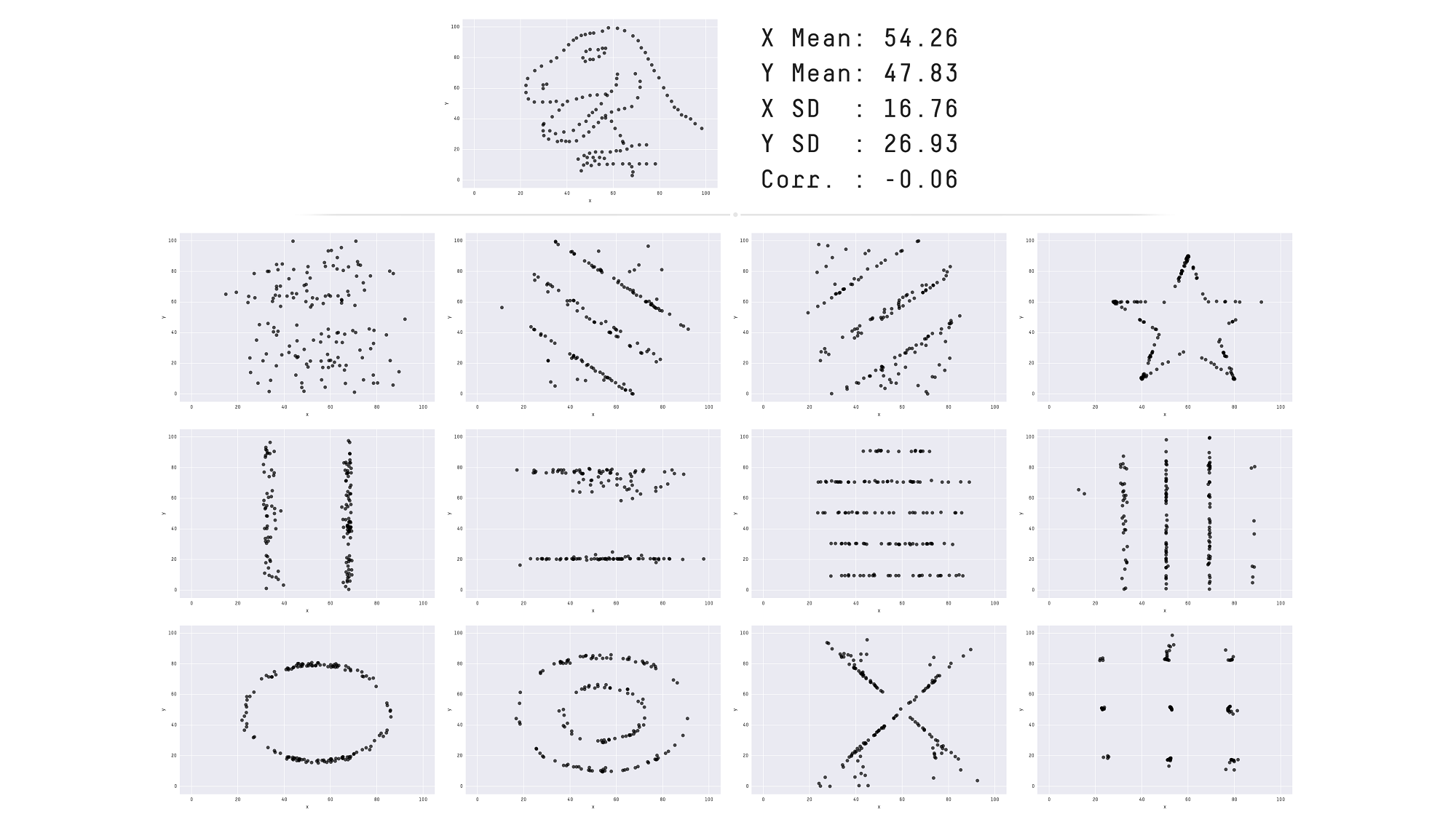
[The Datasaurus Dozen dataset](https://www.autodeskresearch.com/publications/samestats).
Throughout this course we will focus on producing visualisations that
will enable **understanding important features** of biomolecular data
or the effect of their transformation and analyses. With this in mind,
the beauty of the visualisations we will produce won't be assessed by
how visually attractive the figures are, but how they advance our
understanding the data. In the process of data exploration and data
analysis, we want to be able to quickly generate and interpret
figures. It is of course important to polish the graphics to make them
visually appealing and improve communication with the audience, once a
useful figure has been chosen as a means of communication.
An important aspect of data visualisation is data **manipulation**,
transformation and the format of the data: as seen in
[WSBIM1207](https://uclouvain-cbio.github.io/WSBIM1207/sec-dplyr.html),
its scale (see below) and normalisation of the data (see chapter
\@ref(sec-norm)).
A last feature of data that is intimately associated with its
manipulation and visualisation is its **structure**: long and wide
dataframes (as introduced in
[WSBIM1207](https://uclouvain-cbio.github.io/WSBIM1207/sec-dplyr.html)
or dedicated objects (see chapter \@ref(sec-obj)). Some visualisations
will be much easier when the data is formatted in a certain way.
## Base plotting
The default graphics system that comes with R, often called base R
graphics is simple and fast. It is based on the painter's model or
canvas, where different output are directly overlaid on top of each
other.
Below, we display the relation between the optical density of the
deoxyribonuclease (DNase) protein as measure by an enzyme-linked
immunosorbent assay (ELISA) assay for all observations.
```{r dnase, fig.cap = "The default base `plot` function on the `DNase` data."}
head(DNase)
plot(DNase$conc, DNase$density)
```
We can add some features on the plot, such vertical dotted lines for
all observed observations and customise the look and feel of the plot
by setting specific arguments to the `plot` function.
```{r dnase2, fig.cap = "Customising a base figure using function arguments and overlaying new graphical features."}
plot(DNase$conc, DNase$density,
xlab = "DNase concentration (ng/ml)",
ylab = "Optical density",
pch = 1,
col = "steelblue")
abline(v = unique(DNase$conc), lty = "dotted")
```
If we wanted to change anything to the figures, we would need to
repeat all the commands and modify accordingly. Any additional command
would be added to the existing canvas.
`r msmbstyle::question_begin()`
How would you produce a figure that differentiates the different runs
using base graphics?
`r msmbstyle::question_end()`
`r msmbstyle::solution_begin()`
```{r colbyrun}
plot(DNase$conc, DNase$density, col = DNase$Run)
```
`r msmbstyle::solution_end()`
`r msmbstyle::question_begin()`
Use the `hist` and `boxplot` functions to produce a
histogram of all optical densities and a boxplot of the densities
split by run.
`r msmbstyle::question_end()`
`r msmbstyle::solution_begin()`
```{r hist_boxplot, fig.width = 14, fig.height = 7, fig.cap = "The base `hist` and `boxplot` functions, the latter using the formula interface."}
par(mfrow = c(1, 2))
hist(DNase$density)
boxplot(density ~ Run, DNase)
```
`r msmbstyle::solution_end()`
The base graphics function are very effective to quickly produce out
of the box figures. However, there is no global overview and
parametrisation of the visualisation. The layout decisions have to be
made up upfront (and if not adequate, the figure needs to be redrawn)
and every aspect of the figure is customised locally as function
arguments.
More generally, base graphics functions will work with various inputs:
above we have worked with a `data.frame`, vectors and a formula. There
is no unified type of data across all functions which makes it
efficient for some types of data (if they match), but also very
heterogeneous in terms of interface, leading to a lot of customisation
code.
Finally, defaults, and colours in particular, are poorly chosen.
## The `ggplot2` package
**`ggplot2`** is a plotting package that makes it simple to create
complex plots from data in a data frame. It provides a more
programmatic interface for specifying what variables to plot, how they
are displayed, and general visual properties. The theoretical
foundation that supports the `ggplot2` is the *Grammar of
Graphics*[^gg]. Instead of producing the figure, the user defines and
assembles the visual components into an object that is the
displayed. There is a book about ggplot2[^ggbook] that provides a good
overview, but it is outdated. The ggplot2 web page
(https://ggplot2.tidyverse.org) provides ample documentation.
[^gg]: Wilkinson, Leland. 2005. The Grammar of Graphics (Statistics
and Computing). Berlin, Heidelberg: Springer-Verlag.
[^ggbook]: Wickham, Hadley. 2016. ggplot2: Elegant Graphics for Data
Analysis. Springer-Verlag New York.
To build a ggplot, we will use the following basic template that can
be used for different types of plots:
```
ggplot(data = <DATA>, mapping = aes(<MAPPINGS>)) + <GEOM_FUNCTION>()
```
We need first to load the `ggplot2` package:
```{r ggload}
library("ggplot2")
```
- use the `ggplot()` function and bind the plot to a specific data frame using the
`data` argument
```{r gg0, fig.cap = "We have only specified the data, and there's nothing to display yet."}
ggplot(data = DNase)
```
- define a mapping (using the aesthetic (`aes`) function), by
selecting the variables to be plotted and specifying how to present
them in the graph, e.g. as x/y positions or characteristics such as
size, shape, colour, etc.
```{r gg1, fig.cap = "`ggplot2` can now generate the axes, ticks and ranges based on the data."}
ggplot(data = DNase,
mapping = aes(x = conc, y = density))
```
- add *geoms* – graphical representations of the data in the plot
(points, lines, bars). To add a geom to the plot use the `+`
operator. Because we have two continuous variables, let's use
`geom_point()` first:
```{r gg2, fig.cap = "Final figures with rendering of the data as a scatter plot."}
ggplot(data = DNase,
mapping = aes(x = conc, y = density)) +
geom_point()
```
`r msmbstyle::question_begin()`
Compare the `ggplot2` and base graphics version of the density
vs. concentration plot. Which one do you prefer, and why?
`r msmbstyle::question_end()`
It is possible to store the output of the `ggplot` function into a
variable that can be visualised by either typing its name in the
console or explicitly printing it (like any other variable).
```{r ggobj, fig.cap = "Saving and printing an object."}
gg <- ggplot(data = DNase,
mapping = aes(x = conc, y = density)) +
geom_point()
print(gg)
```
Let's immediately customise this visualisation to
- highlight how to re-use the `gg` object without repeating the
plotting code and
- how we can add additional (identical or different) *geoms* to a
plot.
```{r gg3, fig.cap = "Adding another `geom_point` with its own (local) aesthetics. "}
gg + geom_point(aes(colour = Run))
```
`r msmbstyle::question_begin()`
What do you think of the colours used to differentiate the different
runs above?
`r msmbstyle::question_end()`
`r msmbstyle::solution_begin()`
```{r ggex, fig.cap = "Setting the Run to a category by coercing it to a character, rather than a numeric."}
gg + geom_point(aes(colour = as.character(Run)))
```
`r msmbstyle::solution_end()`
Finally, we can model easily model and visualise the relation relation
between concentration and optical density using a *smoothing geom*:
```{r dnasmooth, fig.cap = "Modelling the relation between concentration and optical density."}
ggplot(data = DNase,
mapping = aes(x = conc,
y = density)) +
geom_point(aes(colour = as.character(Run))) +
geom_smooth(method = "loess")
```
<!-- Below is an example of more elaborated composition, overlaying points -->
<!-- and a non-linear *loess* regression. But first, let's load a object -->
<!-- containing microarray data from the `hiiragi2013df1` data. The data is -->
<!-- originally available from the -->
<!-- [`Hiiragi2013`](http://bioconductor.org/packages/release/data/experiment/html/Hiiragi2013.html) -->
<!-- package and describes the cell-to-cell expression variability followed -->
<!-- by signal reinforcement progressively segregates early mouse lineages -->
<!-- [@Ohnishi:2014]. -->
<!-- ```{r gg4, fig.cap = "Modelling the relation between the expression of X1426642_at and X1418765_at."} -->
<!-- library("rWSBIM1322") -->
<!-- data(hiiragi2013df1) -->
<!-- ggplot(hiiragi2013df1, aes(x = X1426642_at, y = X1418765_at)) + -->
<!-- geom_point(shape = 1) + -->
<!-- geom_smooth(method = "loess") -->
<!-- ``` -->
<!-- And, adding colours representing the different samples -->
<!-- ```{r gg5, fig.cap = "Modelling the relation between the expression of X1426642_at and X1418765_at and annotating samples."} -->
<!-- ggplot(hiiragi2013df1, aes(x = X1426642_at, y = X1418765_at)) + -->
<!-- geom_point(aes(color = sampleColour), shape = 19) + -->
<!-- geom_smooth(method = "loess") -->
<!-- ``` -->
## Visualising 1D data
Let's start by exploring some 1 dimensional visualisation. This is
very relevant for omics data such as transcriptomics or quantitative
proteomics, when contrasting the expression values across multiple
samples.
We will be using data from the
[`Hiiragi2013`](http://bioconductor.org/packages/release/data/experiment/html/Hiiragi2013.html)
package and describes the cell-to-cell expression variability followed
by signal reinforcement progressively segregates early mouse lineages
[@Ohnishi:2014].
```{r hiiragi}
library("rWSBIM1322")
data(hiiragi2013df1)
head(hiiragi2013df1)
```
First, we convert a microarray gene expression data to a data.frame,
fit for some `ggplot2` visualisation, focusing on genes Fgf4 (probeset
`X1420085_at`), Gata4 (`X1418863_at`), Gata6 (`X1425463_at`) and Sox2
(`X1416967_at`).
```{r pivot_longer, message = FALSE}
library("tidyverse")
genes <- dplyr::rename(hiiragi2013df1,
Fgf4 = X1420085_at,
Gata4 = X1418863_at,
Gata6 = X1425463_at,
Sox2 = X1416967_at) |>
select(Fgf4, Gata4,
Gata6, Sox2) |>
pivot_longer(names_to = "gene",
values_to = "expression",
everything())
head(genes)
```
### Histogram
```{r hist, fig.cap = "Distribution of the Gata4 expression"}
genes |>
filter(gene == "Gata4") |>
ggplot(aes(x = expression)) + geom_histogram()
```
### Box plots
```{r boxplot, fig.cap = "A boxplot of expression values."}
p <- ggplot(genes, aes(x = gene, y = expression, fill = gene))
bxplot <- p + geom_boxplot()
bxplot
```
`r msmbstyle::question_begin()`
Repeat the above figure replacing the boxes by violins using the
`geom_violin`. Which one do you think does a better job?
`r msmbstyle::question_end()`
`r msmbstyle::solution_begin()`
```{r violin, fig.cap = "A violin plot of expression values."}
vlnplot <- p + geom_violin()
vlnplot
```
`r msmbstyle::solution_end()`
See this post, [The Boxplot and its
pitfalls](https://www.data-to-viz.com/caveat/boxplot.html) for more
detail about boxplots and how to improve them using jitter, violin
plots, and information about the sample size.
### Dot plots and beeswarm plots
When the data aren't too large, it is also possibly to visualise all
points to get a sense of their distribution.
```{r jitter}
jtrplot <- p +
geom_jitter(aes(colour = gene)) +
theme(legend.position = "none")
```
In a dotplot, the position of the points along the y axis is
discretised into bins (set as 1/6 below) and the points are then
stacked next to each other.
```{r dot}
dotplot <- p + geom_dotplot(binaxis = "y", binwidth = 1/6,
stackdir = "center", stackratio = 0.75,
aes(color = gene)) +
theme(legend.position = "none")
```
The beeswarm algorithms tries to avoid overlapping points: if a point
were to overlap an existing point, it is shifted along the $x$-axis
by a small amount sufficient to avoid overlap.
```{r bee}
library("ggbeeswarm")
beeplot <- p + geom_beeswarm(aes(color = gene)) +
theme(legend.position = "none")
```
```{r showdots, fig.cap = "Showing all expression values using jittering (left), a dotplot (centre) and a beeswarn plot.", fig.with = 16, fig.height = 4}
library(patchwork)
jtrplot + dotplot + beeplot
```
### Density and ecdf plots
```{r dens}
densplot <- ggplot(genes, aes(x = expression, color = gene)) +
geom_density() +
theme(legend.position = "none")
```
```{r ecdf}
ecdfplot <- ggplot(genes, aes(x = expression, color = gene)) +
stat_ecdf() +
theme(legend.position = "none")
```
```{r, fig.cap = "Density and cumulative density functions of expression values.", fig.with = 12, fig.height = 6}
densplot + ecdfplot
```
### Summary
- **Boxplot** makes sense for unimodal distributions (see below).
- **Histogram** requires definition of bins (width, positions) and can
create visual artefacts especially if the number of data points is
not large.
- **Density** requires the choice of bandwidth; obscures the sample
size (i.e. the uncertainty of the estimate).
- **ecdf** does not have these problems; but is more abstract and
interpretation requires more training. Good for reading off
quantiles and shifts in location in comparative plots.
- **beeswarm**: for up to a few dozens of points, just show the data.
## Number of modes
The number of modes of a distribution depends on scale transformation
of the data.
```{r sim, fig.cap = "Histograms of the same data without (left) and with (right) log-transformation."}
sim <- data.frame(x = exp(rnorm(n = 1e5,
mean = sample(c(2, 5),
size = 1e5,
replace = TRUE))))
p1 <- ggplot(sim, aes(x)) +
geom_histogram(binwidth = 10, boundary = 0) +
xlim(0, 400)
p2 <- ggplot(sim, aes(log(x))) +
geom_histogram(bins = 30)
p1 + p2
```
This also applies to density plots.
## Visualising 2D data
```{r sc1, fig.cap = "Scatter plot comparing the expression of a wild-type vs. FGF4 KO."}
data(hiiragi2013df2)
head(hiiragi2013df2)
scp <- ggplot(hiiragi2013df2,
aes(x = `59 E4.5 (PE)`,
y = `92 E4.5 (FGF4-KO)`))
scp + geom_point()
```
`r msmbstyle::question_begin()`
The over-plotting of the dots stops us from learning anything about
the density of the different regions of the plot. Use the `alpha`
parameter to `geom_points` between 0 (full transparency) to 1 (opaque,
default).
`r msmbstyle::question_end()`
`r msmbstyle::solution_begin()`
```{r scp2, fig.cap = "Transparency can help distinguish regions of different densities."}
scp + geom_point(alpha = 0.1)
```
`r msmbstyle::solution_end()`
```{r scp3, fig.cap = "Focusing on contours rather that individual values."}
scp + geom_density2d(h = 0.5, bins = 60)
```
```{r scp5, fig.cap = "Local density summaries."}
scp + geom_hex()
```
## Visualising data along more dimensions
When visualising data along additional dimension, we can parameterise
the points by setting their shape, colour, size and transparency, that
can be set with point aesthetics such as `fill`, `color` (or
`colour`), `shape`, `size` and `alpha`.
A very powerful way to represent data along additional dimensions is
facetting, i.e. producing sub-plots for different subsets of the
data. Below, we first re-annotate the data using some regular
expressions
```{r facet1, fig.cap = "Different sub-plots for different lineages using colours (left) of facets (right) to distinguish the different lineages."}
p1 <- ggplot(hiiragi2013df1, aes(x = X1426642_at, y = X1418765_at, colour = lineage)) +
geom_point()
p2 <- ggplot(hiiragi2013df1, aes(x = X1426642_at, y = X1418765_at)) +
geom_point() +
facet_grid( . ~ lineage )
p1 + p2
```
```{r facet2, fig.cap = "Different sub-plots for different lineages and embryonic stages."}
ggplot(hiiragi2013df1,
aes(x = X1426642_at, y = X1418765_at)) +
geom_point() +
facet_grid( Embryonic.day ~ lineage )
```
`r msmbstyle::question_begin()`
Use facets to visualise the distribution of the four Fgf4, Gata4,
Gata6 and Sox2 genes in the `genes` data using histograms.
`r msmbstyle::question_end()`
`r msmbstyle::solution_begin()`
```{r hist2}
ggplot(genes, aes(x = expression)) +
geom_histogram() +
facet_wrap(~ gene)
```
`r msmbstyle::solution_end()`
## Interactive visualisation
```{r plotly0}
scp <- ggplot(hiiragi2013df2[1:100, ],
aes(x= `59 E4.5 (PE)`, y = `92 E4.5 (FGF4-KO)`))
scp2 <- scp + geom_point()
```
Once we have stored ggplot object in a variable, we can simply pass it
to the `plotly::ggplotly` function to generate an interactive figure.
```{r plotly, eval = FALSE}
library("plotly")
ggplotly(scp2)
```
See https://plot.ly/r for examples of interactive graphics online.
## Additional exercises
`r msmbstyle::question_begin()`
Load the `barley` data that comes with the `lattice` package (that is
already installed on your computer). The data describe the yield from
a Minnesota barley trial as a data frame with 120 observations on the
following 4 variables.
- `yield` Yield (averaged across three blocks) in bushels/acre.
- `variety` Factor with levels `Svansota`, `No. 462`, `Manchuria`,
`No. 475`, `Velvet`, `Peatland`, `Glabron`, `No. 457`, `Wisconsin No. 38`
and `Trebi`.
- `year` Factor with levels `1932` and `1931`.
- `site` Factor with 6 levels: `Grand Rapids`, `Duluth`,
`University Farm`, `Morris`, `Crookston`, `Waseca`.
Familiarise yourself with the data
`r msmbstyle::question_end()`
```{r bar1, echo = FALSE}
library(lattice)
data(barley)
```
`r msmbstyle::question_begin()`
Visualise the yield for each variety on all site in 1932 and 1931
using `ggplot2`. Try to generate a figure on your own. If you
struggle, discuss with your fellow students. If you need additional
help, or as a check, execute the code in the `barley` manual page
example.
`r msmbstyle::question_end()`
```{r, echo = FALSE, include = FALSE}
ggplot(barley, aes(x = yield, y = variety, colour = year)) +
geom_point() +
facet_grid(site ~ .)
```
`r msmbstyle::question_begin()`
Can you spot an issue with the data?
`r msmbstyle::question_end()`
`r msmbstyle::question_begin()`
Write a function named `(gg)plot_probe_sets` that takes two probe sets
and the `hiiragi2013df1` data (from the `rWSBIM1322` package) as input
and produces a scatterplot. Your function should test if the provided
probe sets are valid before producing the plot and inform
otherwise. Below are some example outputs.
```{r plot_probe_sets, echo = FALSE}
plot_probe_sets <- function(x, y, data = hiiragi2013df1) {
stopifnot(x %in% colnames(hiiragi2013df1)[1:6])
stopifnot(y %in% colnames(hiiragi2013df1)[1:6])
plot(data[, x], data[, y], xlab = x, ylab = y)
}
ggplot_probe_sets <- function(x, y, data = hiiragi2013df1) {
stopifnot(x %in% colnames(hiiragi2013df1)[1:6])
stopifnot(y %in% colnames(hiiragi2013df1)[1:6])
ggplot(data = hiiragi2013df1,
aes(x = .data[[x]], y = .data[[y]])) +
geom_point()
}
```
```{r visfun, fig.width = 8, echo = TRUE}
plot_probe_sets("X1426642_at", "X1420085_at", data = hiiragi2013df1)
ggplot_probe_sets("X1426642_at", "X1420085_at", data = hiiragi2013df1)
try(plot_probe_sets("X1416967_at", "123_at"))
```
`r msmbstyle::question_end()`