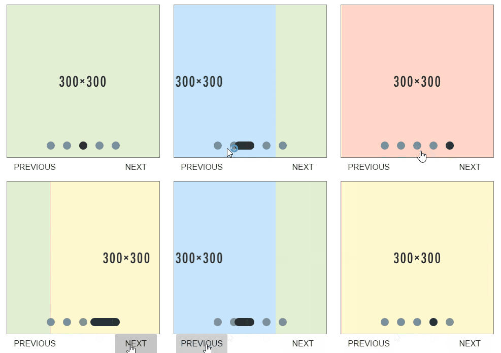
Polymer element for displaying slides in a carousel. Have a quick look at the Component page
First you need bower, see their site for details
bower install --save l2t-paper-slider
Each slide must be within a paper-slide tag, but other than that you have complete control.
  <l2t-paper-slider>
    <paper-slide>#1</paper-slide>
    <paper-slide>#2</paper-slide>
    <paper-slide>#3</paper-slide>
    <paper-slide>#4</paper-slide>
  </l2t-paper-slider>
There is also auto progression and slide duration for how long it should remain on one slide
  <l2t-paper-slider auto-progress slide-duration="2">
    <paper-slide>#1</paper-slide>
    <paper-slide>#2</paper-slide>
    <paper-slide>#3</paper-slide>
  </l2t-paper-slider>
You can set a different default start position, the first start postion is 0 (as opposed to 1)
  <l2t-paper-slider position="1">
    <paper-slide>#1</paper-slide>
    <paper-slide>#2</paper-slide>
</l2t-paper-slider>The following custom properties are available for styling:
| Custom property | Description | Default |
|---|---|---|
| --paper-slider-styles | (Mixin) Customs styles for slider container | NULL |
| --paper-slide-dot | Color of unselected Nav Dot | rgba(255, 255, 255, .5) |
| --paper-slide-dot-selected | Color of selected Nav Dot | #FFF |
| --paper-slide-width | Width of slide container | 100% |
| --paper-slide-height | Height of slide container | 600px |
| --paper-slider-dot-container-styles | (Mixin) Custom styles for dot container | NULL |
| --paper-slide-dot-styles | (Mixin) Custom styles for dot | NULL |
| --paper-slide-background | Default background color for slides | rgba(0, 0, 0, 0) |
| --paper-slide-font-size | Default font size for slide | medium |
| Attribute Name | Functionality | Type | Default |
|---|---|---|---|
| totalSlides | Number for storing total number of slides | Number | NULL |
| autoProgress | Boolean value to state if slides should auto proceed | Boolean | false |
| slideDuration | Number of seconds each slide should remain for | Number | 5 |
| hideNav | Boolean value to state if nav should should hidden | Boolean | false |
| position | Number for storing start position of slides | Number | 0 |
| disableSwipe | Boolean value to state if swipe shoud work | Boolean | false |
| sensitivity | String to storing high, low or default swipe sensitivity | String | 'default' |
| Attribute Name | Functionality | Type | Default |
|---|---|---|---|
| _totalDots | Array for storing number leading up to totalSlides | Array | [] |
| _dotStyles | Object for storing all the styles of the dot elements | Object | NULL |
| Method Name | Action |
|---|---|
| moveNext() | Method for moving to the next slide or back to the first slide |
| movePrev() | Method for moving to the previous slide or to the last slide |
| movePos(slide) | Method for moving to a specific slide |
| Method Name | Action |
|---|---|
| _autoProceed() | Method for moving automatically ever slideDuration seconds |
| _countSlides() | Count the slides, and set totalSlides |
| _createDots(t) | Create the nav dots 1 for each slide |
| _animateCSS() | Method for styling and animating dots |
| _listenerInit() | Adds onclick listener To update the position |
| _reInit() | Method to reinitialise on totalSlides change |
| _swipeHandler(e) | Method for adding swipe event handler |
I adapted this project from Tobias Reich's project Material Slider Dots. The code is mostly his, I just made it more dynamic for a polymer enviroment.


