如果你想在react中使用,可以使用 react-arc-progress 组件,由于使用了React Hook,依赖的React版本需要 >=16.8.0
npm install arc-progress -S如果选使用<script>直接引入js文件,可点击下载arc-progress.min.js文件。
<div id="progress-container"></div>

<script>
  const customText = [{text: '%', size: '12px', color: '#000', x: 142, y:102}];

  const arcProgress = new ArcProgress({
    el: '#progress-container',
    progress: .68,
    speed: 5,
    value: '5439.92',
    size: 200,
    customText,
    observer(e, t) {
      console.log('监听动画进度', e, t);
    },
    animationEnd(e) {
      console.log('动画执行结束', e);
    }
  });

</script>如果在React中使用,可以使用react-arc-progress 组件
如果在vue中使用,在可以获取真实dom节点的生命周期里进行实例化
在Vue中:
<template>
  <div>
    <div id="progress-container" />
  </div>
</template>

<script>
  import ArcProgress from 'arc-progress';

  export default {
    data () {
      return {
        customText: [{text: '%', size: '12px', color: '#000', x: 142, y:102}]
      }
    },
    mounted() {
      arcProgress = new ArcProgress({
        el: '#progress-container',
        progress: .68,
        speed: 5,
        value: '5439.92',
        size: 200,
        customText: this.customText,
        observer(e, t) {
          console.log('observer the animation', e, t);
        },
        animationEnd(e) {
          console.log('the animation is end', e);
        }
      });
    }
  }
</script>| Option | type | Description |
|---|---|---|
| el | string or dom (必传) | 容器的class 或者 id名,也可以直接传入 dom 节点的引用 |
| size | number | 生成进度条canvas容器的大小,默认为200 |
| progress | number (必传) | 设置进度条的进度,取值范围为0 - 1 |
| text | string | 设置进度条文字 |
| arcStart | number | 设置圆环的起始点,具体用法见下 |
| arcEnd | number | 设置圆环的结束点,具体用法见下 |
| thickness | number | 设置圆环进度条的厚度 |
| fillThickness | number | 设置圆环进度条填充内容的厚度,不设置该项时默认与thickness一致 |
| emptyColor | string | 设置圆环进度条为空部分的颜色 |
| fillColor | string or object | 设置圆环进度条填充部分的样式,可以设置纯色或渐变色,也可以使用图片进行填充,具体用法见下 |
| lineCap | string | 设置圆环进度条末端的类型,有3个可选的值,分别是:butt, round, square。默认值是 round |
| speed | number | 设置动画速度阈,范围为-100到100,默认为0 |
| animation | boolean or number | 设置动画持续时间,单位为毫秒值,当取值为false时,没有过渡动画 |
| textStyle | object | 设置文字样式,具体用法见下 |
| customText | array | 设置自定义的文字内容,具体用法见下 |
| animationEnd | function | 进度条动画结束时候的回调 |
| onError | function | 捕获错误的回调 |
| observer | function | 监听进度条动画变化时的回调 |
实例化后可调用的方法
| Name | Description |
|---|---|
| updateProgress | 更新进度条的方法,传递参数optios如上一致(没有el参数) |
| destroy | 销毁进度条的方法 |
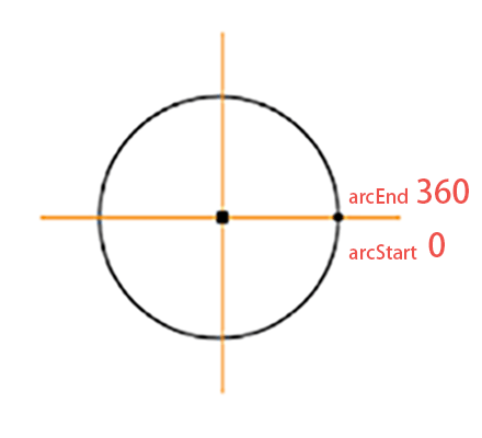
如图所示标注了弧形的起点和重点,方向为顺时针。如果你想绘制一个圆形进度条,可以设置arcStart为-90,arcEnd为270。如果想绘制一个半圆,可以设置arcStart为180,arcEnd为360。可以根据需要调整绘制起止角度数。
fillColor为被填充的进度条颜色,可以传入色值为其定义颜色,如(#fe4d3c)。
如果想使用渐变色填充,改参数需要设置为对象类型,例如{gradient: [color 1, color2, color 2]},则会生成三个颜色的径向渐变色。
如使用图片填充,则需要将参数设置为对象格式{image: url},传入图片的url地址。例如 fillColor: {image: 'http://img.com/fillImg'} 时,则会使用该图片进行填充。
设置传入text参数的文字样式,它需要为对象类型,可选的内容如下
| Name | Type | Description |
|---|---|---|
| size | string | 设置文字大小, 如 18px |
| color | string | 设置文字颜色, 如 #fa0556 |
| font | string | 设置文字字体, 如 Microsoft YaHei |
| x | number | 设置文字对齐的x轴 |
| y | number | 设置文字对齐的y轴 |
customText 选项可以自定义文字内容,它的格式为数组,可以定义多个文字。其每个用法与textStyle参数一致,只是多了text字段。
| Name | Type | Description |
|---|---|---|
| text | string | 设置文字内容 |
| others | 其他参数内容与textStyle用法一致 |