All code from this tutorial as a complete package is available in this repository.
If you find this tutorial helpful, please share it with your friends and colleagues! For more like it you can subscribe on Youtube or follow me on Twitter.
This tutorial is available as a video lesson if you prefer that format:
- Prerequisites
- Introduction
- Adding Tailwind
- Storybook Support for Tailwind
- Scoping and Requirements
- Front End Planning
- Front End: Search Component
- Front End: Header and Footer
- Front End: Layout
- Front End: Results
- Back End Planning
- Back End: Search Data
- Back End: API Routes
- Static and Dynamic Pages in Next.js
- Front End Finishing Touches
- Themes and Design Systems
- Next Steps
- Wrapping Up
IMPORTANT: This tutorial is a continuation of a previous tutorial.
If you wish to align the repository with the start of this tutorial, clone the repository and git checkout 6630ca95c25e66d7b6c7b1aad92151b481c1b9c5.
After you check out that commit, create a new branch to follow along with this tutorial. An example would be something like git branch fullstack-tutorial and then git checkout fullstack-tutorial.
It should be possible to follow this tutorial with a new blank project if you choose without all the configuration from the previous setup, but I would recommend you at least read through the article to understand the project architecture before we get started.
If you wish to try starting from a fresh Next.js project, run the following commands to set up the core project:
npx create-next-app --tsThen you will also want to install Storybook. Follow these instructions in a new project to get aligned with the beginning of this tutorial.
We also create all of our components off a base template that includes styles, stories and mock data. You can get that template from here.
Good luck, and I hope you enjoy this tutorial.
This tutorial is the second in a series about building scaleable Next.js architecture.
In the first installment, we focused entirely on the base project setup, we didn't actually begin building an application, just a simple component template to show the process.
In this next stage we will be looking at actually building out an application. We'll be looking at how Next.js handles some fundamental things like routing, image optimization, static vs dynamic pages, building an API, and of course: styling solutions.
We'll be using the current "hot commodity" Tailwind CSS as the tool we use to organize our design system, and get styles implemented quickly while maintaining a consistent look and feel to the product.
Finally and maybe most importantly, this tutorial is also focused on trying to replicate the real software development process. So we won't just be jumping into building, we'll be looking at what the requirements are based on our goals, what the scope of the project should be, and planning out in advance how we are going to build both the front end and back end.
By the end of the tutorial our goal will be to have a functional full-stack Next.js app that we can push to a production site and continue to iterate on in the future with a team of developers following a consistent system.
If that all sounds good to you, let's jump right in!
Tailwind CSS describes itself as:
A utility-first CSS framework packed with classes like flex, pt-4, text-center and rotate-90 that can be composed to build any design, directly in your markup.
So basically it's a way to enforce a bit of consistency and convenience, while also placing most of your styles closer to the components you're developing.
Tailwind's compiler will analyze all your code and only bundle raw CSS based on the classes you actually use, so it requires some dependencies to get up and running.
Before we get started I would very highly recommend the Tailwind CSS IntelliSense extension for VS Code. It gives you autocomplete for Tailwind styles, shows you the actual CSS values being applied, integrates with your custom theme, and generally and makes working with Tailwind so much smoother.
Now, let's begin by running the following commands in the root directory of our project:
yarn add -D tailwindcss postcss autoprefixerTailwind will compile into regular CSS for your final build so there is no need for it to exist as a runtime dependency in your project.
postcss and autoprefixer are tools for transforming CSS that Tailwind uses to do its job.
After Tailwind has been installed, we need to initialize it.
npx tailwindcss init -pThis will automatically create a postcss.config.js file for you. In addition to that you also need to create a tailwind.config.jsfile in the root of the project. One might get created by default as well. Its contents should include:
tailwind.config.js
module.exports = {
  content: [
    './pages/**/*.{js,ts,jsx,tsx}',
    './components/**/*.{js,ts,jsx,tsx}',
  ],
  // Ensure these match with .storybook/preview.js
  theme: {
    screens: {
      xs: '375px',
      sm: '600px',
      md: '900px',
      lg: '1200px',
      xl: '1536px',
    },
  },
  plugins: [],
};
Notice the pattern I used above is aligned with our /components and /pages directories. These are the only places I am planning to place React components (and therefore Tailwind styles since they are written on the components).
If you plan on adding more top level component directories in the future make sure you update this config.
We're almost ready to test it. We just need to add a few default baseline values to our global.css file. At this point I'm going to move it to the /pages directory because we will be building this app entirely with Tailwind and will not have any need for a global styles directory. (Note you may also need to update the import in .storybook/main.js if you do this).
If you choose not to use Tailwind, you can either keep the styles directory, or even still choose to remove it and keep your .modules.css (or SCSS, or styled-components) next to the components themselves.
Take special note of the @tailwind values at the top.
pages/global.css
@tailwind base;
@tailwind components;
@tailwind utilities;
You can remove any other browser normalizing CSS you had in global, Tailwind will take care of that for you.
I have also updated our index.tsx to get rid of Home.module.css and deleted that file:
pages/index.tsx
import CatCard from '../components/cards/cat/CatCard';
import { mockCatCardProps } from '../components/cards/cat/CatCard.mocks';
import PrimaryLayout from '../components/layouts/primary/PrimaryLayout';
import SidebarLayout from '../components/layouts/sidebar/SidebarLayout';
import { NextPageWithLayout } from './page';

const Home: NextPageWithLayout = () => {
  return (
    <section className="bg-gradient-to-r from-cyan-500 to-blue-500">
      <h1>
        Welcome to <a href="https://nextjs.org">Next.js!</a>
      </h1>
      <CatCard {...mockCatCardProps.base} />
    </section>
  );
};

export default Home;

Home.getLayout = (page) => {
  return (
    <PrimaryLayout>
      <SidebarLayout />
      {page}
    </PrimaryLayout>
  );
};
Now let's test to make sure Tailwind is installed and configured properly.
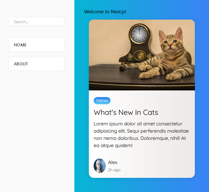
Notice that className on the section component in the above home page? That's tailwind right there, essentially just quick shorthands for the CSS properties you're already familiar with.
Without Tailwind installed and configured they won't do anything, but with Tailwind we should see a blue/cyan linear gradient background.
The nice thing is that Next.js will handle all the build process for you, you don't even have to think about it. Just start up your dev server (you may need to reboot to pick it up if it was already running):
yarn devAnd go to http://localhost:3000.
Looks like everything is setup. We only have one problem, if you try and run Storybook you're not going to see your styles. Your Next.js is setup to process your Tailwind classes, but by default Storybook is not.
If you don't have Storybook installed and configured already, remember to read the prerequisites section of this guide.
Start by adding the PostCSS addon for Storybook:
yarn add -D @storybook/addon-postcssOPTIONAL: If you want to keep using CSS modules as well:
yarn add -D storybook-css-modules-presetThen update your .storybook/main.js file to:
.storybook/main.js
module.exports = {
  stories: ['../**/*.stories.mdx', '../**/*.stories.@(js|jsx|ts|tsx)'],
  /** Expose public folder to storybook as static */
  staticDirs: ['../public'],
  addons: [
    '@storybook/addon-links',
    '@storybook/addon-essentials',
    '@storybook/addon-interactions',
    'storybook-css-modules-preset',
    {
      /**
       * Fix Storybook issue with PostCSS@8
       * @see https://github.com/storybookjs/storybook/issues/12668#issuecomment-773958085
       */
      name: '@storybook/addon-postcss',
      options: {
        postcssLoaderOptions: {
          implementation: require('postcss'),
        },
      },
    },
  ],
  framework: '@storybook/react',
  core: {
    builder: '@storybook/builder-webpack5',
  },
};
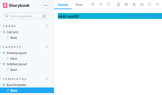
I've just added our blue/cyan gradient to the BaseTemplate.tsx component to test in Storybook to ensure it's properly compiling Tailwind styles (I removed the class again immediately after the test).
Time to commit our progress with git commit -m 'feat: implement tailwind css'
If you want to align with this step of the tutorial, clone the repository and use git checkout 6630ca95c25e66d7b6c7b1aad92151b481c1b9c5.
One thing I would like to do with this tutorial is cover, at least at a very high level, the general software development lifecycle. Obviously this topic can span full posts and entire books, but I think it's important to touch on the concepts especially for those devs following along with the tutorial who may not have the existing experience working with real projects in the industry. That is one of the goals of this tutorial series.
So with that in mind I am going to treat it like a real project.
First I need to ask the client (in this case the client is myself): What are your goals? What are you trying to achieve?" It's possible (though very unlikely) that once discussed in detail, this challenge can actually addressed without building new software at all. Perhaps there is an existing tool out there already built that fits their needs that they are not aware of?
In our scenario my goal is to "teach people about building applications in Next.js". Alright. I think it's fair to presume I'm going to need to build a Next.js application to deliver on that goal.
It turns out that I (the client) has a list of particular topics that I would like to teach readers about as part of this tutorial. They are concepts that nearly everyone building a professional Next.js app will encounter in the process of development
- Styling
- Routing
- API routes
- Static and dynamic pages
- Image optimization
- Sharing state between routes
- Authentication
- Internationalization
- Unit and end-to-end testing
- Data persistence (database)
Notes: The two separate footers are not required. Just one (showing location) is enough.
Great. That really helps me decide how I am going to scope the project.
Immediately out of the gate, since I am writing multiple blog posts I am going to assign all the "nice-to-have's" into the Phase 2 of the project (in our case, future blog posts). The scope of Phase 1 will include all the "must have's".
But what kind of project will I build to meet those requirements? I'm looking for the minimum viable example I can choose which will allow me to demonstrate each of those and meet the client needs without going over time and budget.
After spending some time reviewing popular sites out there to get ideas, I have decided that for this tutorial we are going to make a very simple Google clone.
Why? Well let's review the requirements:
- Styling (Google has a simple design, we'll use Tailwind CSS to recreate it)
- Routing (we'll demonstrate two routes, the main "home" page and a "results" page)
- API routes (we'll use the
fetchAPI to query for some mock search data with an API route) - Static and dynamic pages (main page can be static, search page dynamic based on search query)
- Image optimization (the Google logo)
Excellent! We have our requirements and scope, and now we are ready to work.
Before we dive in and start making components, let's take a bit of time to look at the whole project holistically and get an idea what components we are going to need. Normally this is likely where you would involve your designer in your process and use an industry grade tool like Figma to plan out and design the components you are going to need before you even begin thinking about code.
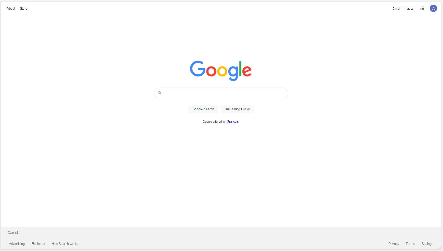
Lucky for us we already have the best design we could possibly ask for: a fully interactive one accessible at https://www.google.com.
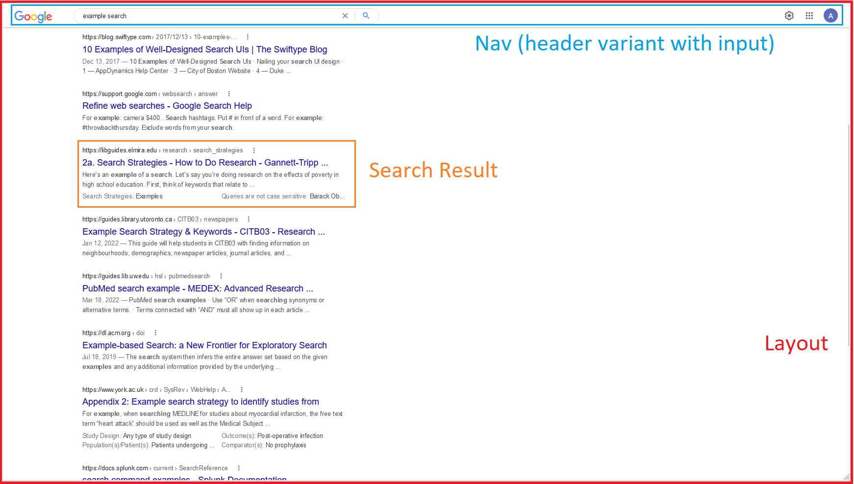
So we'll give the designer a break on this project and tackle it ourselves! I still want to get an idea what components I'm going to need so let's take a look at the two main pages we want to create and get an idea what the components are, and build a mental model of which pieces of it are re-used in multiple places.
(Note when I say "components" here in this context, I'm talking about the general concept of components, like the individual parts that something is composed of. I haven't gotten to the React-specific code "components" yet)
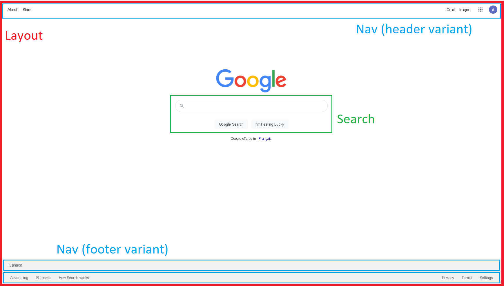
So you can see in the above I've isolated at least a few components at minimum:
- Layout (likely need home and results variants)
- Search (the functional part including the input, will be a form)
- Nav (both header and footer variants, only difference being the background colour and top/bottom position. The elements can be child components)
- Search Result (the structure of and typography of everything that does into rendering one result of a search, including title, text, url, etc)
The above is just one possible approach of a near infinite number even for something as simple as this. This is the project design stage and there honestly is no one right answer on exactly how to do it. Most people find in there career after a few years of getting the coding down, this is the stuff that ends up being the real challenge.
A good app will have the team spending much more time getting the design and plan in place, so that the absolutely minimum amount of coding needs to be done to achieve that goal. The coding and development stage is usually not only the most expensive, but it's also the most costly and complex to "undo" if requirements were not correct the first time.
I'll stop short of getting into the bureaucracy of it, because of course the reality is never this cut and dry, but hopefully you can see what I'm getting at. If at all possible, do it once, do it right, and be consistent. Other developers (and your future self) will thank you.
With that out of the way, I think we're finally ready to begin development on the front end components!
We will be doing ALL of our component designing and testing in Storybook.
You'll find that will be a recurring theme in our development process. It's a great way to make sure that the components we build look correct in isolation, so we can validate that without interference from other parts of the app, and then place them into our app afterward once they have been verified.
For this reason I actually have the flexibility to start working on whichever component I like. I'm going to begin with the Search component first.
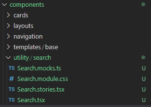
Create a new directory called /utility inside /components. As before, we'll start by copying our templates/base into the components/utility directory to start our component.
If you are unsure what I am describing, you can refer back to the original tutorial where we created the BaseTemplate component, or simply take it from the project repo.
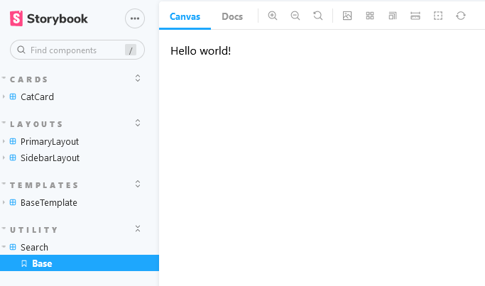
Run a find and replace for each instance of BaseTemplate and replace with Search in the copied folder, including both the content of the files and the filenames themselves. Lastly change the title in Search.stories.tsx to utility/Search. When you are done it should look like this:
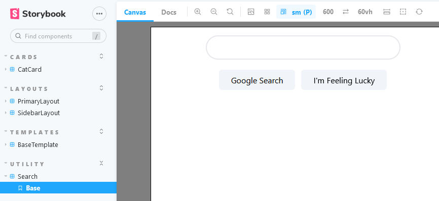
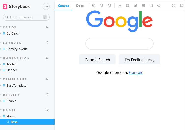
And in Storybook with:
yarn storybook(You may still have some lingering Tailwind test styles on the template which can be removed. Note also that I am leaving the .module.css template on here for those who choose not to use Tailwind, but we will not be using it in this tutorial)
Alright time to begin building the component! This is the one I've outlined in green in the original planning design above and titled as Search.
I'm going to begin with just the HTML structure, no styles or function logic. The "Search" button and input implies I'm going to want a form.
components/utility/base/Search.tsx
export interface ISearch {}
const Search: React.FC<ISearch> = () => {
return (
<form>
<input type="text" />
<button type="submit">Google Search</button>
<button type="submit">I'm Feeling Lucky</button>
</form>
);
};
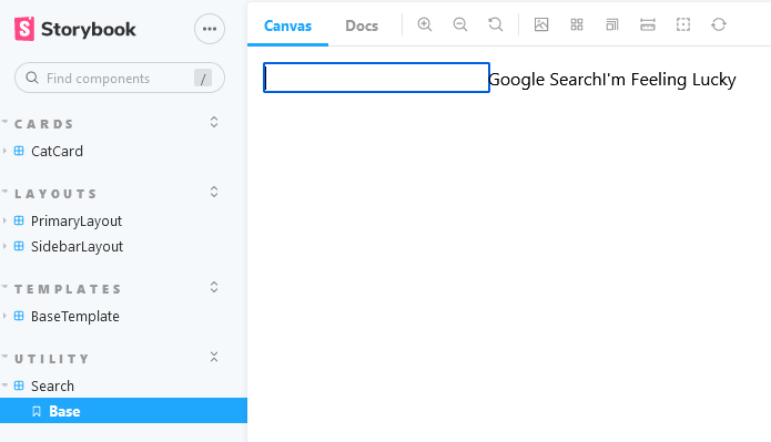
export default Search;Look at that Search component, pretty incredible eh? Hit the submit button in storybook and get an error since you don't have a backend to handle it. I'd say it's basically done... well maybe not.
I'm happy with the structure though, function-wise it's got everything we need. Let's do the styling next to get the look and feel up to speed.
If you're not familiar with Tailwind CSS I recommend you take a read through their documentation first to get a good feel for the syntax. If you're experienced with CSS you should find it very easy, for the most part it's just convenient shorthands. Just use the search bar of ctrl + F to quickly find the Tailwind version of what you need.
Full disclosure: I've been using Tailwind now for a grand total of about... 48 hours. It's brand new to me too! But I'm acknowledging that, not as a negative, but as a positive to show how straightforward it is to learn when you already have the fundamentals down.
I chose Tailwind for two reasons: ease of development (get styles in place quickly) and consistency (the base theme and pre-set values help ensure that the different parts in our app will look and feel the same).
Now with all that said, let's start adding those classes! Here's the same component as above, just with some Tailwind styles added (and a wrapper element for the buttons).
components/utility/base/Search.tsx
export interface ISearch {}
const Search: React.FC<ISearch> = () => {
return (
<form className="flex flex-col items-center gap-y-5">
<input
type="text"
className="rounded-full border-2 w-5/6 sm:w-96 h-12 px-3"
/>
<div className="space-x-3">
<button
type="submit"
className="border-0 p-2 px-6 bg-slate-100 rounded-md"
>
Google Search
</button>
<button
type="submit"
className="border-0 p-2 px-6 bg-slate-100 rounded-md"
>
I'm Feeling Lucky
</button>
</div>
</form>
);
};
export default Search;We can abstract those repeat classes on buttons out to a separate @apply directive to avoid repeating yourself.
Note: please read through Tailwind's extremely good documentation on this concept because it discusses how in a lot of cases the @apply solution can actually reduce future maintainability, so you just want to make sure it's the right decision first.
I'm using it here because I just want you to be aware of it and how to do it, and secondly they use an example of a global button style as one of the times that it should be used, so I feel confident using it in this example.
We just need to remove those repeat button styles and put them into pages/global.css and replace with an actual class name like so:
pages/global.css
@tailwind base;
@tailwind components;
@tailwind utilities;

@layer components {
  .btn-primary {
    @apply border-0 p-2 px-6 bg-slate-100 rounded-md;
  }
}
components/utility/base/Search.tsx
export interface ISearch {}
const Search: React.FC<ISearch> = () => {
return (
<form className="flex flex-col items-center gap-y-5">
<input
type="text"
className="rounded-full border-2 w-5/6 sm:w-96 h-12 px-3"
/>
<div className="space-x-3">
<button type="submit" className="btn-primary">
Google Search
</button>
<button type="submit" className="btn-primary">
I'm Feeling Lucky
</button>
</div>
</form>
);
};
export default Search;Excellent. Our Search component is finally ready visually (I've opted not to use the magnifying icon as it is embedded within the input element which makes the CSS a bit more complex than the intended scope of this tutorial.)
Try using the screen size button within Storybook (you can see it set to sm in the screenshot) to test at different mobile breakpoints. Notice we used the default 5/6 width on the input but set to sm:w-96 once the screen begins to stretch to keep it from getting too large.
Simplifying responsive design is one of the things Tailwind really excels at.
The last piece is to implement the management of the search state (basically keeping track of what the user has written so far).
The easiest way to do that is with the useState hook.
(Reminder once again that this is not a React tutorial, if you are not familiar with useState then you have potentially jumped the gun into Next.js a little too quickly. Not to worry! Shouldn't take you long to pick up, the new React documentation focused on hooks is probably the best way to learn straight from the source)
components/utility/base/Search.tsx
import { useState } from 'react';
export interface ISearch {}
const Search: React.FC<ISearch> = () => {
const [searchTerm, setSearchTerm] = useState<string>();
return (
<form
className="flex flex-col items-center gap-y-5"
onSubmit={(e) => {
e.preventDefault();
alert(`Action requested. Search for term: ${searchTerm}`);
}}
>
<input
type="text"
className="rounded-full border-2 w-5/6 sm:w-96 h-12 px-3"
value={searchTerm}
onChange={(e) => setSearchTerm(e.target.value)}
/>
<div className="space-x-3">
<button type="submit" className="btn-primary">
Google Search
</button>
<button type="submit" className="btn-primary">
I'm Feeling Lucky
</button>
</div>
</form>
);
};
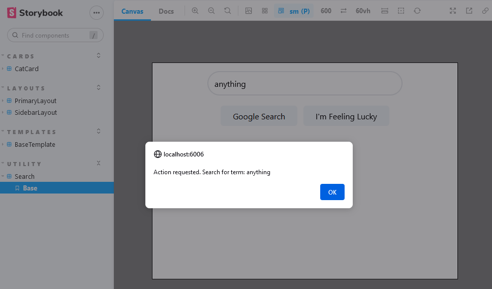
export default Search;The above will allow you to track and react to changes in the search form on the searchTerm variable. I've also added a Javascript-based form handler (as opposed to the default HTML behavior) so we can use it later if we need it. The preventDefault steps the normal form submission behavior of making a POST to the server from occurring.
At this point we are not sure if the search term might need to be managed elsewhere in the app (other components might need to be able to read it) or how we are going to submit the form. Normally that would be part of the planning process and I would know before writing code, but I am including this default behavior here to show as an example how we will refactor later if needed.
This completes our Search component for now until we know more about what we want to do with it. Aside form the alert() it appears to do everything we need it to do, and renders without visual issues on all breakpoints, so we can consider that done for now (normally you'd update your ticket and submit to QA for approval that the execution matches the design).
Time to commit our progress with git commit -m 'feat: create Search component'
If you want to align with this step of the tutorial, clone the repository and use git checkout 676a71b50755d859f46a12e54f8ea3484bf1f208.
We're gonna kick up the speed a bit here to get the basic remaining components in place.
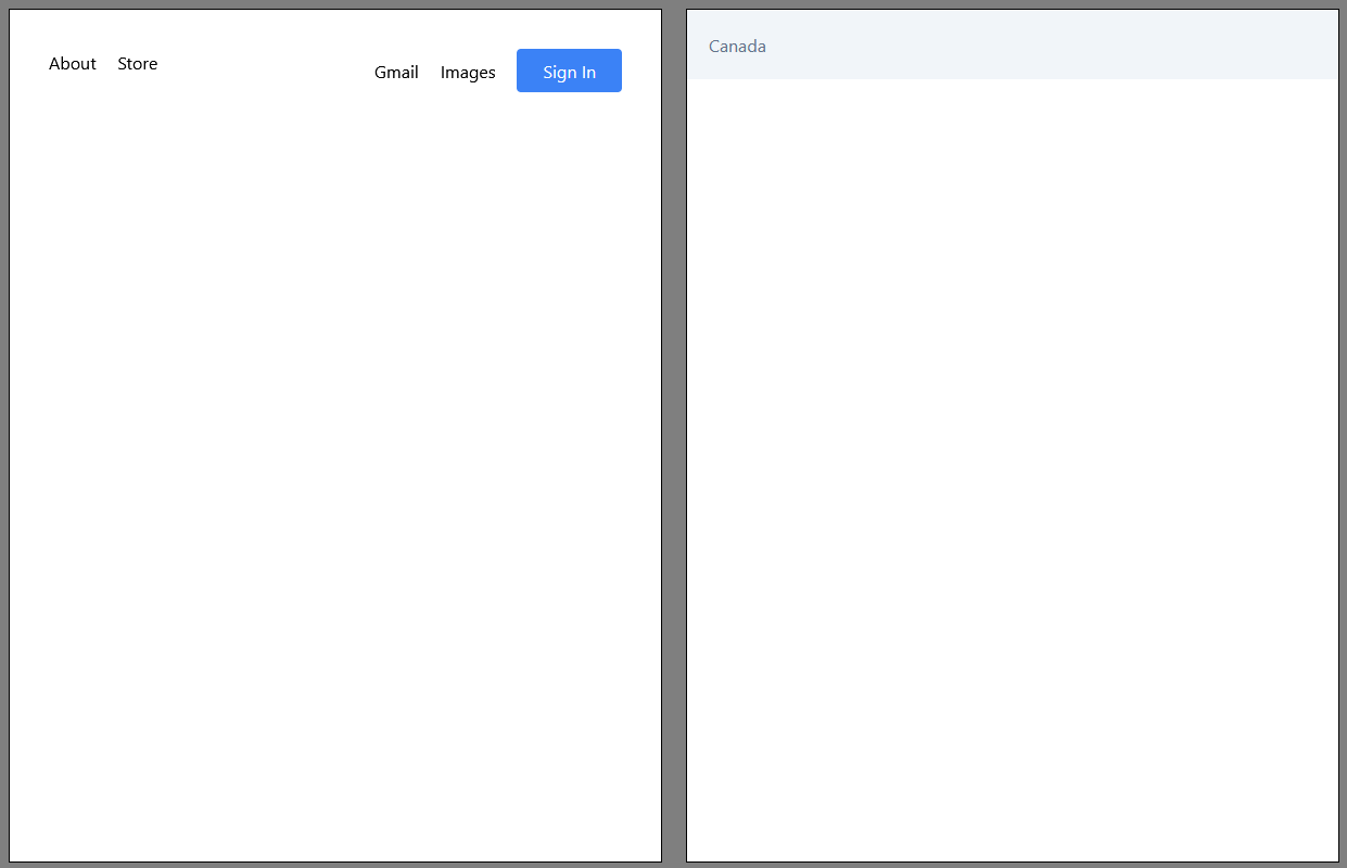
I've decided to build the Header and Footer as separate components for the time being. There is definitely behavior that is shared between them that could be abstracted into is own component (links/buttons in a row separated on each side of the screen horizontally with flex's space-between).
However there is still a lot that's unique, the content for sure, the position and the background colour. Enough that I have decided to separate them for the sake of simplicity in this demo.
Let's get to building.
Remember in each case we are using the BaseTemplate. For Header the Story title is navigation/Header.
components/navigation/header/Header.tsx
import Link from 'next/link';

export interface IHeader extends React.ComponentPropsWithoutRef<'header'> {}

const Header: React.FC<IHeader> = ({ className, ...headerProps }) => {
  return (
    <header
      {...headerProps}
      className={`w-full flex flex-row justify-between ${className}`}
    >
      <div className="space-x-5 m-5">
        <Link href="/">
          <a className="hover:underline">About</a>
        </Link>
        <Link href="/">
          <a className="hover:underline">Store</a>
        </Link>
      </div>
      <div className="space-x-5 m-5">
        <Link href="/">
          <a className="hover:underline hidden sm:inline">Gmail</a>
        </Link>
        <Link href="/">
          <a className="hover:underline hidden sm:inline">Images</a>
        </Link>
        <button className="border-1 p-2 px-4 sm:px-6 bg-blue-500 rounded text-white">
          Sign In
        </button>
      </div>
    </header>
  );
};

export default Header;
A cool feature of the above is that the Gmail & Images links disappear on the smallest screen size. In the real app we would have a menu that includes those items so they are not inaccessible on mobile, but on larger screens we get handy shortcuts to them.
Another thing you'll notice is the special <Link /> component provided by Next.js as an alternative to the <a> anchor tag. These links are required in order to maintain stage between routes in Next which we'll get to in a little while. Learn more about it here.
Now we move onto the Footer.
components/navigation/header/Footer.tsx
export interface IFooter extends React.ComponentPropsWithoutRef<'footer'> {}

const Footer: React.FC<IFooter> = ({ className, ...footerProps }) => {
  return (
    <footer
      {...footerProps}
      className={`w-full p-5 bg-slate-100 text-slate-500 ${className}`}
    >
      <p>Canada</p>
    </footer>
  );
};

export default Footer;
We were told in our requirements that only one footer is required. Right now we have the value hard coded as Canada, but we can return to that later. Just focusing on style for now.
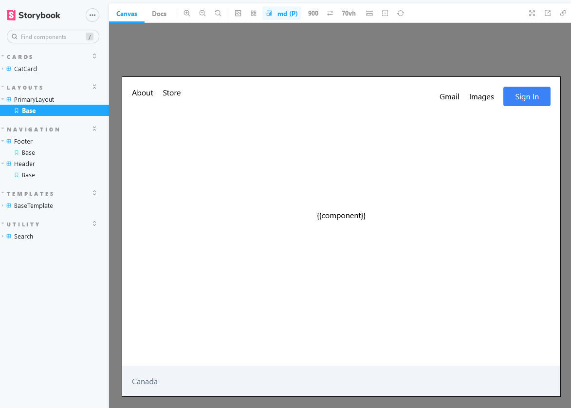
Presuming you've been following up with the previous blog / tutorial you will already have a layout component in place in components/layouts/primary/PrimaryLayout.tsx. This is important because we already set that layout up to persist between page routing so it doesn't reload the same layout and nav bar when you transition from one page to another.
One that note you can delete components/layouts/sidebar entirely, our new Header and Footer will replace that. Remember to delete it elsewhere in the code where SidebarLayout is imported. You can also delete pages/about.tsx for the same reason. It was just an example to show routing and no longer required in our app.
As for PrimaryLayout.tsx we will update it as follows (first remove or just blank out PrimaryLayout.module.css) then:
components/layouts/primary/PrimaryLayout.tsx
import Head from 'next/head';
import Footer from '../../navigation/footer/Footer';
import Header from '../../navigation/header/Header';

export interface IPrimaryLayout {}

const PrimaryLayout: React.FC<IPrimaryLayout> = ({ children }) => {
  return (
    <>
      <Head>
        <title>NextJs Fullstack App Template</title>
      </Head>
      <div className="min-h-screen flex flex-col items-center">
        <Header />
        <main>{children}</main>
        <div className="m-auto" />
        <Footer />
      </div>
    </>
  );
};

export default PrimaryLayout;
With our layout in place, we are ready to build the actual home page.
The way that Next.js handles routing is super simple and straightforward out of the box. Similar to a traditional webserver all you need to do is create directories.
The directory structure you create will match the path structure of your site and the page it loads is simply the index.tsx inside that directory, same as a webserver would look for an index.html by default.
For our home page accessible at the base / route of our site, we simply use pages.index.tsx. We already have the Header, Footer, Search components, and layout created, so all the home page needs to do is put those together and add the logo & language toggle link.
pages/index.tsx
import Image from 'next/image';
import Link from 'next/link';
import { useRouter } from 'next/router';
import PrimaryLayout from '../components/layouts/primary/PrimaryLayout';
import Search from '../components/utility/search/Search';
import { NextPageWithLayout } from './page';

const Home: NextPageWithLayout = () => {
  const { locale } = useRouter();

  return (
    <section className="flex flex-col items-center gap-y-5 mt-12 sm:mt-36">
      <Image
        src="/Google.png"
        alt="Google Logo"
        width={272}
        height={92}
        priority
      />
      <Search />
      <p>
        Google offered in:{' '}
        <Link href="/" locale={locale === 'en' ? 'fr' : 'en'}>
          <a className="underline text-blue-600"> Français</a>
        </Link>
      </p>
    </section>
  );
};

export default Home;

Home.getLayout = (page) => {
  return <PrimaryLayout>{page}</PrimaryLayout>;
};
(Note that I have downloaded this version of the Google logo from its Wikipedia page, named it Google.png and place it in the root public directory of the project)
There's two new Next.js specific components showcased here that I'd like to cover:
- Link - Next provides a special kind of link that is used as a superpowered version of the
<a>anchor tag. You still use the anchor tag, but by wrapping it in a<Link>with thehref, Next will handle a click to that link in a special way that preserves state in your application without a full page load and refresh (among other benefits described in the docs)
We have also taken advantage of the locale value in the useRouter hook to handling efficiently toggling back and forth between locales. Try it yourself (you'll need to run the yarn dev server to test it since you won't have access to routing in Storybook), but it works great for toggling back and forth between languages.
Remember that our app's available locales can be customized in next.config.js on the i18n field. Right now we don't have any translation in place, so only the URL will switch (updating the text copy for i18n support will be a topic of a future tutorial.)
- Image - Image handling in web development is surprisingly complicated, and as such, Next has created a special
<Image>tag to replace the standard<img>which helps optimize your images on the server at build time and decide exactly the right one to serve to your users. The biggest immediate benefits here are load times (quality optimizations, PNG -> WEBP conversions as example) and also addressing Cumulative Layout Shift issues. I highly recommend you click the link to the docs to read more about it. In this example we are only using a small subset of the features available.
In addition to the Image component API docs, Next also includes a special section talking about how they manage image optimization which is well worth a read.
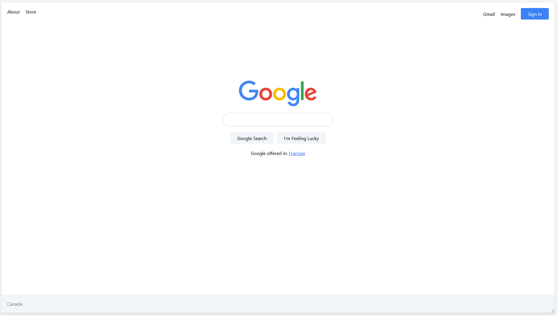
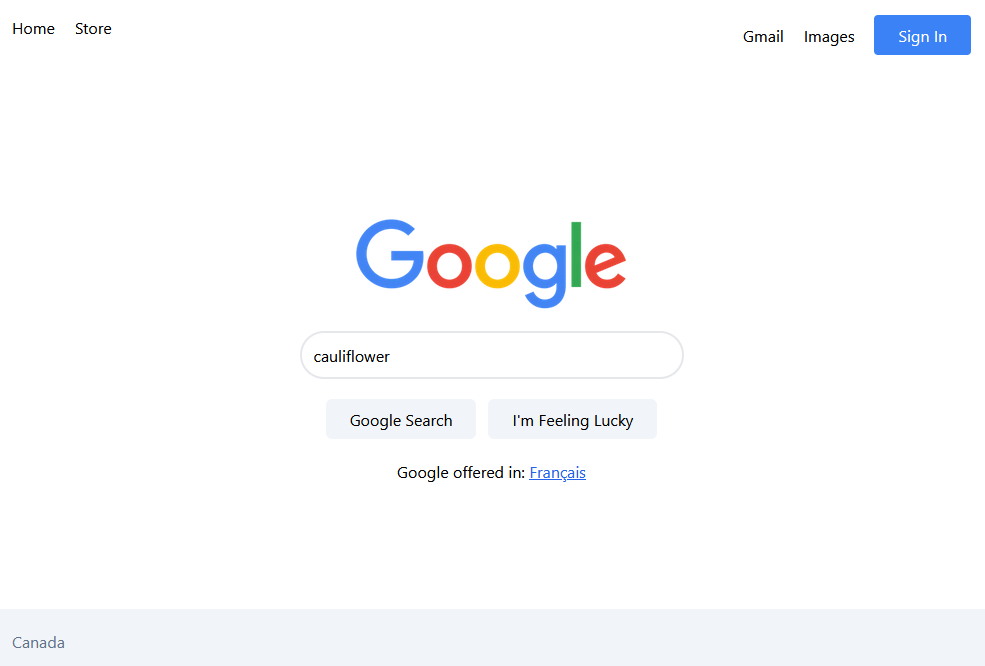
Thanks to a few handy Tailwind classes, with the above version of pages/index.tsx we now have a fully desktop and mobile friendly (simplified) clone of Google's homepage you can view on your dev server.
One could make the argument that Storybook isn't quite the right place to test full pages. It's more focused on the individual components than the complete integration of all of that.
That said however, Storybook does have full support for pages and recommendations for how to handle it, so with that in mind if you'd like to test your pages in Storybook then I'll show you the tools you'll need (at this stage) to get it working.
The main challenge is always mocking functional dependencies. So for example Next's router does not exist in Storybook. Other future challenges will be authentication and internationalization.
Each of these can be individually managed though with mock functions that provide sensible defaults, and most of the popular ones (including Next router) have addons to handle most of the config for you.
Here's how to support Next Router in Storybook. Start by installing the addon and reading its documentation.
yarn add -D storybook-addon-next-routerThen update your config files:
.storybook/main.js
module.exports = {
  ...
  addons: [
    ...
    'storybook-addon-next-router',
  ],
};
.storybook/preview.js
import { RouterContext } from 'next/dist/shared/lib/router-context';

...

export const parameters = {
  ..
  nextRouter: {
    Provider: RouterContext.Provider,
  },
};
Then create a story for your page. Since you don't want to interfere with NExt's router by placing stories in your pages directory and potentially causing errors, I have created the __stories__ directory specifically for holding any page stories.
__stories__/pages/index.stories.tsx
import { ComponentMeta, ComponentStory } from '@storybook/react';
import Home from '../../pages';

export default {
  title: 'pages/Home',
  component: Home,
  argTypes: {},
} as ComponentMeta<typeof Home>;

const Template: ComponentStory<typeof Home> = (args) => <Home {...args} />;

export const Base = Template.bind({});
And there it is. Remember that the layout (Header and Footer) are applied by Next via a separate function call, so we only have the actual page content here for testing. If you want to test the layout use the layouts/PrimaryLayout story.
Things are in a good state so time to commit our progress with git commit -m 'feat: build home page'
If you want to align with this step of the tutorial, clone the repository and use git checkout 9ff325aceb0e2096fa618d78489beec2c00dea12.
We still have the "Results" page to do, but the nice thing is there's a LOT of overlap so we really only have one more custom component to build (Search Result) as well as setting a variant of the layout (home is centered on the page while the results are left-aligned).
Start by copying the BaseTemplate, rename base to search-result and replace each instance of BaseTemplate with SearchResult.
components/utility/search-result/SearchResult
import Link from 'next/link';

export interface ISearchResult extends React.ComponentPropsWithoutRef<'div'> {
  url: string;
  title: string;
  text: string;
}

const SearchResult: React.FC<ISearchResult> = ({
  url,
  title,
  text,
  className,
  ...divProps
}) => {
  return (
    <div
      {...divProps}
      className={`flex flex-col w-5/6 max-w-screen-md space-y-1 ${className} `}
    >
      <Link href={url}>
        <a
          className="cursor:pointer hover:underline"
          target="_blank"
          rel="noopener noreferrer"
        >
          <p>{url}</p>
          <p className="text-blue-600 text-xl ">{title}</p>
        </a>
      </Link>
      <p>{text}</p>
    </div>
  );
};

export default SearchResult;
Then the mock data:
components/utility/search-result/SearchResult.mocks.ts
import { ISearchResult } from './SearchResult';

const base: ISearchResult = {
  url: 'https://www.google.com',
  title: 'This is a link to a search result about product or service',
  text: 'The topic of this link is product or service.  Description of the search result. The description might be a bit long and it will tell you everything you need to know about the search result.',
};

export const mockSearchResultProps = {
  base,
};
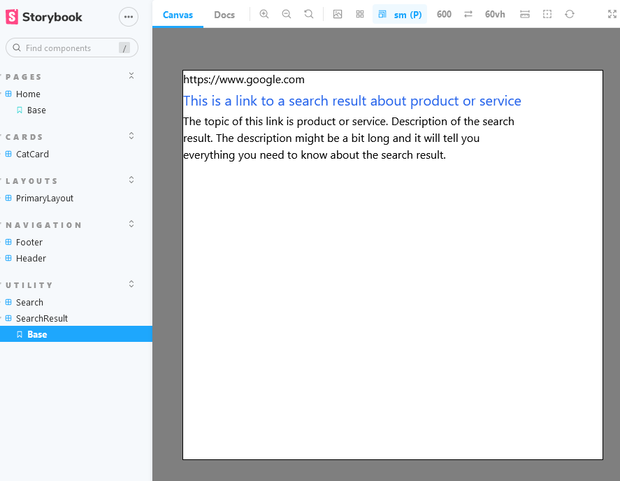
Finally rename the story to utility/SearchResult and load Storybook, our component will look like a real Google search result (or close enough for our purposes):
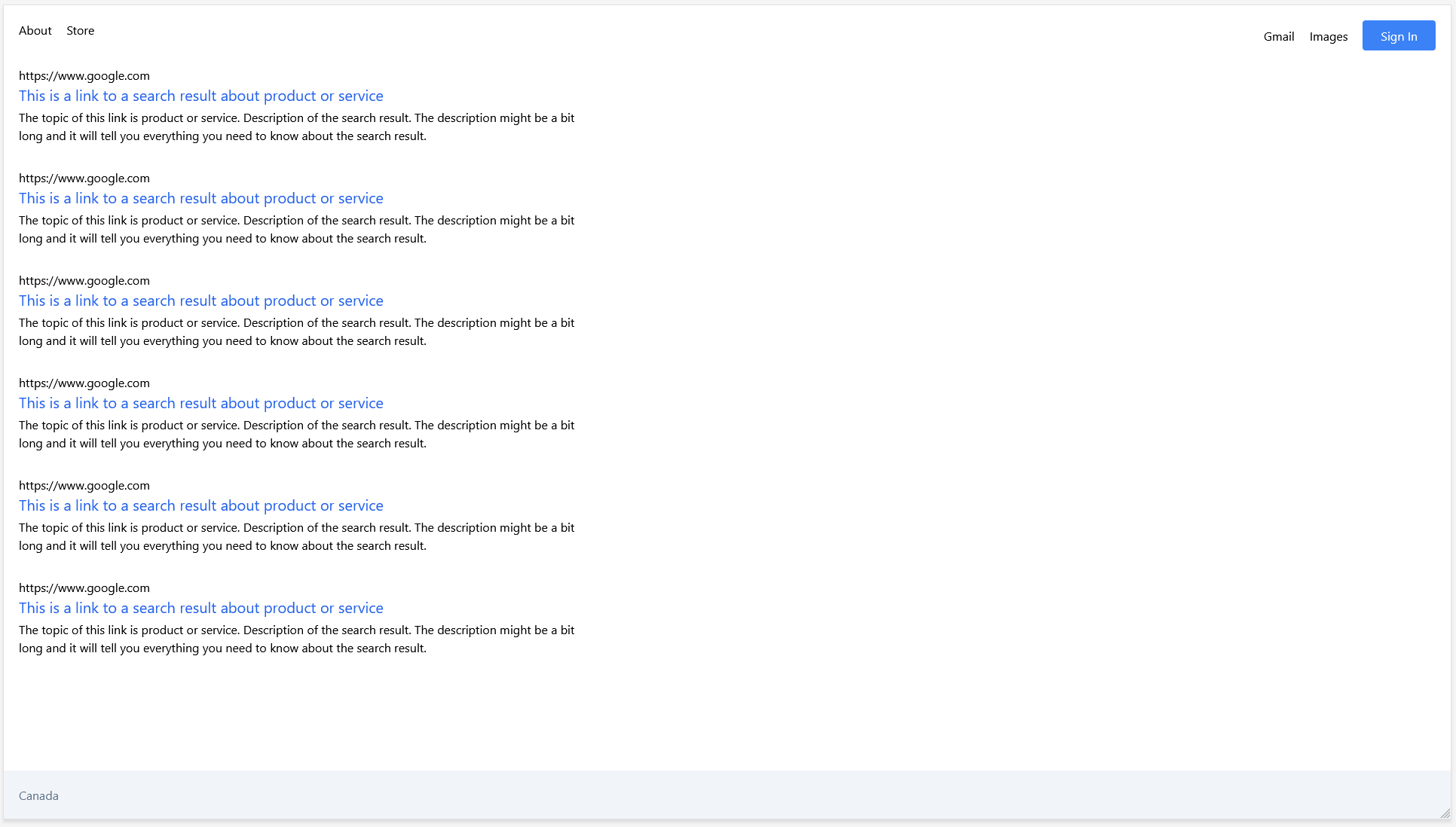
With our result in place, we are ready to create the results page. Create a /results directory in the /pages directory and that's all you need to do, Next will handle the routing for you.
pages/results/index.tsx
import PrimaryLayout from '../../components/layouts/primary/PrimaryLayout';
import SearchResult from '../../components/utility/search-result/SearchResult';
import { mockSearchResultProps } from '../../components/utility/search-result/SearchResult.mocks';
import { NextPageWithLayout } from '../page';

const Results: NextPageWithLayout = () => {
  return (
    <section className="flex flex-col items-center gap-y-5">
      <div className={`flex flex-col space-y-8`}>
        {[...new Array(6)].map((_, idx) => {
          return <SearchResult key={idx} {...mockSearchResultProps.base} />;
        })}
      </div>
    </section>
  );
};

export default Results;

Results.getLayout = (page) => {
  return <PrimaryLayout justify="items-start">{page}</PrimaryLayout>;
};
Since the /results page has its layout left aligned, we need to update out PrimaryLayout.tsx to support a conditional prop. I've created the optional justify prop below and used Typescript to allow the user two options: items-center (default) and items-start.
components/layouts/primary/PrimaryLayout.tsx
import Head from 'next/head';
import Footer from '../../navigation/footer/Footer';
import Header from '../../navigation/header/Header';

export interface IPrimaryLayout extends React.ComponentPropsWithoutRef<'div'> {
  justify?: 'items-center' | 'items-start';
}

const PrimaryLayout: React.FC<IPrimaryLayout> = ({
  children,
  justify = 'items-center',
  ...divProps
}) => {
  return (
    <>
      <Head>
        <title>NextJs Fullstack App Template</title>
      </Head>
      <div {...divProps} className={`min-h-screen flex flex-col ${justify}`}>
        <Header />
        <main className="px-5">{children}</main>
        <div className="m-auto" />
        <Footer />
      </div>
    </>
  );
};

export default PrimaryLayout;
Now start your dev server with yarn dev and go to http://localhost:3000/results
This is a good time to commit our progress with git commit -m 'feat: create results page and SearchResult component'
There's a couple of things I'm going to be excluding from the clone for simplicity. Technically Google's results page still includes the search bar and even places it in the header on scroll.
You could easily create a modified version of that component and place it as a child element into this page and the header, but in terms of this tutorial we wouldn't really touch on any new Next.js-specific topics by doing that (and that's what this tutorial is focused on), so to keep things moving forward I'll leave that as an optional challenge for you if you choose.
If you want to align with this step of the tutorial, clone the repository and use git checkout 3c4cf387cfd9112fe26c5dd268c293d7c1c00f5f.
Now that we have the visual aspect of the application essentially feature complete (that we know of at this stage) it's time to move onto the back end.
The great thing about Next.js is that it really is a complete full stack solution. Because pages are rendered on the server, obviously that means you have access to a server environment, and that means you can securely do things like access your database directly without needing to expose credentials to the client browser.
The primary vehicles that Next.js uses to do this depends on whether your back end functions are designed to provide data directly to pages being rendered, or if they are standard APIs that simply return data to any source in any shape (usually JSON, but not necessarily).
For the former, pages, we would use getServerSideProps and for the latter we use API routes.
In order to teach how they work, we'll be using both in this example.
Let's begin by thinking about how our app would work if we were actually querying real data. A really simplistic ELI5 version of what Google does is that it crawls through all public data on the web and index it so that it's organized in a way that is fast to search through (a simple example would be in alphabetical order).
That index would be stored by Google in some kind of database. Let's ignore the obvious differences between our little imaginary database and the worldwide distributed datacentres they use, and just simplify it to "searching through existing text in some database."
Adding a real database is beyond the scope of this tutorial (though it will be covered in a future one soon, likely using Prisma and PostgreSQL) so we're just going to create our own little pretend one that is close enough so that we can at least teach the fundamentals.
Like many other aspects of web development, once you have the fundamentals, you can very quickly learn to work with any specific tool or implementation of those ideas.
There are many ways to plan your back end, but personally I believe the most important first step is to begin with your data model. From there you build out any relationships between those data models, and modify as needed based on requirements.
If you are fortunate enough to have a rock solid data model to begin with that all parties are aligned with, and a schema to enforce correctness, you will be in an extremely good position to build your application.
In our case we have control of the data (since we are creating it) and as such I will simply design it to align with the information provided with the standard Google search results:
We already began this work when we built the SearchResult component so I am going to stick with those values for simplicity. You could definitely make the argument that description is a more apt term than text. Once again feel free to design your schema however you like, you don't need to follow what I've used to the letter.
Now that we have decided how the model for our search data will be shaped, we only need to decide how the app will get that data to our results page.
My plan for the journey is as follows:
- Search value term is entered by user on
homepage input form - Form submission redirects to
resultspage with user's search value as a query parameter in the URL - When rendering on server side, the
resultspage will query an API route (we will call it/api/search) inside agetServerSidePropsfunction, which extracts the search value from the URL query param and passes it to the API route. - The API route will query our mock database with the search value and provide the results filtered by the search value back to the
getServerSidePropsfunction on theresultspage. - The
getServerSidePropsfunction on theresultspage will receive its search results then pass those results as props to theresultspage component to render the data for the user.
I'll note that in this flow technically the results page could just query the database directly in getServerSideProps. There are two main reasons I've chosen not to do that however:
- In a real app, other pages or even external services might have reason to query search results with a search value, so I don't want to tie that search logic specifically to the
resultspage - More personally, I want to demonstrate how to use both API routes and
getServerSidePropsin this tutorial.
Now with all that planning in place, I think we are ready to build.
We'll begin with the mock database. When working with Node/Javascript/Typescript etc most real database that you query will be done using Node drivers for those DBs which will returns the results in JSON format. JSON is one of (if not THE) most popular formats for transmitting data on the web, so if your app can handle JSON payloads you'll be in very good shape to handle data from many different sources.
That's the reason I've chosen to put our mock data inside a JSON file.
We're going to begin using the /lib directory in the root. If you recall from the initial tutorial that is the folder I created which will store all the domain & business logic and data that our application deals with.
If "components" and "pages" are the front end directories, then "lib" is our back end directory (though we will leverage it from both sides to get all the benefits that come with that, hence the full-stack app we are building).
Create a /search directory inside of /lib. This is where we will be placing all the logic related to the concept of search data and results. Within that we'll create a file called database.json and populate it with the dummy data below:
lib/search/database.json
[
  {
    "url": "https://en.wikipedia.org/wiki/Cat",
    "title": "This is a link to a search result about cats",
    "text": "Did you know their whiskers can sense vibrations in the air?  Description of the search result. The description might be a bit long and it will tell you everything you need to know about the search result."
  },
  {
    "url": "https://en.wikipedia.org/wiki/Dog",
    "title": "This is a link to a search result about dogs",
    "text": "They sure do love to bark.  Description of the search result. The description might be a bit long and it will tell you everything you need to know about the search result."
  },
  {
    "url": "https://en.wikipedia.org/wiki/Cats_%26_Dogs",
    "title": "This is a link to a search result about both cats and dogs",
    "text": "Both of them have tails.  Description of the search result. The description might be a bit long and it will tell you everything you need to know about the search result."
  },
  {
    "url": "https://en.wikipedia.org/wiki/Broccoli",
    "title": "This is a link to a search result about broccoli",
    "text": "Broccoli was invented by crossing cauliflower with pea seeds.  Description of the search result. The description might be a bit long and it will tell you everything you need to know about the search result."
  },
  {
    "url": "https://en.wikipedia.org/wiki/Cauliflower",
    "title": "This is a link to a search result about cauliflower",
    "text": "Who invented cauliflower?  Description of the search result. The description might be a bit long and it will tell you everything you need to know about the search result."
  }
]
I've slightly modified the titles and text values so that we'll be able to perform real searches on the data and see the filtered results.
I'm also going to create a Typescript interface that aligns with this data model. We'll be using that everywhere in our app to minimize errors when working with this data.
lib/search/types.ts
export interface ISearchData {
  url: string;
  title: string;
  text: string;
}
This interface is now the source of truth for everything related to search data in the app. If we every change or add new fields, we add them here and then I want to see every API and every component in the app that uses that data to immediately break and throw a warning that I have to update those as well to handle the schema change.
For that reason there is one place I need to update already. Our SearchResult.tsx component has its own explicit type for url / title / text. Instead of that I'm going to refactor it to extend this type so they always remain aligned:
components/utility/search-result/SearchResult.tsx
import Link from 'next/link';
import { ISearchData } from '../../../lib/search/types';

export type ISearchResult = ISearchData & React.ComponentPropsWithoutRef<'div'>;

...
Everything else below the ellipsis for the component is the same, only the type and imports have been updated.
I'm going to begin with the data and work my way out. I've already created the data in the mock database. The next connection point to that data is our API route that will be loading it and returning a filtered version of it to whoever is querying.
All API routes in Next by default begin with the /api prefix to differentiate them from routes that you would expect to visit and receive an HTML page. Our search query API will be /api/search, so create that structure now along with an index.ts file. Since this is an API dealing with data and not a React component, we can just use the .ts extension:
/pages/api/search/index.ts
// Next.js API route support: https://nextjs.org/docs/api-routes/introduction
import type { NextApiRequest, NextApiResponse } from 'next';
import database from '../../../lib/search/database.json';
import { ISearchData } from '../../../lib/search/types';

interface IApiSearchRequest extends NextApiRequest {
  body: { searchTerm?: string };
}

export type IApiSearchResponseData = ISearchData[];

export default function handler(
  req: IApiSearchRequest,
  res: NextApiResponse<IApiSearchResponseData>
) {
  const {
    body: { searchTerm },
  } = req;

  if (req.method === 'POST' && searchTerm && searchTerm.length > 0) {
    // Creates a regex search pattern for a case insensitive match from the user's search term
    const searchPattern = new RegExp(searchTerm, 'i');

    const filteredResults = database.filter((result) => {
      return (
        // Check the user's search term again either the title or the text of the database entry
        searchPattern.test(result.title) || searchPattern.test(result.text)
      );
    });
    res.status(200).json(filteredResults);
  } else {
    res.status(400).json([]);
  }
}
Let's unpack the above.
We'll start with the database. We're very spoiled to have such amazing tooling in this day and age. By default Typescript will be able to handle the import of raw JSON files and even provide types for us based on the schema that it detects on the fields in the file. We don't even need to explicitly cast it.
This behavior is enabled with the esModuleInterop and resolveJsonModule values in your tsconfig.json file in the root of your project, both of which are enabled by default in the Next.js Typescript template we are using.
The second is that we have decided that we will be expecting the user's searchTerm on the body of a POST request to get search results. If it's not a POST request or the searchTerm is missing or empty, we are going to return a 400 Bad Request along with an empty JSON array to indicate there are no results due to a poorly formatted or invalid request. The benefit of this is that regardless of term we will be able to handle an expectation of an array in the response, either empty or not.
The last key part here is the logic of the actual search. We convert the user's search term into a Javascript regular expression (aka regex) object with the "i" flag which means case insensitive.
If you are unfamiliar or just not comfortable with regexes, an alternative option that accomplishes the same result would be to check if:
result.title.toLowerCase().includes(searchTerm.toLowerCase());The result of the string compare is used to filter out the complete list of all search results. Obviously if we were using real web indexes there's no possible way we would load ALL possible search results before processing, but this is an example and we know exactly the current size of our data, so our implementation is safe in that scope.
Now let's test our endpoint before we go any further. If you're not familiar with API testing I would suggest you look into some of the great tools out there. Postman used to be the best, but they've started really locking things down behind sign-up walls. It does still have a workable free version though. Insomnia is a great alternative.
If you're comfortable with the command line and you're on a Linux or Mac machine (or Windows with a command line version) the fastest way is to just use cURL.
Below is the command that will make a search request to your API for the term dog.
I've added a couple of echo; in the screenshot just to add newlines to make it more readable -- there are tools to display formatted JSON on the command line too if you want to look them up and get really fancy, but all we care about now is if the payload is returned and is correct.
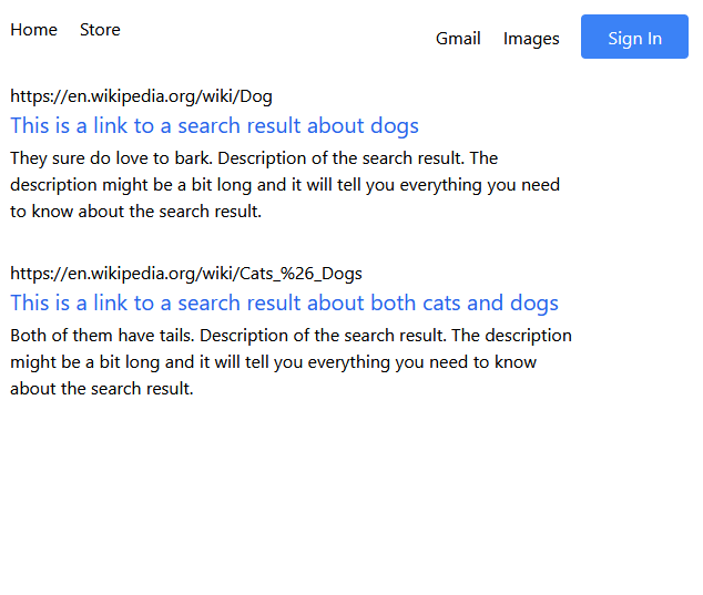
curl -X POST -H "Content-type: application/json" -H "Accept: application/json" -d '{"searchTerm":"dog"}' "http://localhost:3000/api/search"There's our result! If you look closely it's returned 2/5 entires from our mock database, the one about "dogs" and the one about "cats & dogs".
Since our search term was dog I'd say that's a good sign things are working well.
Let's switch gears and set up your results page to use this endpoint and get the search results to display.
Now we are ready to introduce our first getServerSideProps function. We'll be adding it to our results page so that we can take the search term from the URL of the initial request and use it to fetch search data that we render the page with.
As soon as you introduce this function the page is no longer a candidate for static generation, which is the default behavior for pages in Next. If possible pages will always be generated when you build your app presuming they always look the same for every user. Our home page is an example of that.
Our results page however is going to look different all the time depending on the search term, so consequently Next will have to render that page dynamically every time a user requests it. The benefit obviously being the dynamic data and the downside being an increase in page load time.
We'll begin by doing a simple test of the getServerSideProps function by setting it up with a simple dummy prop.
pages/results/index.tsx
import { GetServerSideProps } from 'next';
import PrimaryLayout from '../../components/layouts/primary/PrimaryLayout';
import SearchResult from '../../components/utility/search-result/SearchResult';
import { ISearchData } from '../../lib/search/types';
import { IApiSearchResponseData } from '../api/search';
import { NextPageWithLayout } from '../page';

export interface IResults {
  searchResults: ISearchData[];
}

export const getServerSideProps: GetServerSideProps<IResults> = async ({
  query,
}) => {
  let searchResults: IApiSearchResponseData = [];
  // 1
  const searchTerm = query.search;

  if (searchTerm && searchTerm.length > 0) {
    // 2
    const response = await fetch(`http://localhost:3000/api/search`, {
      body: JSON.stringify({ searchTerm }),
      headers: {
        'Content-Type': 'application/json',
      },
      method: 'POST',
    });

    searchResults = await response.json();
  }

  return {
    // 3
    props: {
      // Will be passed to the page component as props
      searchResults,
    },
  };
};

const Results: NextPageWithLayout<IResults> = ({ searchResults }) => {
  const hasResults = searchResults.length > 0;

  return (
    <>
      <section className="flex flex-col items-center gap-y-5">
        {hasResults ? (
          <div className={`flex flex-col space-y-8`}>
            {searchResults.map((result, idx) => {
              // 4
              return <SearchResult key={idx} {...result} />;
            })}
          </div>
        ) : (
          <p>No results found.</p>
        )}
      </section>
    </>
  );
};

export default Results;

Results.getLayout = (page) => {
  return <PrimaryLayout justify="items-start">{page}</PrimaryLayout>;
};
Hopefully you are able to get an idea how data is being passed in the example above. I would encourage you to read the documentation if you haven't already.
There's a few critical things to understand and unpack here before we talk about what the actual page is doing.
First of all, it's important to be aware that getServerSideProps is a special function that must be named exactly that which is run automatically by Next as part of the page build process. Because of this you should not expect to be able to create a Story for this page in Storybook.
Think of that as a good thing, we are talking about data fetching from our API, at this point we have moved away from the real purpose of Storybook. Ideally it should not be making API calls for data. Of course we could create a mock version of our getServerSideProps function and configure Storybook to use it, but that's beyond the scope of this tutorial.
For now, while we are working on the back end we will be doing all our testing on the development build by running yarn dev.
Just before you run the dev server, let's talk about what's happening. There's a lot going on here so I've add four numbered 1-2-3-4 comments in the code above to talk about.
-
The
queryfield on the context object thatgetServerSidePropsreceives will have the query parameter from the URL. So this page is expecting to receive a URL like/results?search=somethingand that "something" will be available as available onquery.searchthat we extract into thesearchTermvariable. -
Here we are querying our own APi we created! Same values and headers we did with cURL test. The search term will be what we extract from the URL, and we'll save the result in
searchResultswhich defaults to an empty array. -
We must return an object with values on the
propsfield, that is what our page component will receive. All this is typesafe along the way including the return value, pay close attention to the three places theIResultsinterface is used along the way. -
We take whatever search data is returned and map it to our
SearchResultcomponent. We already know the return data matches the expected props, so we can use the spread operator to very easily pass each prop at once.
Now we are ready to run
yarn devAnd open the URL to http://localhost:3000/results?search=dog
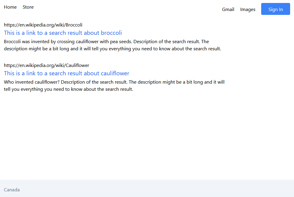
Notice the query param I added to the URL? It works! Try changing it yourself to other terms and see if you get different results. Some examples from the mock database would be broccoli and bark.
Time to commit our progress with git commit -m 'feat: implement search API and results page query'
If you want to align with this step of the tutorial, clone the repository and use git checkout f7321a266c51528d2369bf5d5862bc4ace4fdfcb.
I'm going to have to backtrack a little bit, turns out there was one more front end task that I forgot before moving to the back end.
We need to configure our Search component to redirect to the results page and put the search term into the URL when it does so that our search bar actually works.
This is quite easy to do, the necessary update to the Search.tsx component looks like this:
components/utility/search/Search.tsx
import { useRouter } from 'next/router';
import { useState } from 'react';
export interface ISearch {}
const Search: React.FC<ISearch> = () => {
// 1
const router = useRouter();
const [searchTerm, setSearchTerm] = useState<string>('');
return (
<form
className="flex flex-col items-center gap-y-5"
onSubmit={(e) => {
e.preventDefault();
// 2
router.push(`/results?search=${searchTerm}`);
}}
>
<input
type="text"
className="rounded-full border-2 w-5/6 sm:w-96 h-12 px-3"
value={searchTerm}
onChange={(e) => setSearchTerm(e.target.value)}
/>
<div className="space-x-3">
<button type="submit" className="btn-primary">
Google Search
</button>
<button
onClick={() => alert('FEATURE COMING SOON!')}
className="btn-primary"
>
I'm Feeling Lucky
</button>
</div>
</form>
);
};
export default Search;I've added some numbered comments on the code for reference.
-
We import Next's router which allows us to navigate to different pages while preserving all state.
-
In the
onSubmitfunction we use the router'spushfunction to navigate to the results page and set the search query param to the current value of thesearchTermwhich is set by the input field.
I've also added a silly FEATURE COMING SOON! alert to the I'm Feeling Lucky button, but don't hold your breath on that one.
I think we're finally ready to take the entire app for a test drive. Start the dev server with yarn dev and visit http://localhost:3000
How cool is that? We just built our own functioning search engine. Ready to work at Google or NASA now right?
Couple small features to keep in mind, you can return to home and search again by clicking the "Home" link. You can also search by typing your value and just pressing "enter" since it's a <form> element and the browser handles that behavior automatically by triggering onSubmit.
Time to commit our progress with git commit -m 'feat: connect search input to results page'
If you want to align with this step of the tutorial, clone the repository and use git checkout .
Although the app is "feature complete" as per the scope of this article, there is one final related topic that I want to touch on that I think is absolutely critical: theming.
The link I made above is not specific to Tailwind or any one particular implementation of a theme, because I wanted to first talk about the importance of theming as a concept before we apply it to our app.
As you get more experienced and build more apps you'll realize your CSS naturally starts to look something like:
.card {
  background-color: red;
  padding: 12px;
}

.nav-bar {
  background-color: red;
}

.content-section {
  padding: 12px 24px;
}

.title {
  font-size: 24px;
}
This is a really contrived example, but you can probably see where I'm going. As your app grows and your CSS grows you end up using the same values over and over.
Of course with modern CSS you can do something like --primary-color: red; and then background-color: var(--primary-color), which in itself is already a great improvement, but often what you're looking for is to create a consistent design system that automatically gets used as a default by the pieces of your app without even having to explicitly say it.
Every core component that needs a color should just have --primary-color on it by default rather than you having to be explicit about it. You should only need to do so if overriding it. Similarly with spacing, your app will feel a lot more consistent if all spacing between elements is a multiple of some value like 4px or 8px.
That's what creating a design system (like Material Design for example) aims to do. Build a consistent look for your digital product and place a meaningful framework around it. A good design system will lead to a more consistent and predictable user experience, and also provide the path of least resistance for developers implementing it.
This is just a very basic introduction, I am absolutely not a designer myself but I love working with good ones, because they make my job easier and our product better.
The final part of this tutorial is going to look at Tailwind CSS's specific implementation of a design system and how you can use it to make your app better.
Like everything, before we begin I always recommend you first read the documentation. Tailwind's docs are fantastic and will help you get up and running quickly.
We actually already created a basic theme in the Tailwind installation section where we established the value of the different xs sm md etc screen breakpoints for our app. The theme lives in tailwind.config.js and we are going to expand on it.
I revisited Google again to see if there's any little changes we can make to closer align the styles, a couple easy ones are: Google uses the Arial font, and the search bar is a bit wider than the max Tailwind static with we have available by default (w-96)
So rather than explicitly override our components, let's update our theme so that the rest of the app can benefit from those conventions!
tailwind.config.js
module.exports = {
  content: [
    './pages/**/*.{js,ts,jsx,tsx}',
    './components/**/*.{js,ts,jsx,tsx}',
  ],
  theme: {
    // Ensure these match with .storybook/preview.js
    screens: {
      xs: '375px',
      sm: '600px',
      md: '900px',
      lg: '1200px',
      xl: '1536px',
    },
    fontFamily: {
      sans: ['Arial', 'sans-serif'],
      serif: ['Garamond', 'serif'],
    },
    extend: {
      colors: {
        blue: {
          500: '#1a73e8',
        },
      },
      spacing: {
        128: '32rem',
      },
    },
  },
  plugins: [],
};
I've updated the fontFamily globally by setting the value there on the theme object. Within that theme object I also have a nested object called extends.
Any values I place on the theme will completely replace Tailwind's defaults, but setting values on the same values inside extends will add those values in addition to the existing ones.
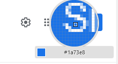
I've overridden the blue-500 colour with the actual colour Google uses on their button based on using the handy eyedropper in Firefox (More Tools -> Eyedropper).
That's what I've done with the new width 128 which will translate into a w-128 Tailwind class. Let's swap out the w-96 value for w-128 on our Search component:
components/utility/search/Search.tsx
...
<input
  type="text"
  className="rounded-full border-2 w-5/6 sm:w-128 h-12 px-3"
  value={searchTerm}
  onChange={(e) => setSearchTerm(e.target.value)}
/>
...
That's it!
There's more cool stuff you can do with the theme we didn't mention here. The colour specific documentation is worth a look, as is the concept of using a self-referencing function to get access to the theme value.
For example if you wanted to set a blue colour and then later reference that exact colour on a background while still on the theme itself with theme('color.blue').
One topic that is critically important for large Next.js apps that we haven't yet addressed is the ability to share state between pages.
In traditional single page React apps it's quite simple to pass your props or wrap the app in context, but how is that handled in Next when transitioning to a completely separate page?
The answer is that we leverage the top level _app.tsx component to manage our state. As long as we are using Next's built in router or the special Next <Link> component, Next will be able to handle the persistance of state in our app between pages.
The same general rules for React state still apply, if the user refreshes the page or manually enters a URL it will be lost. In those cases if you want persistance you would want to look at localStorage or a state management packaged solution that includes support for local storage like Recoil
Just for a quick demonstration of how to use it, we will be implementing a mock "auth" state that is controlled with our "Sign In" button. Our goal will be that your authenticated state will still persist even when hitting the search button and navigation to the /results page.
We will be using React context for this. Down the road when you implement a real auth service, you could potentially even connect it to this component we are going to create and replace the mock data with real data, while still using our context solution to control the UI state.
First things first I think it's time to create an additional root directory. We need a place to store React specific logic (like context and custom hooks) that is not the same as pure UI (components) or domain logic and services (lib).
Proper project structure is critically important and there are some great resources about it out there. I want to find the right balance between too compact (too much unrelated in one directory) and too abstract (directories for every different concept no matter how small).
For our use case I am going to create a root directory called /state which will be intended to hold both custom hooks and React context. The two are usually tightly related so I am comfortable keeping them together for the time being.
Within /state I will create a directory called /auth which will manage everything related to the state of authentication in our app.
state/auth/AuthContext.tsx
import { createContext, useState } from 'react';

interface IAuthContext {
  authenticated: boolean;
  login: () => void;
  logOut: () => void;
}

const defaultValue: IAuthContext = {
  authenticated: false,
  login: () => undefined,
  logOut: () => undefined,
};

const AuthContext = createContext<IAuthContext>(defaultValue);

export const AuthProvider: React.FC = ({ children }) => {
  const [authenticated, setAuthenticated] = useState(
    defaultValue.authenticated
  );
  const login = () => setAuthenticated(true);
  const logOut = () => setAuthenticated(false);

  return (
    <AuthContext.Provider value={{ authenticated, login, logOut }}>
      {children}
    </AuthContext.Provider>
  );
};

export default AuthContext;
The above component will provide context to our entire application that any component can use to check if the user is authenticated to see certain content. When that authentication state changes (using one of the two handy login/logOut functions we have provided) then all children of the context provider will re-render and update their state.
(Note when I say all children I mean ALL children, even ones that don't use the authenticated context value. This is an important concept to understand, I would recommend you read more about it if you aren't familiar with that concept. This is a place to start. It's one of the reasons why global state management libraries like Redux and Recoil are so widely used is that they have ways of working around this behavior if you need to)
We will create a new button component called AuthButton. This component is going to be dependent on the context provided by AuthContext, so we need to remember that when we use this button somewhere up the component tree we will need an AuthContext.Provider component for it to work -- the trick is to remember that's not just for our app, that applies to Storybook as well! For now though, let's just build the component.
Copy our BaseComponent over again into the /components/button directory and rename it to auth. We're going to replace all instances of BaseComponent with AuthButton including the filename. Make sure you also change the story title to buttons/AuthButton and remove any most data from the template.
The structure of the AuthButton already exists, we are going to extract it out of our Header component into its own component like so:
components/buttons/auth/AuthButton.tsx
import { useContext } from 'react';
import AuthContext from '../../../state/auth/AuthContext';
import styles from './AuthButton.module.css';

export interface IAuthButton extends React.ComponentPropsWithoutRef<'button'> {}

const AuthButton: React.FC<IAuthButton> = ({ className, ...buttonProps }) => {
  const { authenticated, login, logOut } = useContext(AuthContext);

  return (
    <button
      onClick={authenticated ? logOut : login}
      className={`${styles.container} ${className} border-1 p-2 px-4 sm:px-6 bg-blue-500 rounded text-white w-28`}
      {...buttonProps}
    >
      {authenticated ? 'Sign Out' : 'Sign In'}
    </button>
  );
};

export default AuthButton;
Pay attention to the useContext invocation, that is how twe consume the <AuthProvider> context that will be wrapping our entire application. We'll get to that part last. The next step is to take this new auth button use it in our Header:
import Link from 'next/link';
import AuthButton from '../../buttons/auth/AuthButton';

export interface IHeader extends React.ComponentPropsWithoutRef<'header'> {}

const Header: React.FC<IHeader> = ({ className, ...headerProps }) => {
  return (
    <header
      {...headerProps}
      className={`w-full flex flex-row justify-between ${className}`}
    >
      <div className="space-x-5 m-5">
        <Link href="/">
          <a className="hover:underline">Home</a>
        </Link>
        <Link href="/">
          <a className="hover:underline">Store</a>
        </Link>
      </div>
      <div className="space-x-5 m-5">
        <Link href="/">
          <a className="hover:underline hidden sm:inline">Gmail</a>
        </Link>
        <Link href="/">
          <a className="hover:underline hidden sm:inline">Images</a>
        </Link>
        <AuthButton />
      </div>
    </header>
  );
};

export default Header;
Finally we need to update _app.tsx which is the component that wraps our whole app. We want every piece of our app to have access to the Auth context, so right now that serves as the best place for it.
Technically every time the auth updates the app will re-render, but that is okay since presumably a real user would only be signing in once per session.
pages/_app.tsx
import type { AppProps } from 'next/app';
import { AuthProvider } from '../state/auth/AuthContext';
import './globals.css';
import { NextPageWithLayout } from './page';

interface AppPropsWithLayout extends AppProps {
  Component: NextPageWithLayout;
}

function MyApp({ Component, pageProps }: AppPropsWithLayout) {
  // Use the layout defined at the page level, if available
  const getLayout = Component.getLayout || ((page) => page);

  return <AuthProvider>{getLayout(<Component {...pageProps} />)}</AuthProvider>;
}

export default MyApp;
And finally, if we want to be able to access these context values for the components when we run them in Storybook, we need to create a default story template that includes that context.
For that we use Storybook decorators. Just export a const called decorators which React component(s) you want as a wrapper around all your stories.
import { AuthProvider } from '../state/auth/AuthContext';

...

export const decorators = [
  (Story) => (
    <AuthProvider>
      <Story />
    </AuthProvider>
  ),
];
Thats it! Now run yarn dev and load http://localhost:3000
When you click on the "Sign In" button if all has gone correct it will toggle to a "Sign Out" which mimics the function of having logged into the site. Doing this is basic React behavior to toggle a button state.
What is special about what we have done is when you enter a term into your search bar and hit search. It will navigate to a completely different page, the results page, but because of the React auth context wrapper your button should still show "Sign Out" if you had signed in on the home page.
And that is persistent state between routes in Next.js
I hope you found this tutorial and learned something about setting up a solid and scaleable Next.js project for you and your team.
This is the first part of what is intended to be a multi-part series on creating a production quality Next.js app.
Some of my ideas for future installments are below, I'd encourage you to leave some feedback about which ones you'd find most useful (or other ones if you don't see them below).
- How to Build Scalable Architecture for your Next.js Project- How to build a fullstack Next.js app using API routes and Tailwind CSS- How to implement unit and end-to-end testing in a Next.s app with jest and playwright
- How to add a global state manager to your Next.js app with Recoil
- How to create a CI/CD pipeline with Github actions and Vercel
- How to implement SSO authentication and internationalization in a Next.js app using NextAuth and i18next
- How to connect a database to your Next.js app with Prisma and Supabase
- How to manage multiple applications in a monorepo with Next.js and Nx
Stay tuned and please don't hesitate to ask any questions, I'm happy to answer if I can!
Remember that all code from this tutorial as a complete package is available in this repository.
Please check some of my other learning tutorials. Feel free to leave a comment or question and share with others if you find any of them helpful:

