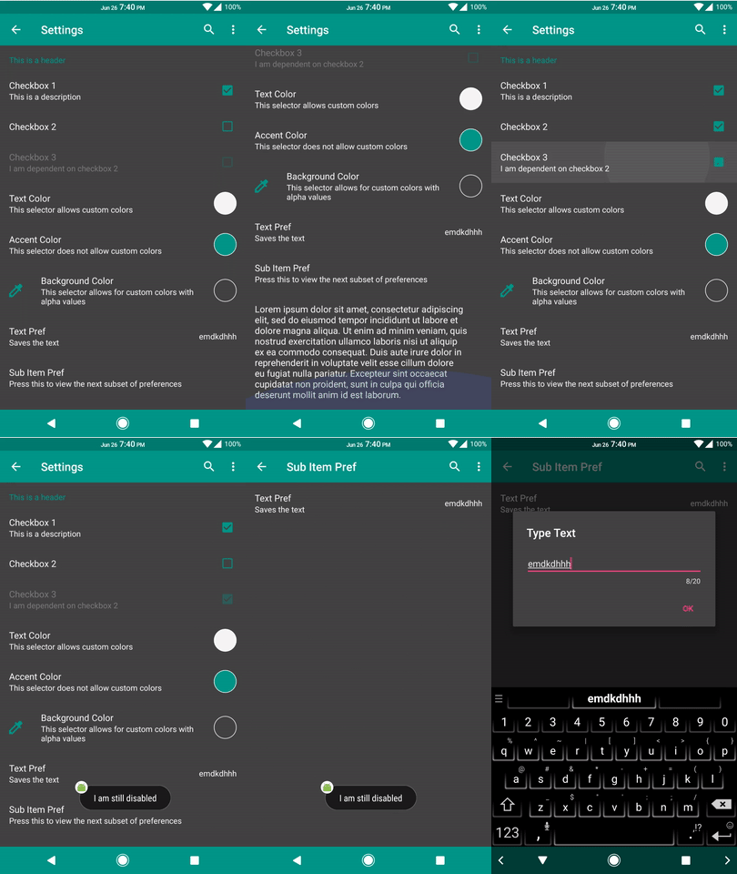
KAU supports Preferences that are created without xmls and through AppCompat. The items are backed by a FastAdapter and support iicons. The logic behind kpref items is that most states are based around callbacks. As a result, we don't need to hold references of items that may change; we simply reload the list and all states will be refetched. This is especially powerful when items are interdependent. Rather than adding a bunch of calls on one item when its state changes (which we can still do in this lib) and propagating to other items when necessary, we may instead reload and have each item verify their states themselves.
The easiest way to create the settings is to extend KPrefActivity.
We will then override onCreateKPrefs to generate our adapter builder.
The adapter builder can easily add items using defined functions. Each item added extends one or more contracts to configure it.
The contracts are as follows:
| Contract | Mandatory | Optional | Description |
|---|---|---|---|
CoreAttributeContract |
NA |
textColor accentColor |
Defines stylings that are added in every item |
CoreContract |
titleRes |
descRes iicon |
Implemented by every item |
BaseContract |
getter setter |
enabler onClick onDisabledClick, visible |
Implemented by every preference item |
KPrefColorContract |
NA |
showPreview |
Additional configurations for the color picker |
KPrefSeekbarContract |
NA |
min max increments toText textViewConfigs |
Addtional configurations for a seekbar, as well as text to be displayed on the side. |
KPrefSubItemsContract |
itemBuilder |
NA |
Contains a new list for the adapter to load when clicked |
KPrefTextContract |
NA |
textGetter |
Additional configurations for the text item |
KPrefTimeContract |
NA |
use24HourFormat |
Additional configurations for time picker |
The kpref items are as followed:
| Item | Implements | Description |
|---|---|---|
checkbox |
CoreContract BaseContract |
Checkbox item; by default, clicking it will toggle the checkbox and the kpref |
colorPicker |
CoreContract BaseContract KPrefColorContract |
Color picker item; by default, clicking it will open a dialog which will change the color (int) |
seekbar |
CoreContract BaseContract KprefSeekbarContract |
Seekbar item. Takes in a given range and will call the setter whenever a user picks a new value. |
header |
CoreContract |
Header; just a title that isn't clickable |
text |
CoreContract BaseContract KPrefTextContract |
Text item; displays the kpref as a String on the right; does not have click implementation by default |
plainText |
CoreContract BaseContract |
Plain text item; like text but does not deal with any preferences directly, so it doesn't need a getter or setter |
timePicker |
CoreContract BaseContract KPrefTextContract, KPrefTimeContract |
Extension ot text that will open and save a time picker |
| This can be used to display text or deal with preference that are completely handed within the click event (eg a dialog). | ||
subItems |
CoreContract KPrefSubItemsContract |
Sub items; contains a new page for the activity to load when clicked |
An example of the adapter builder:
override fun onCreateKPrefs(savedInstanceState: android.os.Bundle?): KPrefAdapterBuilder.() -> Unit = {

	header(R.string.header)

	/**
	 * This is how the setup looks like with all the proper tags
	 */
	checkbox(title = R.string.checkbox_1, getter = { KPrefSample.check1 }, setter = { KPrefSample.check1 = it },
			builder = {
				descRes = R.string.desc
			})

	/**
	 * This is how it looks like without the tags
	 */
	checkbox(R.string.checkbox_3, { KPrefSample.check3 }, { KPrefSample.check3 = it }) {
		descRes = R.string.desc_dependent
		enabler = { KPrefSample.check2 }
		onDisabledClick = {
			itemView, _, _ ->
			itemView.context.toast("I am still disabled")
			true
		}
	}
}
On top of per item configurations, KPrefActivity has some core attributes that you can define on creation.
It is done through the abstract function:
    override fun kPrefCoreAttributes(): CoreAttributeContract.() -> Unit = {
        textColor = { Prefs.textColor }       // text color getter; refreshes automatically on reload
        accentColor = { Prefs.accentColor }   // accent color getter
        // background color does not exist as it is done through the ripple canvas
    }
